


__twocolumncontent.jpg)


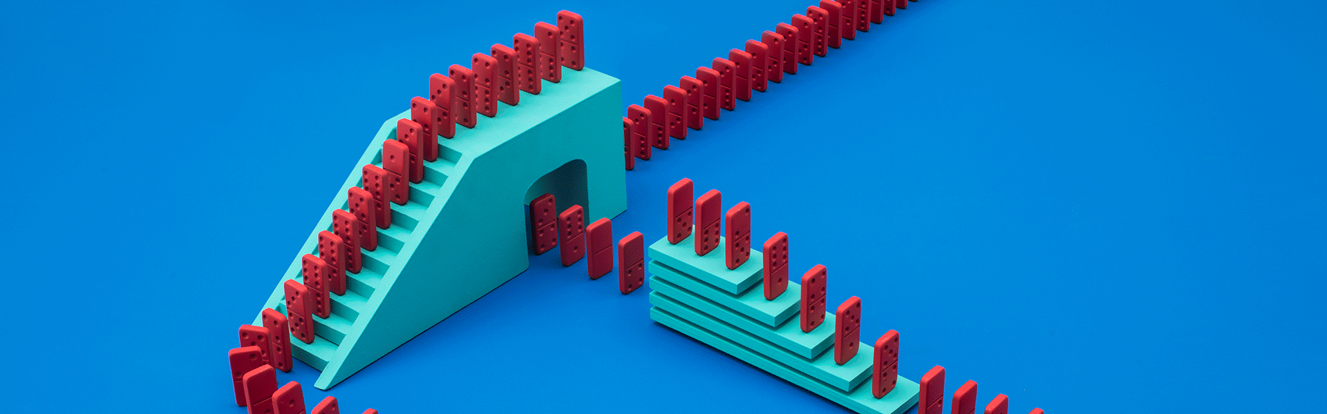
A hole in one sets off a sequence of dominoes; a man tap dances to teeth chompers; popcorn pops to the beat of a drum; a clock spins to a tune played on a piano.
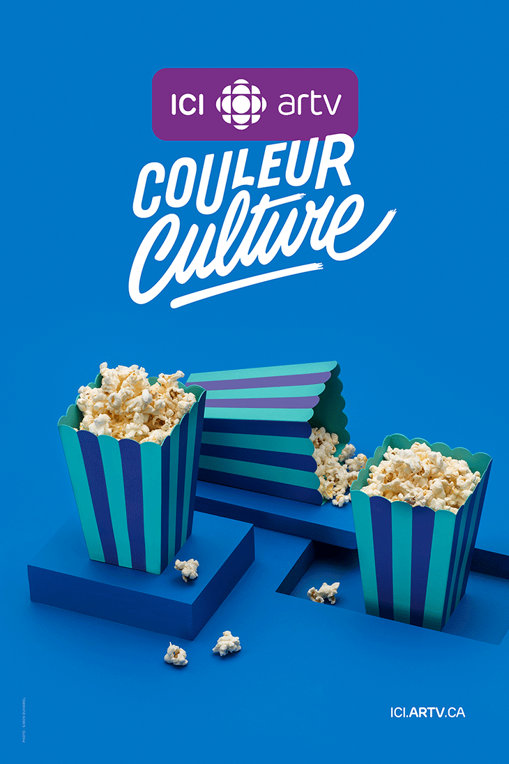
Two unrelated scenes set side-by-side play off of each other in fun and interactive ways for ICI ARTV’s rebrand. The French-Canadian arts and culture specialty channel used the concept of two worlds colliding to showcase the personality of its new tagline, “Couleur Culture” (Colour your Culture) in a playful and quirky way.
Creative Director Marie-Eve Tremblay said the channel was looking for something artistic and edgy that was different from its other branding elements which relied heavily on featuring hosts and TV personalities.
“For us, “Couleur Culture” means that ICI ARTV has a cultural programming, but it also highlights culture in a way that makes you say ‘Wow! It’s colorful, different and surprising!’” she said.
Art Director Olivier Charland, who’s also a well known set designer and graphic designer, led the in-house development of the concept to pair together two parallel universes on a split screen and create surprising interactions between them.
He and his team brainstormed ideas of things that wouldn’t work in real life but could be meshed together to create a relationship, like a joystick that controls the construction of a tiered cake. He began by creating sketches, then built individual sets for each graphic world and captured the interactions on camera to “keep that human touch.”
“We mixed stop motion with live action to make make it more magical,” Charland said.

The project took about a month to complete. The post production was pretty simple, only because it required so much pre-production, preparation and testing beforehand, like setting up all the dominoes and getting the sequence to work in one shot. The vibrant colors also speak to the cultural programming of the channel, while the text in the new tagline uses the same approach of two different fonts that work together.
The campaign itself includes 10 fillers, six IDs, a series of five-second on-air elements to run at the opening of scheduled shows, a series of PG-13 warnings that air before content-sensitive shows, and photos for print and web campaigns.
ICI ARTV also developed original music scored so that the spots can be cut at various times depending on programming needs. This element adds another layer to the campaign, creating scenarios where the music viewers hear is clearly not, for instance, that of the piano being played on screen, causing everything to feel slightly off beat.
The sound design serves to “immerse the viewer in the quirky world” and “makes it a bit more weird in a sense,” Charland said.
The rebrand, which rolled out toward around the beginning of June, fits with the vibe of ICI ARTV’s programming, like the series C’est juste de la TV (The TV Show), where three hosts candidly discuss the good, the bad and the ugly of what was on television that week, and PaparaGilles (A French wordplay on “paparazzi”) where hosts bring unexpected questions to the red carpet.
“It’s really in the same spirit of our tagline,” Tremblay said. “We don’t want something plain.”
CREDITS
Client: ICI ARTV
Marketing Director: François Jean
Creative Director: Marie-Eve Tremblay
Director, Art Director: Olivier Charland
Director of Photography, Photographer: Simon Duhamel (Consulat)
Production Director: Myriam Girouard (Folio)
Editor: François Ratelle
Composer: Jean-Phi Goncalves (XS Music)
Motion Designers: Patrick Dupuis, Jonathan Harnois
Post Production Coordinator: Sandrine Delpech
Announcers: Martin Rouette and Sophie Vajda
Tags: