


__twocolumncontent.jpg)


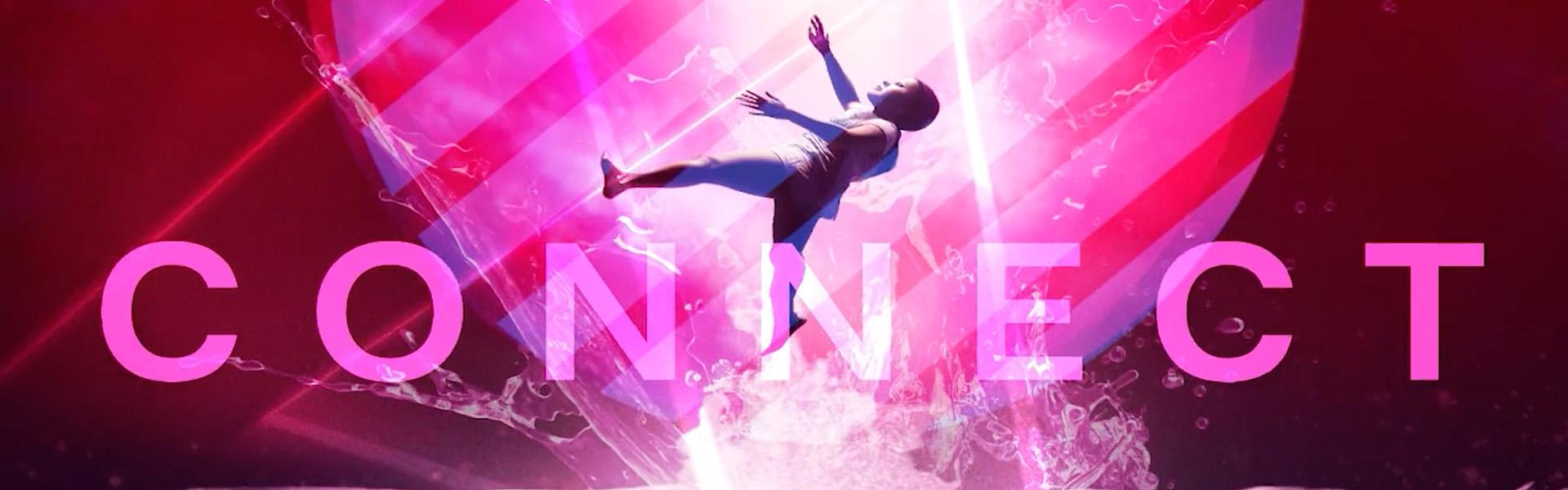
The theme of the opening sequence for Promax’s Festival of Virtual Content is “Building Connections.” Along the way, the design team at Promax agency partner Bellaluca found that it had to build its own connections – both within the piece and within the global entertainment marketing community—before arriving at a final package.
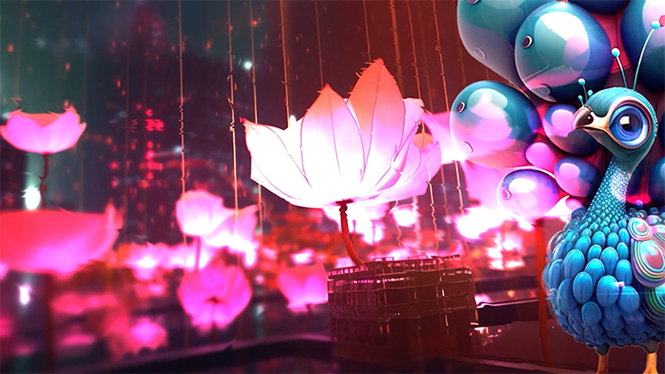
In the sequence, above, the viewer is taken on a journey around the world—visiting dreamy, colorful versions of Los Angeles, Singapore, India and Amsterdam where Promax events either were held or were intended to be held this year before going virtual.
Initially, the video was supposed to open separate Promax conferences in North America and Europe, both of which were later consolidated into the Festival of Virtual Content, which is running now on Wednesday at 9 a.m. PT through early November. Along the way, Promax chapters in Singapore and India decided they would like to use the Bellaluca-created assets for their in-person conferences as well, so the assignment evolved and expanded.
“There are so many ways to play with the idea of connectivity. We were so drawn to it because we’ve been so disconnected and in a creative field, that kills you,” said Bellaluca Executive Producer Emily Nardone.
The strategy was to take the theme, “Building Connections,” and incorporate that throughout all of the assets – including web banners, social media graphics, speaker nameplates and much more. Once India and Asia came on board, Bellaluca integrated those locations into the overall look and feel as well.
After Bellaluca established the strategy, the team created still images to conceptualize the ideas. Bellaluca Founder and Creative Director Justin Nardone, Emily’s husband, then. animated them and set them to music.
“We wanted to nail down the look, the style, and these icons,” Justin said. “We really wanted to get all of that established before we went forward with the video.”
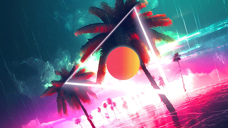
Each location has its own palette. Los Angeles draws its pink and orange colors from the sunrise, while Amsterdam is showcased in blues and reds that often merge into fuschia. India’s palette comes from its peacock, featuring teals and purples, while Asia is shaded in blues and yellows. As the video proceeds, the palettes come together as one.
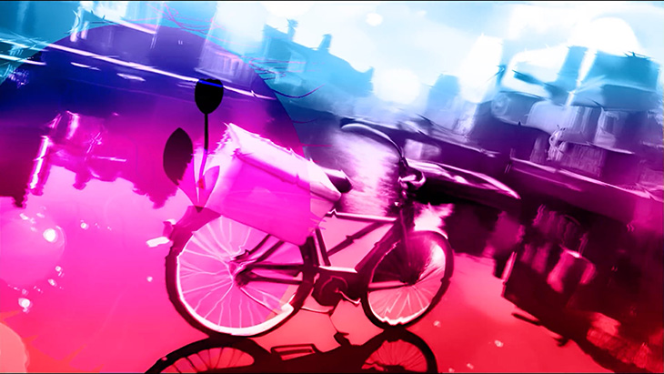
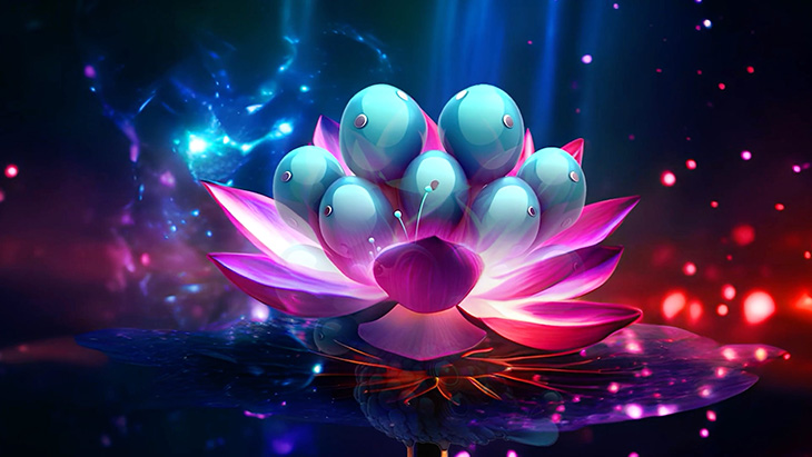
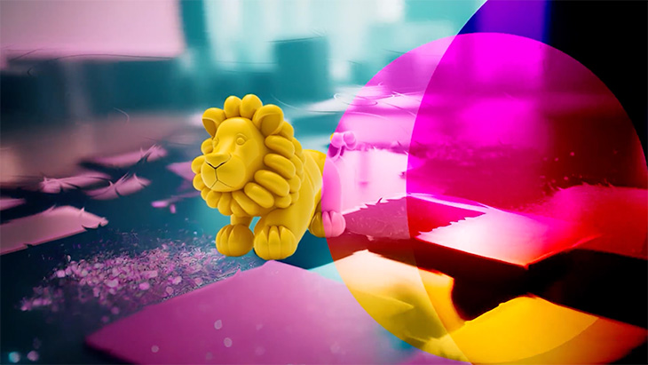
Each location also has its own symbols, which show up either as whimsical balloon shapes or, like Amsterdam’s bicycles, are propelled along by balloons. In Los Angeles, you can float in a balloon swan, while India’s icon is a bright peacock and Asia’s a puffy little lion.
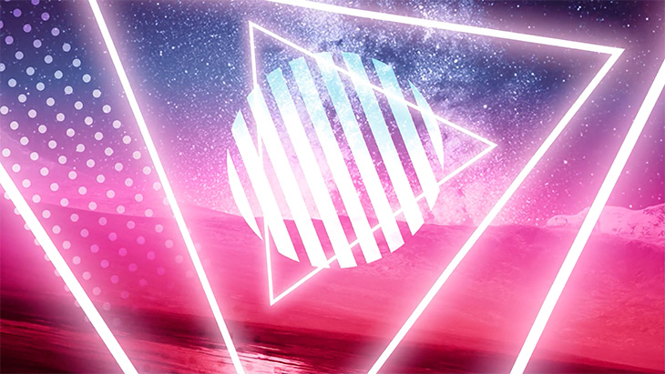
Other symbols also pop up in the sequence, such as a spaceman and satellite dishes, which are meant to signify exploration, technology and the future – topics on which all of these conferences, whether in-person or virtual, are touching. A triangle, often a symbol of connection, shows up throughout.
“All of this came from our strategy boards,” Emily said. “Topics like artificial intelligence and non-reality – how do those play against artists who are tangibly creating things? How are they connected?”
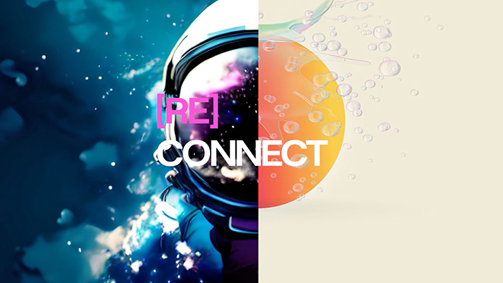
Emily, a former journalist and writer, also likes to play with fonts and words, using brackets to break out words like [re]connected, causing people to think about what that might mean. Overall, the fonts used across the 2023 Promax Experience are meant to evoke the future with their clean, sleek lines. Those futuristic fonts also had to play nicely with Promax’s own typography so the two were bridged by a simple sans serif font.
Once the stills were in and the concepts solidified, Justin began adding the motion-graphics elements. For example, he used water displacement maps in After Effects to stretch and morph objects to give the piece a dreamy feel.
“There are so many analogies you can make with water,” said Emily. “It flows, it evolves, it recycles – there are a million things you can draw off of that.”
In the end, the sequence is meant to offer viewers something new every time they see it.
“Everything is having a rebirth, a reset,” said Justin. “After you look at it a couple of times, you pick up a few things. Every little section has its own ideas. We wanted them to all relate to each other. We didn’t want to make it in your face, we wanted to make it more mysterious, ethereal and dream-like.”