


__twocolumncontent.jpg)


Deconstructing a crime scene is an important part of the investigative process, and Argentine design agency Inland Studio used that same concept to rebrand Fox Crime.
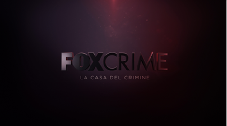
The creative team was led by art director and studio partner Gonzalo Nogues, who said the network dedicated to crime and investigation “wanted to move away from the typical language used in the genre to create something more modern, filled with action and style.” The pitch also included improving the overall branding, saying it was “too monochromatic. Something bolder, with much more personality and versatility, was needed.”
The refresh also incorporated a contemporary understanding of the concept of crime, creating a universe that defines the Fox Crime network, while steering clear of clichés.
“This was challenging because there is so much stereotyping in crime,” says Nogues.
In its approach, the studio explored the deconstruction process that takes place during a criminal investigation.
“A crime is always followed by the construction of the scene; it is deconstructed, constructed, and deconstructed once again,” says Nogues.
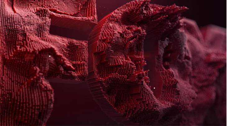
While most scenes would end in a reconstructed phase, Inland Studio “made an effort to step out and finish in deconstruction,” by using a glitch effect to represent the disarticulation of elements, says Julián Nuñez, art director and Inland Studio partner.
“It has always been regarded as an error or something annoying in 2D video, so we thought about translating it as something that would support the brand while [still] being aesthetic. The final result was a 3D glitch,” Nuñez says.
The process required a lot of testing.
“After extensive research on glitch techniques, we came up with a new version of it,” says Javier Bernales, third partner, and art director.


Creating a Fragmented Universe
The creative team focused first on the logo, then moved to frame creation.
“At the beginning, the deconstruction we had devised was much simpler, with three fragments and diagonal [partitions],” says Gonzalo. “After much trial and error, we reached a decomposition that uses horizontal lines, and another that uses dots placed vertically.”
The effect is made up of two variants. Onone hand, square bars break the frame, along with a traditional glitch on the logo. On the other hand, there is a more organic fragmentation, as if the ground were shaking. Both techniques give Fox Crime’s new identity a dynamic look, with organic pieces that open, a close, and reopen somewhere else.
Another tactic magnifies the logo for highly detailed shots.
“You get so close that you detach from the logo, from Fox, and you end up deconstructing what you were not really watching. So the concept is complete,” says Bernales. The visual aims to “connect the crime-scene clues one by one,” he says.


The Color of Crime
Inland Studio also developed an editable production system specifically for this job.
“Each piece had three colors and two different systems, composed of lines and dots, and each of the lines or dots had these three colors,” explains Gonzalo.
The rebrand required a new creative language, and Inland Studio integrated the concept of crime with a new color palette.
“The channel had a more generic branding of gold and blue, which did not communicate the idea of crime, so there was a need to illustrate the genre,” explains Gonzalo.
Gradients of red and blue—conjuring images of police sirens—mix with white to represent laboratories and black to connect the viewer to a sense of drama. The combination captures the, vertiginous dark world of the crime genre.
The colors also speak to a male audience without abandoning the female target, which was among the channel’s objectives, according to Gonzalo.
The image refresh took nearly a year to complete, with more than 120 assets that define the channel’s identity as bold, new and original.
“The visual identity is in sync with current expectations, such as high-resolution 3D,” says Nuñez. “The glitch effect is intended to disturb viewers, to hit them in the eye and shock them, creating a degree of provocation.”
Version español: Brand/Rebrand: Inland Studio decosntruye Fox Crime
Tags: