


__twocolumncontent.jpg)


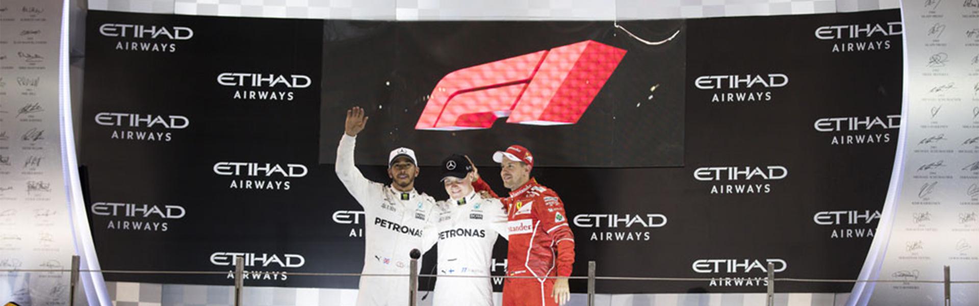
Formula One revealed its new “modern retro” brand identity at the last race of the sport’s season in Abu Dhabi on Sunday.
Advertising agency Wieden+Kennedy designed the new logo, which is intended to evoke the sleek look and feel of an F1 race car. The sport’s former logo, represented below, had been in place for 23 years.
The project was led by W+K London’s Executive Creative Director Richard Turley, who told Design Week “the new mark aims to embody the core forces of Formula 1 racing — speed, attack and control — while its sleek, sharp interlocking components celebrate the technical prowess of Formula 1 engineering teams.”
The new look follows Liberty Media’s acquisition of the sport for £3.3 billion in 2016. Liberty Media also has been working to extend F1’s reach through new broadcast, cable and digital deals.
Immediately after the reveal, several F1 drivers, including three-time world champion Lewis Hamilton, didn’t seem taken with the change. “I don’t think the new one is as iconic [as the old one] but maybe it will grow on us,” he said, according to AutoSport.
READ MORE: Design Week
Tags: