


__twocolumncontent.jpg)


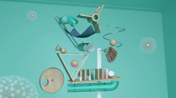
“It had to be contemporary and abstract but not alienating. It had to be simple and elegant but not primitive or naive. It had to be bright and welcoming but not without impact. It was a female-biased channel but not in the stereotypical [sense] with pink fluff, bling or glows. It was for a city girl and the occasional male. And the main color was teal.”
So said Thomas Bay and Anders Schroder, jointly emailing from Denmark, in a dramatic description of Danish channel TV3 Puls’ directive for its new channel idents. Respectively the executive producer and creative director for Copenhagen’s Frame agency, Bay and Schroder were commissioned to create a series of spots “that reflected the feel of the channel rather than the content of it.”
When dealing with women’s lifestyle content, the compulsion can be to fill the footage with stereotypical “female” objects, explained Bay and Schroder: interior design imagery, TV screens, people, shoes, etc. “That’s [been] seen a million times before and is usually not very inspiring and has a very short shelf life,” they said.
Frame wanted to attack it differently, eschewing live-action for a 3D approach that would reflect the mood of the channel by way of the artificial recreation of natural materials and textures. The goal was to “to create something that you would love to touch and feel,” said Bay and Schroder. “At the same time, we did not want to be literal so we invented fictive objects and shapes that resembled abstract interior/design objects but that clearly did not have a real-world purpose.”
Working in Cinema and After Effects, the resulting “semi-natural” objects (fabric swatches, canisters, a pool triangle) were deliberately mixed with entirely synthetic CG objects (an assortment of abstract yet functional-looking geometric odds and ends), then arranged into still-life-esque compositions. The aesthetic was inspired by Scandinavian interior design companies such as Normann Copenhagen, Hay and Ferm Living, thereby alluding to household décor without being overt about it.
In front of a calming teal backdrop, each new TV3 Puls ident bathes the viewer in a uniquely meditative form of kinetic energy, accentuated by minimal soundscapes created from ambient noise recordings such as billowing sheets, and wooden balls on wooden blocks. The relation of the objects to each other in space is pointedly abstract though hardly random, explained Bay and Schroder.
“Given this abstract universe it was very important to give the objects organic life,” they said. “We thought it would be cool to latch on to positive situations and feelings that could be interpreted into a motion language: A breath of fresh air, opening up, socializing, attraction, and balance. All positive concepts that could serve as the driving idea behind each ident.”
The results are a rarity in the promo space, eschewing clever concepts and graphics for ambient noise and imagery, as much creating a new atmosphere as they do a new TV3 Puls identity.
“Since we knew that the viewers would want to relax and enjoy the shows, we felt that it was important to create a mood and pace that reflected that,” said Bay and Schroder. “There was no need for creating a short-of-breath feel.”
Tags: