


__twocolumncontent.jpg)


Depending on your aesthetic preferences, the shiny metallic Roid-monster (Cleatus, to those of us in the know) who for years has served as the focal point of Fox’s NFL graphics package represent the apex or nadir of sports graphics.
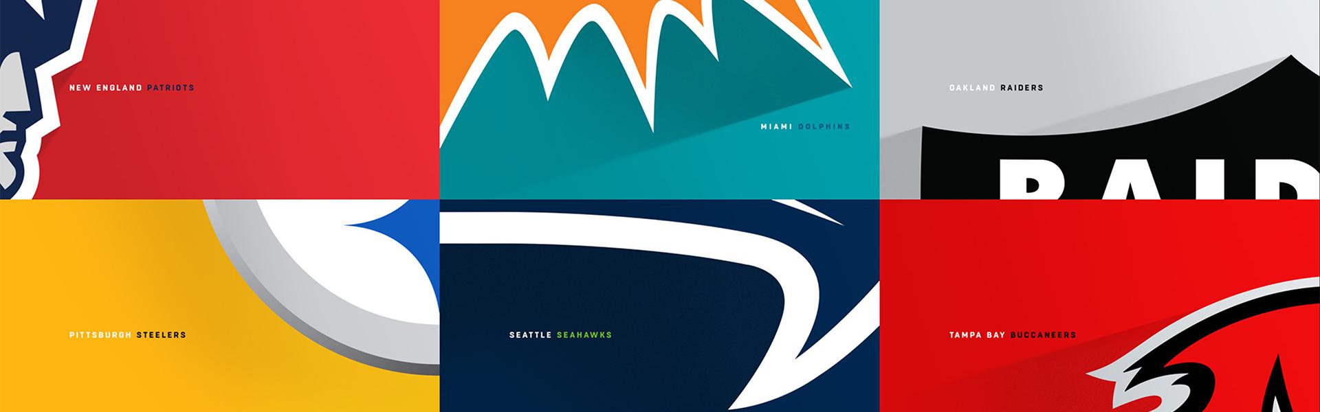
This year, the network revealed a more simplistic, less sensory-overload look. The same thing is happening at other places, including NFL Network where the lustrous, 3-D look of its flagship Sunday show GameDay has been re-imagined by New York-based Trollback+Company.
Trollback Creative Director Rosie Garschina says the agency’s focus was to get back to basics, providing NFL Network with a classic look that could be easily viewed on multiple screens.
“They came to us for a very specific thing,” says Garschina, whose credits include Comedy Central, MTV and ESPN. “They knew that we’re sort of known for providing very clean graphics [which is] unexpected in terms of sports branding.”
Over the course of just a few months, Trollback came up with an updated on-air graphics package, new logos for the GameDay brand and customized typeface that they developed in conjunction with font company Commercial Type. The company’s co-founder Christian Schwartz developed the crisp new font.
“He has an amazing library of reference and projects and sketches,” says Garschina, who brought Schwartz into the process early on. “He immediately just started throwing ideas at the table.”
Schwartz and his team looked at lettering manuals from Europe in the 1960s and 70s to get ideas, including a book on type history from the Czech Republic.
“There are some Swiss and German type faces in there that we thought, for whatever reason, had the right feeling for this.”
Working with lead designer Miguel Reyes at Commercial, Schwartz and his team came up with a font they called “NFLN Tackle.” Schwartz says the design was an intentional shift away from the metallic look and feel of past sports packages.
“We definitely seem to be in a transitional period at the moment,” he says. “The flying chrome 3-D thing had just become so expected and such a cliché that the natural inclination is to do something unexpected and to want to stand out.”
GameDay isn’t a normal sports property. As the NFL’s cornerstone program on Sundays, it produces more than 15 hours of news and highlights every week. Given the enormous amount of air time, Trollback was tasked with providing hundreds of deliverebles flexible enough to be used in multiple settings by NFL Network’s in-house graphics department.
“We try to think of ourselves as being able to create systems that will have longevity, be sustainable [and] withstand the test of time,” says Garschina.
The new typeface is designed to be viewed legibly on TV, smart phones and tablets. That made the simplicity and flatness of the look a necessity as well as a design strategy.
“It’s taking something that is known for a very specific look and feel and putting a different spin on it, putting an unexpected take on it,” says Garschina. “We love to have that opportunity.”
NFL Network is not unique in pairing back the complexity of its graphics packages. Just watch any major sports property from the NFL or NBA on ESPN to the aforementioned Fox redesign and you’ll see sleek and simple is the strategy for sports that are increasingly being watched on small screens as well as large.
Garschina believes the GameDay re-design could be used for years to come.
“The simplicity of the design and the font itself, I could see being relevant for five to ten years,” she says. “That’s our hope.”
Tags: