


__twocolumncontent.jpg)


Whether it’s just a refresh, or a complete overhaul, changing the look and feel of your brand is never easy. Here’s a look back at some of the networks and agencies that Daily Brief felt stood out for crafting visual elements deep in creativity, symbolism, passion and professionalism.
10. TyC Sports’ Rebrand Overflows with Passion
TyC Sports’ passion for soccer resonates loud and clear in its most recent rebrand —a project that grew out of a partnership with Argentine creative studio Lumbre.
9. Red Bee Creates Consistency Across Telemundo in Brand Refresh
Telemundo’s new logo, font and refined color palette are designed to create stronger, more consistent presence across all its TV, digital and out-of-home platforms through a brand refresh by creative agency Red Bee. As a leading Spanish-language broadcaster in the U.S. known for Hispanic media and content, the campaign and refresh are part of a repositioning meant to define the network’s direction for the future.
8. MTV International Gets an Emotional Refresh
MTV International’s global refresh builds on the brand’s previous graphic evolutions, this time honing in on its audience’s emotions by exploring how viewers communicate and interact. The visual update emphasizes bright colors, defined character lines and movement to show that MTV, like its viewers, is free to express itself.
7. TeleMadrid’s Rebrand Puts Spotlight on Spain’s Capital
The star of TeleMadrid is deeply embedded in the channel’s nearly 30 year history. Creative studio Comodo Screen’s rebrand transformed the symbol into fun graphics through which the star serves as a connective thread uniting TeleMadrid’s properties. Without sacrificing brand recognition, it symbolizes a fresh start by putting the public station’s focus back on the city of Madrid.
6. The Daily Brief Podcast: Tegna Stations Launch Group-Wide Redesign
For the redesign of its 46 station brands, Tegna Media took a page from its web and mobile sites, converting the simple and clean looks of its new user interfaces into on-air brand packages.
5. BBC Two Launches Colorful Design-Focused Rebrand
Swirling, vivid colors and animated patterns form the foundation of BBC Two’s first rebrand in 20 years. The new look is positioned around a series of 16 idents, each produced by a different animator, that are based on a curve which loosely resembles the number two as they transition through playful and bold kaleidoscope-like designs.
4. Animal Planet Launches New Global Brand Identity
Marked with a fresh logo of an elephant leaping through the air—designed by New York-based graphic design firm Chermayeff & Geismar & Haviv (CGH)—Discovery’s Animal Planet launched its new global brand identity and a repurposed strategy that includes providing a multi-platform viewing experience for every member of the family.
3. IFC Debuts Brand Refresh With Gretel
IFC revitalized its slightly off branding with a refresh by New York-based Gretel, and kicked off the network’s new look and feel with week of curated programming.
2. ‘A Little Forward’ Sets the Tone at Freeform
“A Little Forward”—It’s both a direction and an attitude, and a defining brand shift at Freeform, which revealed the new tagline, along with a new logo, as part of a strategy to further position the network to target the upcoming generation of “becomers.”
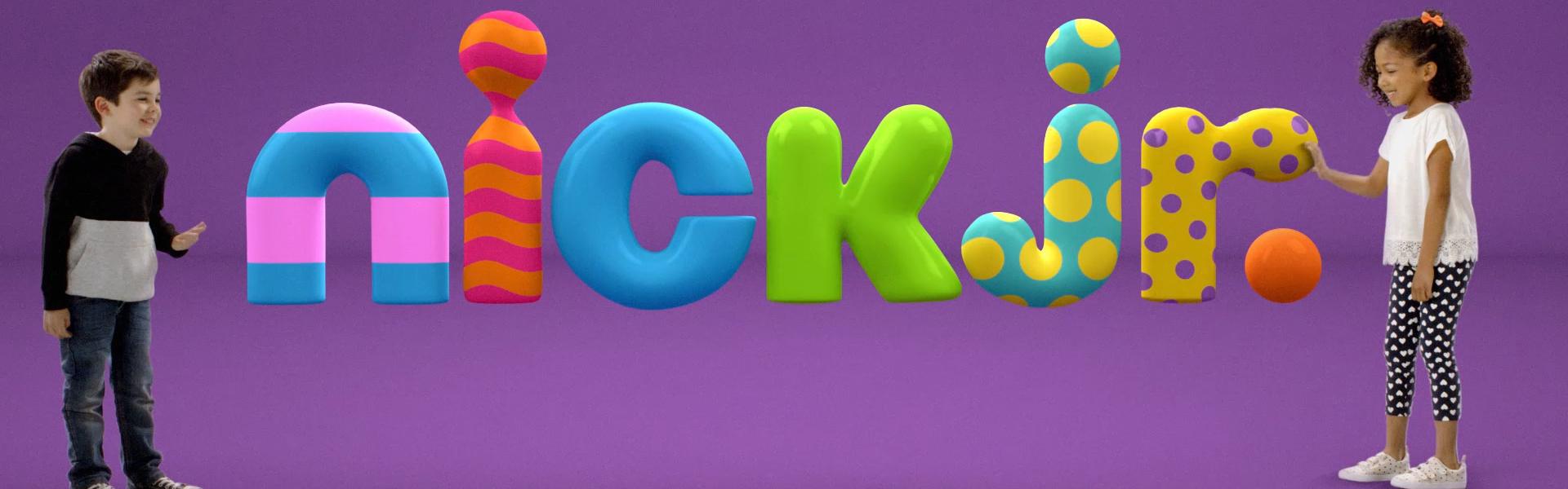
1. Real Kids Play with Animated Characters in Nick Jr.’s Brand Refresh
Nick Jr.’s new on-air brand refresh for it’s preschool programming block features real kids romping around with animated characters, as the two worlds collide. The redesign follows Nickelodeon’s previous refresh from March 2017, and ties into the network’s mission to “make the world a more playful place.”
Tags: end of year 2018 rebrand