


__twocolumncontent.jpg)


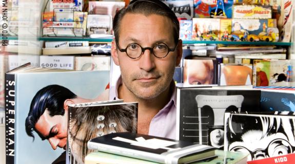
If you’re unfamiliar with celebrity graphic designer Chip Kidd by name, you’ve almost certainly laid eyes on his work – that is, if you’re one of those dinosaurs who have frequented, or still like frequenting, book stores. Speaking of dinosaurs, Kidd rose to fame when he designed the book jacket for Michael Crichton’s novel Jurassic Park, an unforgettable combination of typeface and imagery that quickly became iconic when Universal made it the primary element in the subsequent film’s branding.
But that book jacket is just one of many Kidd has designed during his three decades as associate art director at Alfred A. Knopf, a career that has included unforgettable work for authors like David Sedaris, Haruki Murakami, John Updike and many more. Somewhere in there, Kidd also finds time to edit and oversee publications for Knopf imprint Pantheon Graphic Novels, where he has worked with cartoonists such as Chris Ware, Art Spiegelman and Dan Clowes.
Brief caught up with Kidd in advance of his Conference 2015 session, “‘! or ?’: Chip Kidd and the Graphic Art of Clarity. Or Not.” to talk creativity, design in television and a subject near and dear to the longtime comic book fan – Batman.
Brief: You once said, “Batman himself is a brilliant design solution.” What did you mean by that?
Kidd: You could look at it from the actual and the fictitious. In the fictitious there’s the story itself of this rich kid whose parents are killed in front of him mainly because crime in Gotham City is out of control. And then over the years they added to the mythology the idea that the police force in Gotham is also corrupt. So [Bruce Wayne] had to design a way for himself to make a difference on his own that doesn’t involve joining the police, which is what Commissioner Gordon did.
And then the idea of designing a comic book character back in the late ‘30s… the DC Comics editors were trying to come up with a yin to superman’s yang, so that was going from brightly colored no-mask, all-American to this much more serpentine gargoyle-ian, dark, mysterious figure. It was a brilliant work of design in the real world, creating a character that would compliment what they already had.
It seems that your own design work has always stood out because you find a way to turn book jackets – generally thought of something to be looked at and nothing more – into tactile experiences.
When I started in the business 30 years ago, my goal was to make the book into an object that you wanted to own, and that’s only increased as the medium has evolved and the publishing industry has evolved. Probably the most high-profile example I have currently is the work I have done for Haruki Murakami, but also with the graphic novels and comic book stuff – I want to make the reader want to own it and not just be able to turn it off with a switch.
Do you engage with the television space much in terms of design?
Certainly growing up I got a lot of not only my design sense from television but my sense of humor, my sense of timing, sense of proportion and, for better or worse, sense of history. I did an intro to a book called Just My Type which was a book about typography. I did a spread of all the television show logos that I grew up with and loved, which was really my introduction to a typography that I could and would have an emotional connection with. The yellow stenciled lettering of M*A*S*H. The typeface from The Mary Tyler Moore Show, etc.
What TV logos have been striking you more recently?
The Mad Men logo and title sequence and all of that – you just mention it and all of a sudden you hear the music in your head. What’s always fascinated me about it is, if I didn’t know the show and you just played me that title sequence and asked, ‘when does that show take place?’ I would not say the ‘60s. It seems very early to mid-‘90s to me. It’s odd because the rest of the show doesn’t seem like that at all. They seem weirdly at odds and yet obviously it worked for the audience.
What is your daily work routine like? Are you regimented with your work habits?
My reflexive response is to say no, not at all. But there is a routine I know that I follow… the routine of leaving the house and going to the office. Home is home and work is work and I do enjoy leaving one place to go to the other and then I return. Maybe it’s because I’m a solid middle-class kid whose parents had office jobs, but that’s always made sense to me.
What tips do you have for designers in terms of staying productive and just creating good work?
I’m literally forced to get out of the house and go join the world, and I get to see a lot of the world in the process that’s not just on a screen. I really recommend that. The means to be kind of in a cocoon and experiencing the world vicariously is so prevalent and it gets easier and easier to do that as technology progresses. That can become unhealthy… The other thing I tell people all the time is – learn the history of graphic design. Take a class or classes. It’s really important to understand what was done, why, what worked and what didn’t.
What tools do you like to work with when you create?
I’m really boring – I work mainly in In Design and Photoshop. I’m hopeless at Illustrator and I was very reluctant to give up Quark, but it was just becoming more and more like Betamax. When I write I like to actually write in a design program, which is really strange to some people. I can’t really write in Word, I need to be writing in an actual typeface that I’m actually going to use when it’s done. Some people think that sounds great and some people think it sounds antithetical to what writing’s about.
Hey, whatever tricks you need to get yourself writing, more power to you.
I’m endlessly in awe of really good writers who are prolific, like John Updike or Dave Eggers. It never ceases to amaze me how productive these people are because for me it’s just so difficult.
Check out Kidd’s talk at PromaxBDA The Conference 2015 on Wednesday, June 10 at 2:30 pm at the J.W. Marriott LA Live.
Tags: