


__twocolumncontent.jpg)


The star of TeleMadrid is deeply embedded in the channel’s nearly 30 year history, and it continues to shine brightly in the station’s future by pointing a renewed light on Spain’s capital.
Creative studio Comodo Screen’s rebrand transformed the symbol into fun graphics through which the star serves as a connective thread uniting TeleMadrid’s properties. Without sacrificing brand recognition, it symbolizes a fresh start by putting the public station’s focus back on the city of Madrid.
Over the years, the station’s clout in the city had started to slip, but in 2017 there was a strategic push by incoming CEO José Pablo López to recapture that core audience, said Lourdes Corredor Martín, head of TV image and promos for TeleMadrid.
“This was the start of a new era,” she said. “More open, modern, plural and transgressive.”
In with the Old
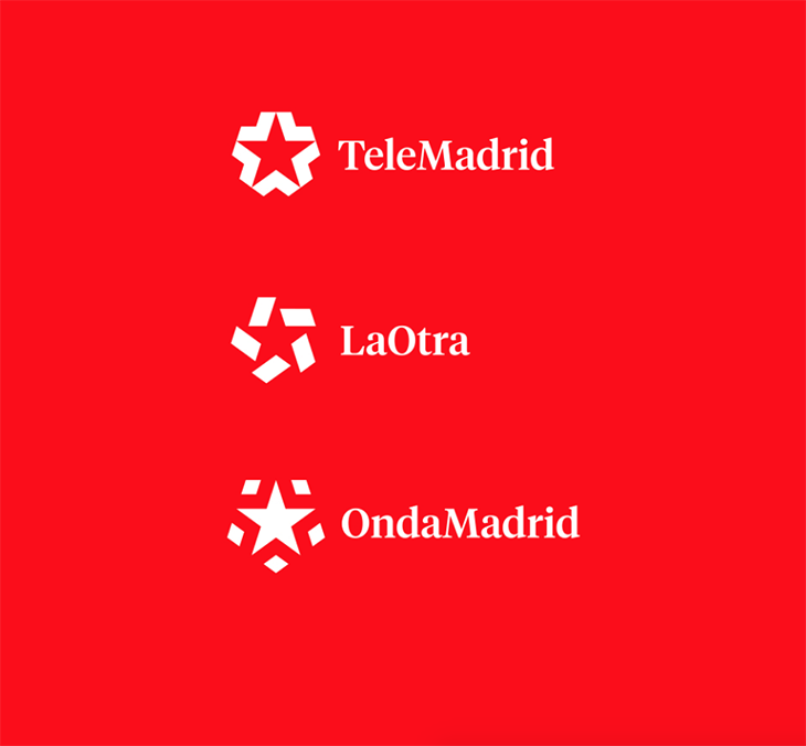
Right away, Comodo Screen recognized that TeleMadrid’s star was the hero of the brand.
“The logo was very popular, very strong, and very well known,” said Comodo Screen Creative Director Pep Prior. “We didn’t want to lose that completely. But we also wanted to make something new.”
The agency created an identity where the star remains front and center of the graphic language, but different iterations of the design, each with its own personality, were crafted for the main TeleMadrid channel; LaOtra, a more dynamic, playful channel for younger viewers; and radio station OndaMadrid.
“The star symbolizes the citizens of Madrid,” Prior said. “It’s always in the center.”
Seeing Stars
From there, each of the logos visually radiate out, reaching toward the city’s surrounding communities. This concept is emphasized in both the still and animated versions, with motion graphics that easily flow from one design to the next.
For all the animations, Comodo Screen developed a rotation where the star swirls around its axis as other colors swoop in along grid-based vectors, creating a clean, simple, strong pattern. With an emphasis on flexibility, the radial symmetry, along with an established color palette, solidifies logos that are both visually appealing, and easy to manipulate.
“We really had in mind that this was something the broadcaster would have to work with after we leave,” Prior said. “They have to make it their own, and be able to evolve it.”
Comodo Screen turned to the five prominent colors of the old logo, then added a few more.
“We gave them a big palette with seven or eight colors,” Prior said. “We realized early on in the process that it was a very open palette, but at the same time very easy to use.”
The agency recommended ideal combinations, as well as those to avoid, and suggested sticking to about three colors per image. The guidelines offer TeleMadrid lots of options to play with for programming, but in such a way that no matter how the colors are used, they’re always going to be geometrically positioned to remind viewers of TeleMadrid’s iconic star—a concept that was very important to the channel.
“The star is the backbone,” Corredor said. “Our corporate identity speaks from the center of the graphic—from the star, from our heart.”
For the more playful channel, LaOtra, Prior and his team incorporated patterns and stripes to appeal to younger viewers. They also settled on a primary scheme of white logos on a red background—the same red as the flag of Madrid—and advised TeleMadrid not to “get too crazy” in the beginning, but to gradually become more colorful over time.


An Eye Toward the Future
TeleMadrid also was looking to position itself with an eye toward technology and to the future, to “evolve towards a pure graphic design that’s viral and digital,” Corredor said, and “where the presence of the digital image is the catalyst of our entire brand.”
“TeleMadrid has opened itself up to a change of strategy where the multimedia language is the engine of our identity,” she said. “For the first time, all of our communication platforms work together.”
The rebrand, which went into effect in September 2017, has been a successful driver of TeleMadrid’s goal to reposition itself as a friendly, empathetic channel—a channel that’s known throughout the city streets, with journalists that viewers can think of as close friends.
“A logo by itself is not going to change the perception of a brand,” Prior said. “But the branding we created with them, and for them, reflects where they want to be heading.”
Indeed, López said ratings have gone up since the rebrand was implemented.
“We have gained an audience in a wider and more diversified profile,” she said. “Our image has changed, and the people of Madrid have managed to embrace it by tuning into TeleMadrid again on their televisions, tablets, computers and mobile devices.”
Tags: telemadrid