


__twocolumncontent.jpg)


If a girl has a gap in her teeth, TeenNick wants to see it. If there’s a boy with acne, TeenNick wants to zoom in on his zits.
“We shot everything super tight and almost macro so you can see the imperfections of the kids,” Michael Waldron, senior vice president, creative director, art and design, Nickelodeon, said about the brand refresh for the company’s tween-targeted network.
“Editorially, you just get right up in their face,” added Elliott Chaffer, executive creative director of branding and design studio Trollbäck + Company, which worked with Nickelodeon on the refresh
TeenNick’s new look and feel piggybacks on last year’s Nickelodeon rebrand featuring more live-action kids in the six-to-11-year-old demographic interacting with cartoon characters from the network’s animated series.
RELATED: Superestudio Adds More Live Action to Nickelodeon’s Brand Refresh
TeenNick, for 12-to-16-year-olds, is designed to essentially age with the kids as the shows they watched when they were younger, such as iCarly and Drake & Josh, move onto the channel and provide an element of nostalgia as they blossom into teenagers.
“They still watch Nickelodeon, but usually on the down low and they don’t go out and tell their friends about it,” Waldron said.
With that in mind, TeenNick’s update puts a modern twist on shows from the network’s past, and features footage of real kids to tie it into the overall branding.
Looking back, it’s amazing how different the clothing, tone and general style of a show shot in 2008 is from one shot in 2018, Waldron said.
To bring that older content up to date, Nickelodeon and Trollbäck began cropping past photos in interesting ways, such as showcasing just someone’s feet, or the top of someone’s head, to present the footage in a new light.

That was mixed with up-close-and-personal high-res camera bursts, and some video, of kids being kids—skateboarding, eating donuts, playing on their phones—for a sort of herky jerky collage of choppy cuts.
Then, it was all run through a custom filter to add a muted visual aesthetic that makes everything feel like it’s from the same world.
Trollbäck also animated a kinetic, repetitive font over the footage, and dropped emoticons sporadically into shots.
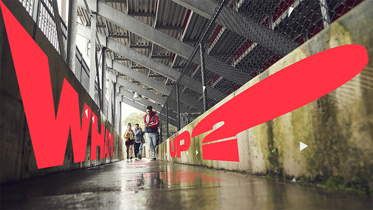

“It created a really interesting typographic look,” Waldron said, “and they animated it in a way that felt energetic.”
The look riffs off of meme-y, repetitive, bespoke typefaces popular in the cultural zeitgeist.
“We wanted to really play in that space,” said Chaffer.
The result is a cohesive and current look with which kids are already comfortable, featuring the kind of photos and videos friends would share with one another, and taking subtle cues from the influence of Instagram and Snapchat stories.
“We didn’t want to be obvious about it,” Waldron it. “We all know kids love social media. Social media network goes linear was the inspiration, but we didn’t want to go overboard.”
When shooting footage of the kids, Trollbäck headed to New Jersey to film at locations such as a skate park, old-school pizza parlor and a house, targeting places that felt like they could be anywhere in America.
Photographers used a wide angle lens to capture kids doing things like hanging out in a bedroom and eating donuts in the kitchen, and Trollbäck ordered a lot of shots where the kids didn’t know they were on camera.
“You kind of just let them be themselves,” Chaffer said. “Don’t direct them to look at their phones. They’re just going to that naturally, and a look at a picture, and send it to someone and laugh about it.”
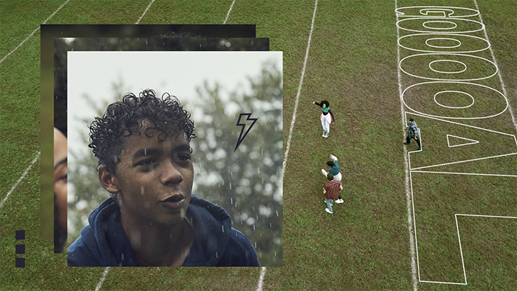
That authenticity also came out during when they were running around playing soccer in the pouring rain.
“The kids energy went up like 1,000 percent because they were soaking,” Chaffer said.
The mood was also perfect for TeenNick’s more desaturated, high-contrast tertiary color palette—moving away from the bright colors of kids’ shows for a more surreal and contemporary look.
“It definitely gave it a look that feels true,” Waldron said.
CREDITS
Nickelodeon
EVP, Chief Creative Officer: Kim Rosenblum
SVP Creative Director, Art & Design: Michael Waldron
SVP Creative Director, Brand: Tony Maxwell
VP, Editorial/Motion Graphics: Kurt Hartman
VP, Design & Animation: Shannon MacNeilage
Associate Art Director: Junichi Nakane
Director, Graphic Operations: Cyrus Shelhamer
Graphics Manager: Jillian McCullagh
VP, Project Management: Adam Weiner
Sr. Director, Project Management: Earl Marona, Jr.
VP Creative Director, Brand Editorial: Erica Ottenberg
Sr. Director, Production: Joe Pappalardo
Writer/Producer: Natalie Clunis
Associate Producer: Miranda Bishop
Production Assistant: Deshon Leek
OACIS Manager: Patrick Speckman
OACIS Coordinator: Solani Khopkar
Sr. Director, Production, Short Form: Chelsea Most
Production Manager: Josh Powers
Trollbäck+Company
Executive Creative Director/Director: Elliott Chaffer
Chief Creative Officer: Alex Moulton
Art Directors: Mike Batista, Erin Kilkenny, Sarah Cohen
Designer: Pat King, Rachael Park
Jr. Designer: Francisco Betancourt
Lead Animators : John Lee, Chris Jung
Animator: Pat King, Aldo Gonzalez, Koda Ko
Editors: September Raines, Erik van der Wilden
Copywriter: Casey Halter
Strategist: Asia Hunt
Executive Producer: Erica Schrager
Producer: Shannon Moore, Daniel Graf
Stills: Anais + Dax
DOP: Justin Donais
Tags: