Making the legendary Nat Geo brand appealing to kids is quite a challenge, but the team at Buenos Aires, Argentina-based Plenty was up to creating an energetic new vibe for Nat Geo Kids that would work both on-air and off-air.
“We had to make it more festive, more fun, more appealing to kids while keeping the same core values Nat Geo has,” says Ines Palmas, executive producer at Plenty.
“One of the main elements we asked Plenty to keep was the icon element—the yellow frame—but in a way that appeals to the young audience,” says Natalia Espanol, who served as an art director at Nat Geo Kids when the project was developed, but is now a creative director at Plenty. “Because the yellow icon is such a recognizable element, we normally can’t touch it that much, but for this project we wanted to make it more fun, make it more playful, and allow it to play in a different space.”
Letting a creative team play with a generations-old icon takes a lot of trust.
“It was challenging for us and it was challenging for the brand because they had to let it go a little bit, and that’s not easy for such a well-established brand,” Palmas says. “We all compromised a little bit to get to the place where it worked for everybody.”
Nat Geo wanted a visual approach for the brand. Inspired by their client’s tag line, “Because we know you are curious,” Plenty envisioned the iconic frame as a limitless container.
Typography also provided continuity.
“The typography used for Nat Geo Kids is the same that’s used by the core channel, so we had two links with the main channel—the yellow border and the typography,” Espanol says.
“It’s not so easy to catch, but it’s an important element,” Palmas adds. “Maybe you won’t realize it unless you’re into design, but it feels like it belongs to the same universe, even if you don’t understand why. Typography is important to the brand, but also for kids who are starting to read. It’s easy to read, and it’s bold, so that works in our favor.”
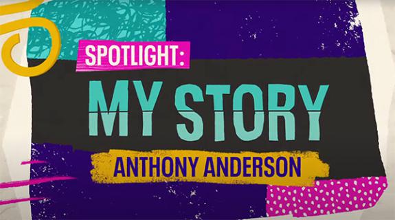
To simplify things Plenty created four different graphics packages—Science & Sea, Nature, Animals, and Space—and assigned each a color that works well with the others and with the yellow frame.
“This way we give each section its own value and personality,” Palmas says. She says the challenge was making the four areas feel unique, yet part of the same world. “The yellow frame, the typography, and the [curvy] line that goes across the screen are the same in all of them, giving them unity while each has its own set of 2D and 3D elements.”
Espanola underscores that Nat Geo wanted more than to rebrand the channel, it wanted to create a universe of graphic elements to draw from in the future. Plenty delivered.
“It’s going to be more than a channel,” Palmas says, “it’s a whole universe.”
CREDITS
Directed by: Plenty
Creative Director: Mariano Farias
Executive Producer: Inés Palmas
Art Direction: Federico Bogado & Nicolás Gloazzo
Producer: Clara Etcheverry & María Alvarez Chaus
Design: Federico Bogado, Fede Kanno, Javier Eyherabide & Nicolás Gloazzo
3D Modelling: Federico Bogado, Fede Kanno & Javier Eyherabide
Animation: Sergio Fuego Damonte, Hernán Estévez, Macs Riedel, Javier Eyherabide & Guillermo Zapiola
Rendering & Lighting: Federico Bogado & Fede Kanno
Compositing: Sergio Fuego Damonte, Macs Riedel & Javier Eyherabide
Music & SFX for Idents: Luciano Pérez
Client: National Geographic
SVP Brand Strategy National Geographic: Emanuele Madeddu
VP Branding National Geographic: Mariano Barreiro
Art Director Branding National Geographic: Natalia Español
Tags:
























__twocolumncontent.jpg)

