


__twocolumncontent.jpg)


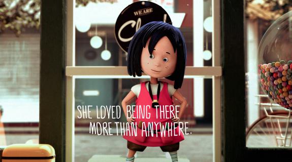
The iPad can be a lot of things, but can it be a platform for a calming story you would want to read to your kids at bedtime? Branding and creative agency Loyalkaspar has proved it can, with the recently launched app Anna & Argyle.
Created over six years on a glacial development schedule of one evening a week (each Thursday), Anna & Argyle was a labor of love for Loyalkaspar’s chief creative officer Beat Baudenbacher, himself a father of two. The goal was to tell a universal story that resonated with kids and adults alike, and that merged its narrative essence with the iPad’s immersive digital powers without relying on interactive features that tend to rile children up rather than relax them. What emerged is a kind of cinematic landscape in a literary form, a digital experience that is framed like a motion picture but moves like a storybook. At the heart of it, a plucky little girl tackles a question in her family’s laundromat that has haunted us all at one time or another: What happens to a sock when it goes missing from its pair?
Loyalkaspar generally applies its storytelling prowess toward the heavily truncated elements of promo, but the tools of design honed there were helpful in crafting a longer narrative as well. Color, for instance, was instrumental in fleshing out Anna & Argyle’s 70-page emotional arc. Baudenbacher wanted the initial world of the laundromat “to be a little nostalgic, a little retro, he said, “so you have a warmer, almost faded postcard color palette.” When Anna returns to this “faded childhood memory” of a realm from her foray behind the machines, it is nighttime, but the colors are now “more poppy, a bit brighter,” he continued. “The two color palettes needed to bookend the journey,” juxtaposing the before and after of Anna’s heightened awareness.
In between the bookends, Anna traverses the wispy, wooly home of Argyle, an imposing figure who is “menacing at first with his goggles on,” Baudenbacher said, “but then as they start engaging in their conversation he takes those off and his tone softens and they start communicating.” Here, the type conveying their dialogue changes from white to pink, communicating a subtle sense of danger but also of discovery as the walls between these two strangers begin to melt away. When Anna finds the missing sock and re-enters the real world, the type color remains pink, evoking a sense of discovery that is permanent and will not fade away.
Even the typeface itself was a labor of love. Baudenbacher created it himself from his own handwriting, drawing out the letters with Sharpie then spending countless hours in the evening moving points around in Illustrator to get them just right. Handwritten type is naturally “kind of messy,” he said. “Depending on how you hold the pen, the stroke weight gets a little thicker and a little thinner, and I wanted it to be more uniform.” Beyond the nuanced look and feel of the individual letters, Baudenbacher manipulated each block of type as a whole, actually molding the shapes of sentences into suggestive flurries of motion that “help create a sense of flow and sort of support the general direction of the frame.” The process of doing this was, to put it bluntly, “a pain in the ass,” he said.
But it takes that kind of meticulous craft and rigor to create an experience as liltingly immersive as Anna & Argyle has wound up being. Every detail feels part of a complete whole, even the app’s impressive publicity materials, which range from intriguing process videos to a black-and-white brand image depicting the heroine moving across the circular face of a laundry machine. Loyalkaspar’s branding expertise “helped shaped the story in a way,” Baudenbacher said. Developing a children’s story from a branding perspective may not seem like “the most natural way to start,” he continued, “but I think because of what we do in our day jobs, there is this inherent instinct to make something that ultimately strands out.”
Images and video courtesy of Loyalkaspar.
Tags: