


__twocolumncontent.jpg)


Late last year Netflix unveiled a major update of its user interface, which completely rethought the way viewers navigated through available titles, and redesigned what they saw while browsing.
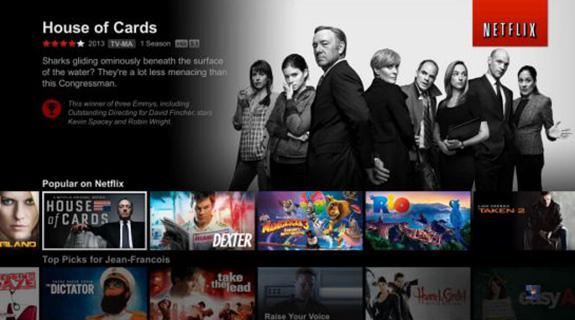
Netflix’s motivation? Make it easier for subscribers to wade through its massive catalog and add a bit more context and hierarchy to what was essentially endlessly scrolling rows of box cover art.
GigaOm peeled back the curtain on the makeover Tuesday, presenting a deep dive on the thinking behind the redesign and the testing that went into producing the final product.
The first big problem: those box covers. While they made sense in an era when people were watching DVDs (and picking up titles at Blockbuster,) they didn’t make sense for users looking for titles to stream.
Netflix’s solution was to swap in large landscape photos that could “tell the story” of what viewers should watch.
Accompanying user guide information was also shifted from the right hand side to a space much closer to the title’s main image, reducing eye strain and making it easier for viewers to digest that information.
Next up on Netflix’s wish list: more personalization and context-awareness:
GigaOm wrote that Netflix execs would “like to see different devices be aware of each other as well as the context in which titles are watched. If a user watches a Navy Seal documentary on his phone during the week, then his TV UI should suggest war movies as Saturday night entertainment.”
Netflix is also studying the possibility of adding preview videos to their title information to help users decide what to watch.
Read More: GigaOm
Brief Take: Netflix knows that it has to continuously optimize and evolve its platform in order to retain current subscribers and attract new customers. As audiences increasingly shift to streaming, look for further innovation that will make its television experience even more appealing for viewers.
Tags: