To create the brand identity for Monaco’s first public TV channel, TV Monaco, Paris-based design agency Gédéon stole a simple symbol, the rhombus, and a bright color, red, from the principality’s coat of arms. From there, it designed an entire brand identity and graphics language for the upstart channel.

Along with being a TV channel, TVMonaco is also a platform and an app, leading Gédéon to design the identity from a digital-first point of view.
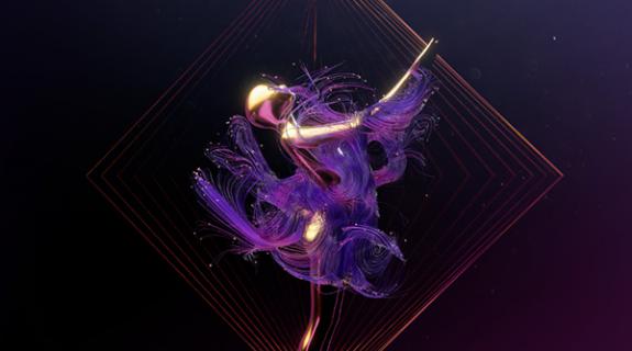
The rhombus – which, when animated, becomes a square or a diamond – “provides a graphic language that brings depth, dynamism and surprise,” according to the Promax Europe 202o Agency of the Year. The rhombus becomes a background motion graphics element in some of the idents, with lines radiating outward to give images a mosaic look.
Turning the rhombus allowed Gédéon to adapt the motion graphics to any ratio and format from the 16:9 of most TV screens to the vertical positioning of TikTok and Reels and the square of Instagram posts.

Gédéon also drew from the idea of the rhombus for the channel’s logo design, giving the “M” a distinctive and angular look, while the “O”s are perfectly round and a little out-sized. The logo also features the channel’s signature bright red.
At the heart of TVMonaco’s new brand is environmental stewardship, while the channel focuses on four key pillars: news, environment, sports and lifestyle.

Along with the new on-air and online brand identity, Gédéon also produced press kits, digital banners, digital out-of-home, merch and posters to be used off air, including in Monaco, nearby towns and in the airport.

TV Monaco premiered on September 1.
CREDITS
Client: TV Monaco
Agency: Gédéon
Director: Nicolas Famery
Producers: Emmanuelle Lacaze, Eglantine Guitard
Copywriter: Jean-Paul Gonçalves
Art Director: Lazare Bessière
Motion Designers: Baptiste Chomiol, Marine Bourdon, Loïc Losco
Tags: brand identity gédéon tv monaco

















__twocolumncontent.jpg)
