


__twocolumncontent.jpg)


When Founder and Executive Director José Fernández talks about his creative studio, Sulfurica, he compares it to music. For him, Sulfurica conjures a restless, rock-infused spirit that’s suffused with its own unique style.
Sulfurica started at the University of Arts, Sciences and Communication (UNIACC) in Santiago,Chile. Fernández was studying graphic design with a specialization in multimedia, along with classmate Claudio Guerra—who is now the agency’s creative director and co-founder. They were both excited by what they were learning in their animation class; after it was over, they continued researching the subject by themselves, until they were asked to create an advertising agency in one of their workshops. That project spawned what is now Sulfurica.
For the project, the two brought in Guerra’s brother, Freddy, who was studying digital animation at the same university. He now serves as the studio’s animation director and third partner.
“We founded Sulfurica out of our love for animation,” says Fernández. “In the ‘90s, when we were younger, we were surrounded by a hyper-visual culture in which MTV videos dominated. I was a fan of movie and music-video directors and the Guerra brothers had a penchant for traditional animation. There was a good marriage of interests.”
When it came time to name the studio, the partners wanted to convey their vision of the industry and they wanted to stand out while doing it. With that in mind, they turned to rock and roll, and were inspired by the element of ácido sulfúrico (sulphuric acid). To them, the mineral connected the natural world to the extreme expression of the music genre.
“We thought of rock-related elements, such as ácido sulfúrico ( sulphuric acid). But it sounded too long, masculine, ugly, so we shortened it and gave it a feminine touch [changing the Spanish masculine ending ‘o’ to the feminine ‘a’] to come up with Sulfurica.”
The logo’s upward slant indicates Sulfurica’s enthusiasm for its work.
“We wanted to contrast our rock-star spirit with a more personal signature that would draw people in with its warmth while still appearing professional. It is the same contrast we experienced as we evolved from an animation and motion graphics studio, to take on a more creative and developmental role,” says Fernández.
Experimental Pitches that Paid Off
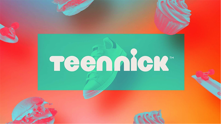
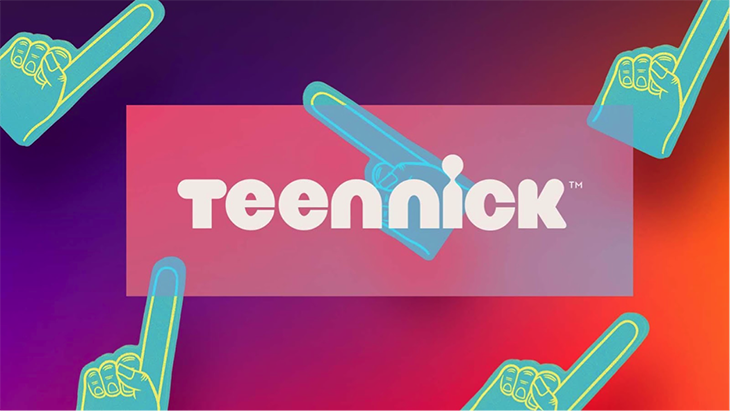
The studio got underway in 2010, specializing in commercial advertising such as animations for retailers, before making a breakthrough pitch to TeenNick.
“This project was an eye-opener that made us consider what we liked to do as an agency,” says Fernández. “We had incorporated design from the beginning, and with TeenNick we became aware of our capacity to participate in the entire creative process.”
Sulfurica developed three proposals to capture unique moments of teenagers’ daily lives.
“We wanted to relate TeenNick’s leading characters to viewers by demonstrating that they are all pre-teens who share the same interests.”
The pieces combine the characters’ day-to-day scenarios with footage from the YouTube channels they host.
Sulfurica also proposed a palette of bright colors and strong gradients, which TeenNick adapted for its daytime and primetime programming.
Another significant pitch was for Chilean studio Loica’s work on Fish Tank Kings for Nat Geo Wild. In this proposal, Sulfurica simulated water by combining 2D and 3D techniques, and represented animals through 3D and animated illustrations.
RELATED: Creative Review: Loica
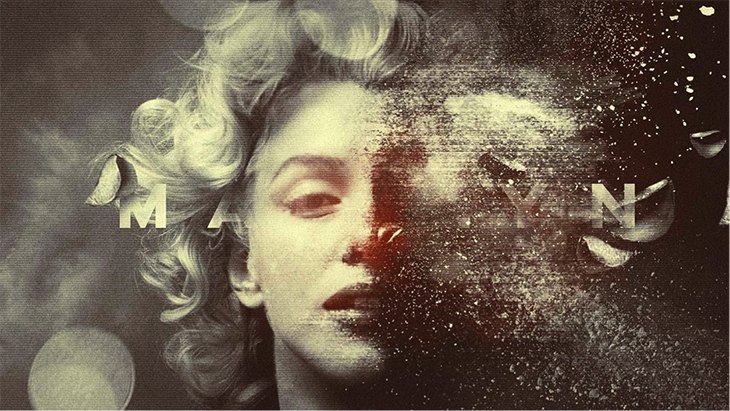
Sulfurica also successfully pitched its idea for the opening sequence of Lifetime’s series The Secret Life of Marilyn Monroe, which chronicles the popular actress’ life. The frames reveal a blurred, stained, broken Marilyn.
“We wanted to depict the degradation of Marilyn’s personal life and her relationship with alcohol and drugs, with a tint of grunge,” says Fernández.

Launching a News Segment
Sulfurica tried its hand at a different type of programming when it designed the graphic toolkit for the launch of Discovery’s DNews YouTube channel The existing English format was adopted for the Spanish market in 2016, launching with 14,000 subscribers. The channel’s strategy relied heavily on analyzing metrics to make format and content decisions, and Sulfurica contributed graphic elements as the process advanced.
“The graphic toolkit was one of the elements in the campaign that we developed to successfully support the format. We were looking for a relatively new studio in the market, one with innovative ideas and the right approach to an alternative product now being offered by Discovery via a digital platform,” says Antonio Rojas, head of on-air and creative services for Discovery Latin America/USH. “However, the path had already been mapped out for us, so our job consisted in adapting the format and making it relevant for the Latin American region, giving it our own flavor and style, not only through the use of the graphic toolkit, but also at conceptual and editorial levels.”
Discovery developed topics aimed at a delivering a constructive message to a Hispanic audience that touched on everything from healthy lifestyles and language, to science, animals and football.
“As for the editorial and strategic side, with this format, Discovery was looking to captivate new audiences by introducing different topics of interest in a fresh and original way. The aim was also to develop a branded content tool for client integration. This was the main idea of DNews en Español,” says Rojas.
Network and agency worked together to develop digital communication that was current and clear.
“Along with Sulfurica, we designed a current look and feel, that relates to the user and the specific platform for which this format was created,” says Rojas.
Fernández believes the opening was the project’s greatest challenge just because it was so short.
“In five seconds, we had to synthesize DNews’ tone and range of topics,” he says. “What we wanted to do was to show a variety of things and we managed to do it through a combination of techniques, from 2D and 3D, to pre-recorded footage.”
Since then, the format has reached 100,000 subscribers in just four months, and currently has more than 6.5 million views.
Expanding its Advertising Branch
The studio also is leaving its stamp on the advertising world. Recently, it did a project for Virgin Mobile that was designed using traditional animation.
“This project helped mark our style because of the freedom we were given. We felt our disruptive spirit had a lot in common with the brand, and we both shared a similar language,” Fernández says.
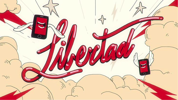
Besides being chromatically striking, the graphic palette uses casual typography that evokes Sulfurica’s own logo, as seen in the word “Libertad” (“Freedom”).
Another example is advertising developed for Toyota, in which the studio created animations and graphics to support the concept: “Toyota takes care of you, always.”
“We worked to achieve something friendly and carefully designed using drawings and illustrations,” says Fernández.
Conducting In-House Research
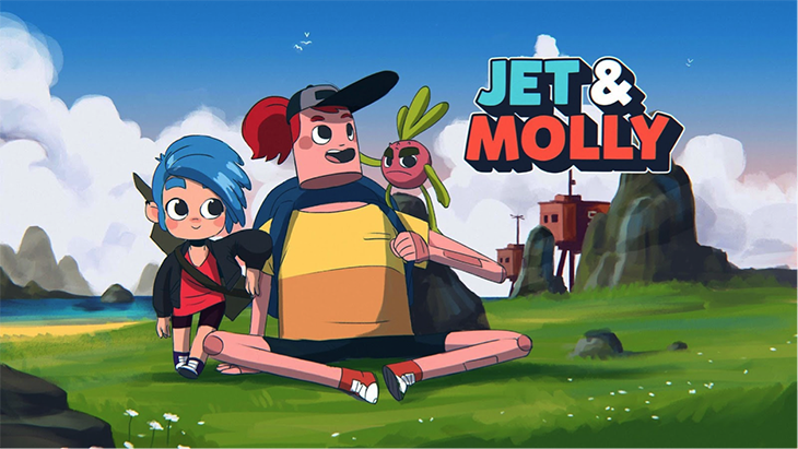
Currently, Sulfurica is digging deeper into virtual reality projects. The studio also is seeking funds for a personal project, Jet and Molly, an animated series that features two girls from YouTube in a “near-future” world, which would coexist on television and on the girls’ Youtube channel.
Overall, the studio is continuing to research art and visual techniques to develop a trademark style.
“We take in everything that helps us to artistically reach new concepts,”
says Fernández. “We try not to set guidelines or follow trends. It is a very ambitious and challenging approach, but we prefer to do something new, that hasn’t already been discovered or implemented widely in the world of graphic and visual design.”
Tags: creative review sulfurica