


__twocolumncontent.jpg)


When KRFT Studio founders Marco Avilez and Jonathan Bravo say their studio’s name out loud, it evokes the arts and craft movement of the 19th century, which sought to revive the value of handmade work in contrast to industrial production, and inspired the studio’s name.
“For us, the digital world also relates to crafts; our hands and our creativity are behind each project,” says KRFT Creative Director Bravo.
Bravo and Avilez met while studying visual communication design at Chile’s Metropolitan University of Technology, and in 2010 they decided to combine their interests in motion graphics, mapping, film and music.
“We created something and we weren’t sure what it was; but it became what we now call our studio. We learned things along the way until we decided to specialize in stop motion post-production,” says Avilez, director and executive producer at KRFT.
Their value of a handmade approach is reflected in both the studio’s name and its logo, which features a monogram.
“The name uses casual typography, which is simplified by cleaning out some gestural features to make it a little more abstract. The traits of the logo seek to convey a heraldic look,” says Bravo.
Capturing Children’s Hopes, Dreams and Culture
The first project to really establish KRFT as a studio, was for TVN’s Tikitilip precolombino (Pre-Columbian Tikitilip), a children’s series dedicated to raising awareness about ancient cultures. The request to animate one of the episodes came from production company Ojitos Producciones.
“The work drove us to get into an office and start working from there,” says Avilez. “Being part of an animation project was an opportunity for us, especially since it was something we saw as out of reach at first because we came from the design world. We realized then that we were good at digital composition.”
The studio took its first big step into television with the TVN documentary series ¿Con qué sueñas? (What do you dream of?), produced by Mi Chica Producciones and winner of a 2011 International Emmy Award. For this project, KRFT was asked to conceive and design an entire visual identity.
“We suggested using children’s illustrations to depict the dreams and wishes of each leading character,” says Bravo.
The opening credits feature graphical elements such as mountains, flowers and musical notes, alongside live-action footage of children.
KRFT continued to create the graphics for the series’ second season.
“In this case, there was a technical shift; graphics were no longer so naive and we chose richer colors and imagery to speak to a child’s dreamland,” says Bravo.
“We wanted to find graphics that were fresh, elaborate, attractive for children, and different from what we usually see in these types of shows,” says Paula Gómez Vera, director at Mi Chica Producciones. “KRFT’s contribution in terms of creativity was very significant. They managed to interpret and reflect through graphics the meaning of our series. We have found in them a partner to work with.”
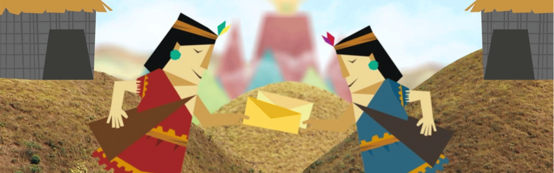
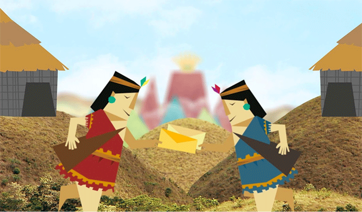
Another project KRFT did for Mi Chica Producciones was the graphic identity for Sueños latinoamericanos (Latin American Dreams), a documentary series that journeys across Latin America to show the lives of children from different countries.
“We decided to continue to integrate graphics into video footage, but this time the concept centered on the Andean culture and its totems. In the opening credits, the kids appear alongside imaginary guardian friends, which are connected to their dreams,” says Bravo.
The studio also worked with the production company for Abre Palabras (Open Words), a series of five-minute pieces for CNTV Infantil, an audiovisual project that is part of Consejo Nacional de Televisión (The National Television Council). The spots seek to develop a deeper appreciation for the indigenous vocabulary we use every day.
“The idea was to create short infographic animation capsules that explained to children the origin of some of their words,” Avilez says.
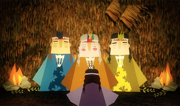
For example, in the following video, the children find out that “Machi” refers to the top spiritual leader of the Mapuche people, while “Yatiri” is an Aymara word meaning “the one who knows” and is used to describe a shaman or traditional Aymara healer.
Experimenting with Different Techniques
In another collaborative work with Mi Chica Producciones, the studio developed the visual identity for ¿Cómo nacen los chilenos? (How are Chileans born?). This documentary series follows the journey from pregnancy to childbirth of Chilean women from across the country, capturing the core of what it means to bring a child into the world.
“We were given freedom to propose whatever we wanted and we decided to go for a mural graphic style,” says Avilez.
The studio used a mapping technique to present birth as a metaphor for life, and the opening titles feature projections on a pregnant belly, symbolizing the growth of nature.
Another landmark project in KRFT’s portfolio is Puerto Papel (Paper Port), created by Zumbastico Studios in co-production with Globo (Brazil), Señal Colombia (Colombia), TVN (Chile) and Pakapaka (Argentina) networks.
“We were asked to incorporate 2D faces onto characters to avoid lip-syncing,” says Avilez. “From there, we started working off a process of trial and error, which we perfected to develop a methodology for the series.”
“The paper motion technique was very specific, and together we had to figure out how to approach it,” says Alvaro Ceppi, partner and director at Zumbastico Studios. “We took, as examples, great stop- motion productions from recognized studios. But at the same time, we wanted to find a personal touch. The collaboration with KRFT was very important in this respect. The studio is very open to experimentation and finding solutions.”
Another turning point was the post-production of Ogro and Pollo (Ogre and Chicken), a clay-mation animated series produced by Zumbastico Studios for the NGO Fundación Vida Buena and the Ministry of Education in Chile.
The visual identity for UCV Televisión’s Pequeño municipal (Small Municipal Theatre) also stands out as an example of how the studio applies craft to its work. The program features several children watching a play being rehearsed at Santiago’s Municipal Theatre and later shows them preparing and interpreting their own versions in the same playhouse.
The creative concept was based on craftsmanship.
“Just as the children made use of many everyday elements to create their own representations of the play, we did the same but in a digital way, using techniques such as collage to repurpose and compose different elements. With this, we wanted the characters to appear handmade, with a certain material texture,” says Bravo.
Wool and a mop are used for the characters’ hair, while other objects make up the face, such as a moon as a nose.
Content Creation and the Next Generation
KRFT Studio is currently focused on content creation, and is developing its own animated series.
“Chile has a lot to say to the world,” says Avilez. “We have a very rich culture and we think this is the moment to rescue it. If we are empowered, and begin to develop content based on this richness, very creative and entertaining things will result. That’s our bet.”
Version español: Creative Review: KRFT Studio
Tags: creative review latin america