


__twocolumncontent.jpg)


Growing up and going to film school in Australia, director, creative director and motion designer Patrick Clair was about as far as you can get from the Hollywood television industry. Perhaps that has something to do with why his work feels like no one else’s.
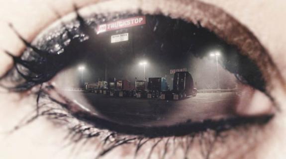
Through his studio Antibody, and as a resident creative director with the Los Angeles filmmaking collective Elastic, Clair had already made a name for himself with stunning design work in film, television and video games. But when Season 1 of HBO’s True Detective hit the airwaves in 2014, it was like a bomb had gone off and we, the collective viewer, were sifting through the aftermath. Fans will always remember that show’s palpable feeling of desolation and despair, but what they’ll remember seeing years from now, when its story is all but forgotten and the dialogue has faded into an existential memory-haze, are those main titles.
Clair and his team won a much-deserved Emmy for True Detective’s haunting images. Only a year later, they’ve been nominated for two additional Emmys in 2015 – for the show opens to AMC’s Halt and Catch Fire and Netflix’s Daredevil. Not bad considering True Detective Season 1 was “the first drama show we ever did,” said Clair, talking to Brief from his Los Angeles office. It was the first thing he said in an in-depth conversation that spanned Clair’s favorite title sequences, his team’s creative process, and how they sought to create “broken portraits out of broken landscapes” for True Detective.
BRIEF: Growing up and forging a design career in Australia, when did you first start to realize title sequences were a gig you could get, and that you were good at them?
PATRICK CLAIR: I started out training in live action back in Brisbane, where I grew up and went to film school. I graduated from there and had just turned 20. I had this piece of paper saying that I was a director, in a city which effectively has no film industry and only a very small promotions industry. So I had to figure out how I was going to make a living. It was around the time when motion graphics was really taking off, because desktop technology had kind of revolutionized it. It had gone from being something which happened in these very expensive flame suites in the ‘90s to the start of 2000 [when] you could start a studio with not much money. There were studios popping up across the world doing a hybrid of animation and design and live action, finding new ways to do visual storytelling, and I thought it was super-cool and got really involved in it. And obviously one of the main places where you can combine design and storytelling is in title sequences.
BRIEF: When you look at titles from the ‘90s and the decades preceding them, the difference in the level of art and craft compared to what folks like you are doing nowadays is like night and day. In retrospect, are you aware of the point at which the tide started to change in terms of quality in main titles?
CLAIR: It was when this idea of the “golden age of television” started to kick around and specifically, when HBO and a small collection of other networks started to tell different kinds of long-form stories on television. Oz was one of the first, and then The Sopranos and Six Feet Under [were] the ones that showed you can do something more nuanced and more interesting with television than had been popular prior to that. That was where you got to see titles really changing from being a chance to throw up some pictures of the actors and put some credits underneath, to being sequences that could really become these little visual poems that were about welcoming the audiences into the world and communicating through visual art what was going on in the drama of the story.
I remember being so struck by that Sopranos title sequence when I first saw it. It maybe wasn’t as “design-heavy” as some of the other iconic HBO titles you referenced, but there was something about its style and rhythm that so perfectly captured the feeling of that show.
I think the best sequences have a really simple concept at their core, and certainly for us, when we’re trying to figure out how to create a sequence that can work for a new show, we return to sequences like [The Sopranos] and the strong simplicity of that concept: it’s Tony driving home. It’s the trip into his neighborhood. Other ones that work really well: Mad Men, which you can sum up as, “it’s a man in free fall”; Dexter, “the brutality of cooking breakfast”; or Six Feet Under is just preparing a dead body for burial. I find that the best title sequences can always be summed up in a single phrase, and that it speaks to what’s at the heart of the drama of the show.
How do you and your team approach discovering that single phrase or concept that speaks to the heart of the show you’re creating titles for?
The ideal process for us is that we immerse ourselves in the world of the story. Whatever is available. Most often that’s going to be the script. Occasionally there might even be a rough cut of the pilot, or there may be a summary of the series in a document form. But most often, its really Episode 1 and then ideally 2 and 3 as well. Following that, the thing I most like to do is to jump on the phone with [the showrunners] and just spend a half an hour just talking about the show. It’s kind of a privilege for us because we come in at this great point where they’ve been working on the series for sometimes years at this point, and they’re absolutely steeped in it. They’re in the middle of really figuring out what’s at the heart of the story. They’ve usually just shot the first episode or they’re just about to, and they’re universally really smart and insightful people so they can just pour out all this symbolism and information, stuff about what motivates the character, stuff about how that resonates in the world they’re in, what that means in a broader social sense. A good show is going to be more about conveying that stuff through the interactions of the characters. But we get to come along and mine that subtext and plunder it and turn it in to visual ideas that we can then go away and develop into concepts for title sequences.
There’s definitely something working at a deep subliminal level in your titles for Season 1 of True Detective. I was never quite able to articulate what it was, until I saw a quote from you citing “pollution of the physical landscape” as a reference point, and that spoke to me. How much did the idea of pollution play into those titles?
Hugely. I was on the phone on this big conference call. I was working from Australia at the time and it was the crack of dawn down there and I was bleary-eyed and sucking down coffee and we had Cary Fukunaga and Nic Pizzolatto and his whole team of producers and execs from HBO, and Nic was describing what the show was doing and he said that they were using the landscape of Louisiana from the mid-‘90s; the kind of petrochemical industrial zone where the landscape was poisoned and polluted and had been exploited. They were using that as a metaphor for the way the characters in the story were people who were broken and polluted and exploited, and that immediately lead me to the idea of, if what the drama is doing is using broken landscapes to show broken people, why don’t in the visuals of the titles we make broken portraits out of broken landscapes?
One thing I have noticed about your title designs for Daredevil, Halt and Catch Fire, and True Detective (Seasons 1 and 2), is that the human components, the cast, are either not really present, as in Daredevil, or obscured in some artful way, as in True Detective. Is that just coincidence or do you lean toward a more abstract depiction of people when it comes to main titles?
It’s really hard to make images of the cast work in a title sequence, and I think that at least for the last five or 10 years, most of the really great title sequences haven’t had the cast in it. It’s something that I keep trying to figure out different ways to do, but it’s really hard and we’re running out of ideas. A title sequence or for that matter any kind of visual design piece is more compelling if it directly features people – faces and human bodies are things people find engaging and interesting and that can say a lot. So whenever we can involve a human component, we do, because that’s what makes good storytelling. It’s just finding new ways to do that which aren’t too literal, but aren’t so abstract they’re not relevant.
At least two of the recent television main titles you’ve done, Halt and Catch Fire and Daredevil (and arguably, True Detective, Season 2 as well), make heavy use of different shades of red and magenta. This color scheme is notorious for posing challenges when projected on TV screens. Do you think there’s a red sea change afoot in the industry?
Daredevil was always going to end up red because it’s the legacy of the characters. But at least it is a tasteful red that is very nicely and professionally shaded by our compositing team. Our lead compositor, Shahana Khan, is a magician, and she did this really beautiful, subdued, smoky, bluish kind of grain on the red that I am just in love with.
Halt and Catch Fire I am equally proud of but it’s a mess. It breaks every rule in terms of the saturation and vividness of the colors. I’m sure if my university lecturers could have been there, they would have been horrified. But I do love that bubbling, intense, vivid, red, magenta, streaky kind of look, and I’m so excited that we got to put it out there and that people seem to have responded to it.
How did you come to break all those design rules on Halt and Catch Fire?
The characters on the show are under such intense pressure, and they put such intense pressure on themselves, that they are really at risk of just completely spinning out of control. It was really trying to find a visual way to express that instability. As we were designing, we looked at references for the color scheme in the different color sets that existed for computers back in the ‘80s. My design team’s instincts was to put them together into good-looking frames, which is what they’re trained to do, and they’re very good at it. But what we found on Halt and Catch Fire is, we would review the day’s work and be like, “this looks too nice. It has to look garish and hideous and awful. Over a period of about a month, we just kept trying different color combinations. We made the reds brighter, mixed the reds with the magentas that were kind of close to the reds, put a spot of lime green in the middle of it – and it wasn’t until we had these kind of hideous, garish images that kind of bled off the screen and sort of made your eyes hurt a little bit, that we realized we’d found something that could reflect the intensity and the pressure and the stress that these characters put themselves under as they tried to invent the computer revolution back in the mid-‘80s.
What title sequences have been inspiring you more recently?
I think the animations that have been done for Broad City are just fantastic. I love that spontaneous illustrative style that’s really fun and playful, and I think it perfectly suits comedy, and I think that generally speaking, the industry has struggled to know what kind of title sequences can appropriately introduce shorter comedy programming. I think [Broad City is] a great example and that other shows like Man Seeking Woman are also great examples. What I’m hoping to see is the start of a tradition there of a new visual language that suits that format. Because there’s clearly this way of making titles for one-hour serious shows, like HBO does or like Netflix does – this artfully designed, polished aesthetic that goes along with that. But comedies are a whole different field and I think it’s going to be really cool to see that develop over time.
Tags: