


__twocolumncontent.jpg)


Discovery’s Destination America has grown a lot in its three short years of existence, expanding to unforeseen programming realms with everything from barbecue and ghosts to monsters and buying property on the bayou.
According to the network, its purpose is to “celebrates the people, places and stories that makes The United States great.” And the original graphics package did just that, but with its new content and growing audience, Destination America’s brand needed to expand along with it.
Laura Giacalone, VP of marketing at Destination America, calls the network “fun Americana,” highlighting big personalities, larger-than-life characters and unexpected places.
Using its existing tagline, “The United States of Awesome,” Destination America enlisted the help of Ferroconcrete to update its brand to reflect its new playful tone and expanded programming.
Christopher Grant, creative director at Destination America, says the refresh was also about matching the tone of the network to the tone of its on-air graphics.
“There’s an energy and vibrancy that we reflect,” he said. “We want to give it a sense of renewal, celebrating all things light and fun.”
Ferroconcrete created a system of icons, a large part of the brand refresh, in order to reflect all of its new and emerging content lineup, which includes Impact Wrestling, Ghost Asylum, Monsters and Mysteries in America, Buying the Bayou and Mountain Monsters.
The purpose of the icons, however, also cohesively ties its varied content together using one graphics system and a light, playful tone. Icons range from aliens to hot dogs and apple pie to Bigfoot, all cleverly integrating its USA colors and familiar stars and stripes motif.
Individually, the icons are placed on a map of the USA with the “United States of Awesome” tagline, changing up a bit depending on the programming of that day or that week.

The strategically placed icons and the colorful map also serve to demonstrate “the breadth of programming that we have now,” said Grant, using the system on idents, in promos and throughout the network’s overall branding.
Color popping helps enhance this look, ramping up the energy with pops of color in the icons’ animation. When the color, the icons and elements of familiar USA branding come together, it’s meant to feel “energetic and constantly moving.”
Another aspect of this creative system was something Grant calls “sloganeering,” playing off the idea of the icons to create phrases that continue to set the tone of the brand’s refresh.
Similar to “The United States of Awesome,” each slogan hypes the spirited tone of the network, including “Great BBQ is like freedom,” “The United States of Spooky” or “This is life, liberty and the pursuit of whatever you want.”
These slogans “are open to when they need to say anything,” said Yo Santosa, creative director at Ferroconcrete. “It has that fun playful tone of voice, speaks to the independent spirit of the network.”

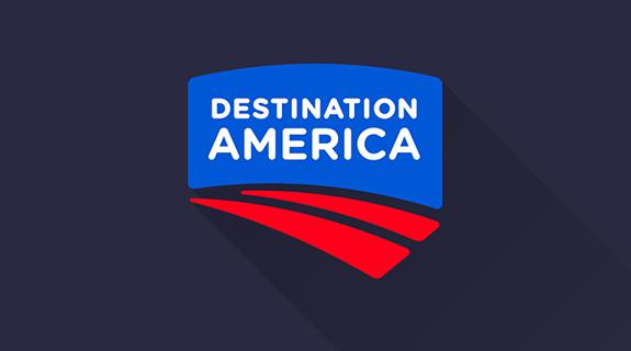
The logo, which was only cleaned up slightly, creatively adapted to the rest of the package.
Destination America’s previous logo consisted of brush strokes, using a similar color palette, which Ferroconcrete molded into a more modern shape.
“Visually we felt it didn’t look like a family with our graphics but only because of the brush strokes,” said Santosa. “We both ended up liking the new clean, really graphic look with a simplified shape.”
Santosa added that in a digital world, that detailed brush stroke logo would get harder to read the smaller it becomes, so a simplified logo with cleaner lines helps Destination America adapt to different platforms on air and off.

Destination America’s logo can now easily be placed inside or around the network’s icon system, which Jen Fong, executive producer at Ferroconcrete, says adds to the idea that “the network is playful, self-aware. It is fun, but it also projects fun.”

CREDITS:
Client: Discovery Networks
Agency: Ferroconcrete
Music on Montage: Imperium by Madeon
Tags: