


__twocolumncontent.jpg)


In 2013, Canadian media company Corus Entertainment selected Eloisa Iturbe Studio to rebrand The Zone, the flagship afternoon programming block of its kids and family network YTV.
“Our direction on The Zone was to see a look that has the DNA of possibility built into it,” said Dolores Keating-Mallen, VP creative director at Corus, “[to see that] anything can happen in this environment.”
Eloisa Iturbe Studio (EIS) responded with a concept that took the motion of a roller coaster as the starting point for a wildly unpredictable promo package that seemed at times to literally burst off the screen.
“It was zaniness, craziness, fun,” said Keating-Mallen, “a sense that anything could happen in front of your eyes whether through the regular TV experience or a social [platform] or a YouTube clip or however you come by it.”
So striking did Keating-Mallen’s team find the work that when it came time to rebrand the entire YTV network less than a year later, Corus bypassed its usual three-company pitch process to call directly upon EIS again. Having used a looping amusement park ride as a symbol of high-speed energy and fun for The Zone for its first effort, EIS’ challenge this time around, she said, was to “create an iconic element as a visual metaphor for the family togetherness that happens with YTV.”
Intentionally designing any kind of iconic visual system is by no means easy, let alone one that perfectly represents a network’s unique ability to bring the whole family around the television. YTV is the “mother brand” when it comes to Corus’ kids portfolio, said Keating-Mallen, with the company’s strongest evening ratings in ages 6-11, gender-neutral co-viewing (kids and parents watching together). Whatever EIS came up with had to honor that notable achievement while also tapping into the unstoppable vitality of The Zone, the work that had gotten them here to begin with.
In any creative pursuit, reviving and enhancing something that was entrenched in your mind as done and gone is one of the hardest things. “We already had the concept for [The Zone] and it was very close in time,” said EIS’ Martin Lanciano, co-director on the project. “That was the main difficulty on this project: to start with this thing we had done for them and make it work for the whole network.”
It’s perhaps clear from viewing The Zone sizzle reel above that EIS’ previous work would not have translated across an entire brand. While captivating, it’s also insanely busy and frenetic, and even kids need to mellow out once in a while. In fact, said EIS owner and rebrand co-director Eloisa Iturbe herself, “you have to think about a kid’s world in a different way now. Kids are not kids like they used to be. The kids’ world is more like our world. It’s not something naive and childish.”
Keating-Mallen agreed. “A lot of kids’ networks use every conceivable color under the sun thinking that because it’s kids you use more color… We don’t line up with the people who think that every color and every shape in the whole world has to be crammed into the frame to get an energetic feel.”
Instead, EIS scaled down for the full rebrand. After many concept proposals that didn’t quite work, the studio “came up with this beautiful idea of the energy strand,” said Keating-Mallen. “An element that wraps around anything that’s precious and cool and good. It joins the family together as they sit down to watch this stuff.”
This graphic idea, said Iturbe, not only served as a fluid transitional device that actually recalled the motion of The Zone’s original roller coaster, but it was “like the energy of children itself:” Warm, playful and even loving, like a 3D abstract of a living hug, zipping between shows to joyfully embrace everything it touches.
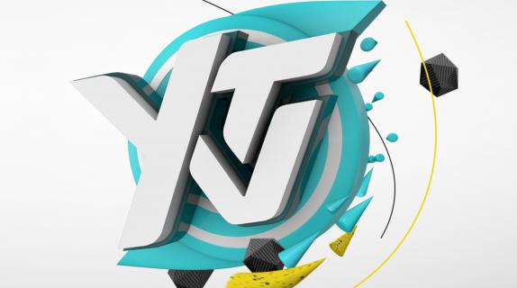
EIS proceeded to deliver a promo package that was sleeker and more precise than The Zone’s aesthetic, and that worked from a more mature color palette of purple and teal against a white backdrop, with vibrant accents of yellow and red. Meanwhile, multi-sided geometric charcoal shapes cruise through the cosmic 3D whirlwinds like asteroids, adding an “older” feel to the brand, according to Iturbe.
The energy strands proved to be remarkably flexible, breaking into glacier-like shards, as in this ident:
…Or, behaving like a school of fish, as in this ident:
The elements of the final YTV rebrand have the irrepressible giddiness of youth, but are guided by a sophisticated visual system. At the subconscious level, the unspoken relationship between the shapes onscreen ensures the viewer at a deep level that “they belong together,” said Lanciano, “and that there’s a coherence between all the elements”
“You’ll never see anything trendy [on YTV],” said Keating-Mallen. “We don’t look down or talk down to kids. We really respect this demographic. We’re doing an amazing brand first and it just happens to be for kids and their families.”
CREDITS
Corus Entertainment Brand Image & Design
VP Creative: Dolores Keating Mallen
Design Creative Director : Vince Robles
Art Director: Somsanith Bouabane
3D Lead Designer: Dustin Kidd
Production Manager: James Chaarani
Eloisa Iturbe Studio
Direction: Eloisa Iturbe, Martin Lanciano
Design: Valeria Moreiro, Ianko Perea, Leandro Fernandez, Susana Pinto
3D and 2D Animation: Maximiliano Riedel, Sebastian Morales, Esteban Simone, Horacio Herrero, Josefina Preumayr
Tags: