


__twocolumncontent.jpg)


From saris wrapped around the frames of Hindu women to eye-popping prayer flags fluttering in the breeze, it’s hard to think about the country of India without envisioning vibrantly colorful fabrics. Dazzling textiles aren’t just a style there, they are a way of life, or, as Indian general entertainment channel Sony SAB recently put it in the brief for its new rebrand, “Threads play a very crucial role in our lives. It’s the thread of relations and love, which binds us all together.”
Flush with family comedies and lighthearted vibes, Sony SAB looked halfway around the world and into another hemisphere for a design company with the right sensibilities to craft its new on-air identity. On the strength of a lively portfolio of eye-popping branding work for an international clientele that includes Russia’s CTC network and Fox Sports Japan, Buenos Aires-based Váscolo won the job with a pitch “mixing glass, plastic, hair and luminance in different color combinations and making those threads twirl, follow paths or behave more organically,” said the agency’s executive creative director Martín Schurmann.
Once their pitch was accepted, Váscolo “started thinking more deeply about the concept and its relations with the Indian culture,” Schurmann said. “That’s when the idea of those threads being the fibers that weave the classic Indian textiles came to our minds. We wanted to show how those strings weave an entire culture.”
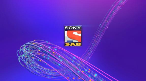
Eventually, Schurmann’s team narrowed the original variety of materials used down to one: a glassy substance pulsating with sparks of illumination that seem to have a life of their own. These translucent strands begin life as “glass drops that contain luminant objects,” Schurmann said. “We like to think that the drops are falling like raindrops and are made of energy. Those drops finally collide and that moment is the birth of the threads cluster.”
Literally weaving in and out of the Sony SAB’s logo, endpages, lower thirds and other elements, the glassy creations communicate the connective power of threads in Indian culture while also making the network appear “even more magical and modern looking,” Schurmann said. Váscolo also delivered a purple color scheme that furthers the “modern and fresh look” with the added benefit of making SAB “totally distinct from the competing signals.”
As smooth and fluid as the threads appear in the rebrand’s final form, there were many design challenges along the journey toward completion. Given only four weeks to complete the project for a launch on Sony SAB’s HD transmission, Váscolo had to quickly craft a graphics system that “let the threads flow in harmonic and soft ways, with a very energetic kind of movement,” Schurmann said.
At the same time, they needed to allow “variations on the [thread clusters],” giving SAB’s in-house team the option to change the number of threads onscreen, thread thickness, degree of cluster rotation, and other crucial factors. Complicating matters further was the realization that the lights that flicker inside the glass threads needed to have their own animation method separate from the threads themselves. Otherwise, “everything is basic,” Schurmann said, “but if the lights are indefinite of the [threads], you have a kind of life inside, a different kind of movement inside.”
But the biggest issue the Váscolo faced “was language and translations,” Schurmann said. Communicating across the world from Buenos Aires to Mumbia (time difference: nine hours), neither party had native English speakers on staff, which “made it a bit tricky with the nomenclature of the elements, feedbacks and in general with the organization,” he continued.
Broadcasting in nine countries besides India, including nations in Asia, Africa and Europe, SAB requested their brand elements in three different languages, Hindi, English and International English, and also used different terms for otherwise familiar onscreen items. Lower thirds, for instance are called Aston bands in India, while end titles are referred to as promo closes.
“We had comings and goings especially trying to translate this system of nomenclature to our system,” Schurmann said.
Overall, however, it was “an amazing experience,” he continued. “It was for sure challenging because of the very tight deadlines, but mostly enriching because it made us grow as a team.”
The Indian television industry is at a pivotal point “in terms of branding and design,” he continued “They are launching their first HD signals, so this is a very exciting moment for them. They have an incredible amount of original content which is created for the inner audience, but they want to make their screens look modern and more global. That’s why they come to us and other studios in America or Latin America to create their branding imagery.”
CREDITS
At Váscolo
Executive Creative Director: Martin Schurmann
Animation Director: Ernesto Reyna
Art Director: Florencia Tasso
Branding Advisor: Natalia Español
Design: Florencia Tasso, Rafael Fornaris, Micaela Podrzaj, Lionel Wainsztok
Animation: Ernesto Reyna, Lionel Wainsztok, Fernando La Mattina, Ulises Depaoli, Julian Glumi
Shadding, Lighting & Rendering: Lionel Wainsztok, Rafael Fornaris
Compositing & Postproduction: Ernesto Reyna, Lionel Wainsztok, Ulises Depaoli, Rafael Fornaris, Fernando La Mattina
Producer: Natalia Giuliano
At Sony SAB
Art Director: Sreejesh Krishnan
Producer: Mansha Bhutani
Tags: