


__twocolumncontent.jpg)


UPDATED: BET Networks’ Michaela Davis and Josh Pelzek join Gretel’s Lauren Hartstone for highlights from Centric’s rebrand at PromaxBDA: The Conference 2015. See them on Thursday, June 11 at 11.15 a.m. at the JW Marriott at L.A. LIVE.
ORIGINAL POST: March 23, 2015:
Viacom’s Centric network (sister to BET) was founded more than five years ago as a music and entertainment channel with acquired programming including The Cosby Show, Martin and Girlfriends. In November 2014, Centric switched genres to become “The First Network Designed for Black Women.”
In a move that represents the opposite of what most rebrands aim to do, Centric wanted to specify its audience while also celebrating its vast diversity.
Centric just welcomed the show Single Ladies, previously on VH1, to the network as a sign of things to come, but the rebrand is much more layered than just adding another off-net series.
First of all, the creative of the rebrand is very intentional – its layered, patterned look is meant to reflect the multidimensional network as well as its audience. According to Michaela Angela Davis, editorial brand manager at BET Networks, it’s a natural move, especially with the latest proof that diversity on TV is powerful and influential – just look at Fox’s Empire and ABC’s How to Get Away with Murder.
“Centric is the only multiplatform lifestyle brand that boldly celebrates the beautiful and diverse world of black women,” said Davis. “We wanted to be very intentional in not looking at this as a monolith. This is a space where women can define themselves.”
NY-based branding agency Gretel, who has worked on network rebrands across all genres from Nick Jr to Style Network, came onboard with the project last summer to help create a graphic look for the channel’s new direction.
“Basically our goal was to not define our audience,” said Lauren Hartstone, associate creative director at Gretel. “A lot of networks are trying really hard to hone in on one specific thing, to define the viewer as one specific thing, and we made it a point not to do that. You want everyone watching to see some piece of themselves on air.”
With an incredibly detailed brief, Gretel and Centric used reference imagery and bright, bold color to formulate a plan that included high-ended photography, patterns, texture and dynamism at every turn.

“Our brief was that there is no one kind of black woman, there’s really a huge amount of variety and diversity within that demo,” said Ryan Moore, creative director at Gretel. “Our job was to really help that, visually and tonally.”
Centric now sees itself as the place for modernity, style and attitude. Davis says the new look is “fresh, forward, with more of a fashion edge. We see it as being fresh, bold, fun, modern, assertive, celebratory.”
To the team at Gretel, that meant finding a natural creative balance while also celebrating the channel’s many layers.
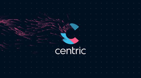
For the logo, Gretel embraced an ever-changing, dynamic piece of imagery that can demonstrate a range of styles and reflect any number of personalities, depending on how and where it’s used.
The logo, which can be used with the just the “C” or with the full word, is filled with patterns and texture with changing color options for each show or package. The easily adaptable logo seamlessly transitions from on-air elements to social to Web:

“Even in this big branded platform, we thought of textured layers in terms of demographic as well,” said Moore. “The idea that there is no specific kind of viewer – everyone’s made of a bunch of different influences – we even distilled that down into the logo.”
One basis of all of these patterns and textures was photography, using the modern black woman as the canvas for a bold and expressive series of faces and personalities.

“We shot a wide range of women and styles, all kinds of looks,” said Hartstone. “Our goal was to make it feel like everyone was included in this – there isn’t just one kind of person watching, it should be completely inclusive.”
Added to that high-end photography is color and a variety of texture, creating a vibrant look that combined subtle neutrals with those stronger hues.
The texture adds a sense of depth to each image and the patterns, focused on thick and fine graphic elements, add complexity. For different uses on air, online and in print, each of these can be pushed to the forefront or downplayed where necessary.

The challenge with all of these graphic pieces became how to balance all of those elements without going overboard.
Gretel had a solid strategy for that, which Moore compares to a series of levers: “It’s like using levers or nobs – you can turn a few nobs up, but that might mean the others need to come down. If you have a burst of color it might mean less intensity in other aspects.”

With all of the pieces lined up and the elements balanced, the creative reflects the channel’s new direction, which was a strategic and branding feat. After all, as Davis says, “No other network that can say it’s the first network for black women.”
CREDITS:
CENTRIC:
Kendrick Reid: Executive Creative Director + SVP (BET networks)
Michaela Davis: Brand Ambassador/Creative Consultant
Andrea Warmington: Creative Director
Josh Pelzek: Design Director
Adiata DeVore: Production Manager / Creative Services
GRETEL:
Executive Creative Director: Greg Hahn
Head of Production: Dina Chang
Producer: Jennifer Brogle
Associate Producer: Haley Klatzkin
Creative Director: Ryan Moore
Associate Cr. Dir.: Lauren Hartstone
Art Director: Adam Wentworth
Designers: Lauren Hartstone, Adam Wentworth, Danny Ruiz, Caleb Halter
Lead Animator: Andrew Brown
Animators: Dave Nelson, Chu Fuchun, Peter Harp, Cyprian Sadlon, Brandon Kennedy, Gerald Soto, Will Huang, Jin Lee, Aldo Gonzales
Editors: Eron Otcasek, Evan Kulwantanaga, Karl Amdal
Tags: