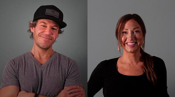
Canada’s Corus Entertainment unveiled a refreshed on-air look this week for its W Network—the country’s top speciality brand for women—that celebrates the concept of relationships while embracing many of W’s enduring creative elements.
Corus tries to keep the branding for its networks feeling fresh and exciting with an update every two years or so. This time, the network decided to go out of house—and south of the border—to partner with an outside agency.
Women’s focus on relationships is part of the W brand’s positioning, according to Dolores Keating-Mallen, vice president, creative director, on-air promotions at the company. Los Angeles-based Troika delivered a creative concept that explores the relationship between positive and negative space, while celebrating the relationships between the on-air talent.
“Our intention is that it’s an evolution of our brand identity,” said Keating-Mallen,“It’s very refreshing, slightly bolder, and has more impact than what we had before.”
One element that hasn’t gone away is the circular W logo in orange that has become the network’s calling card since it was conceived by Elaine Cantwell at spark creative in 2002. Corus also told Troika that they didn’t want to alter the network’s signature color scheme of orange, black, white, and hint of teal. They have a lot of brand equity invested in that combination, and have found that it strikes the right balance of inviting in female viewers without being overly pastel or feminine and driving men away.

With such prominent elements staying the same, the challenge became “how do you do this one more time,” said Keating-Mallen, “where we capture the essence of the fun, and the attitude, and the playfulness we were successful in capturing in the past.”
Troika’s answer to that challenge? A series of network IDs and promos that can be described as elegant and sculptural while always aiming to be natural and warm.
“We didn’t want to be in this cold artificial world,” said Art Director Marc Juon at Troika. “Everything has to have a tactile authenticity.”
Keating-Mallen said her team at Corus was struck by the beauty and depth of the creative delivered by Troika.
“It’s the stepping down of the graphic elements, it’s the layering, it’s allowing the talent to walk through graphics and how we merged the talent with the graphics,” she said.
One of the things Troika wanted to help Corus do is come up with new ways of shooting their talent, Juon said.
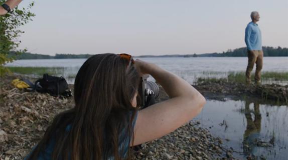
During a one-day shoot up in Toronto they used a technocrane and turntable to help deliver unexpected camera angles and “give everything a fun energy,” Juon said.
The visual branding for the network extended through to talent styling as well, with the signature orange, teal, white, and black providing the color scheme for the wardrobe, and the chic street wear capturing what the talent is like at play.
Keating-Mallen said she was happy to have made the decision to step outside Corus and bring on an outside partner for this project, and even flew down to Los Angeles to collaborate directly with Troika at their La Brea Avenue offices—a first in her 20-odd years as creative director.
Both client and agency said that the teamwork and depth of this partnership was the key to pulling off a successful brand refresh in such a short amount of time (Troika got the assignment in mid-September).
“It really was a tremendous collaboration,” said Dale Everett, creative director at Troika. “That was the secret to doing this project as quickly as we did.”
Tags:















__twocolumncontent.jpg)
