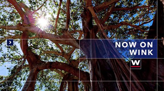
For the redesign of its 46 station brands, Tegna Media took a page from its web and mobile sites, converting the simple and clean looks of its new user interfaces into on-air brand packages.
“Tegna’s been on this content innovation journey for some time, probably for the last couple of years, where we’ve done a lot of deep dives into what today’s audiences and future audiences expect out of local news,” says Meredith Conte, VP of marketing for Tegna Media and a member of the PromaxBDA board of directors. “One of the things that they expect is a great audience experience. In the digital space, that concept is nothing new. But in the local broadcast world, the industry hasn’t embraced that concept.”
To start the process, Tegna reached out to creative agency Troika, and asked them to come up with a “modern and contemporary package that could be future-proofed, that we could evolve and iterate on over time,” says Conte. “We have 46 station brands in our portfolio — you have to have design that can flex.”
What that meant was taking all of the design in Tegna’s portfolio, which was not standardized across the company’s many markets, and stripping it down to the its core elements — unified color palette, font family and brand-new music. The new look also had to incorporate interactivity and user-generated content, both because that’s what viewers are demanding and because Tegna wants to emphasize the community aspect of its local coverage.
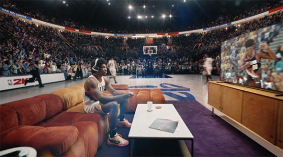
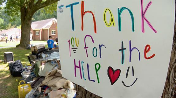
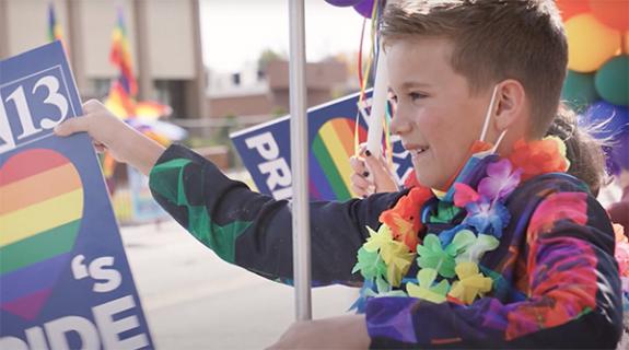
“Troika’s done a lot of studies on fandom,” says Conte. “There’s a desire for self-expression. People are wanting to take selfies or photos and see those on-air. They are wanting to participate in this content. People send us stills of the weather or of the local landscape. Using that user-generated content in the packaging of our stations was a no-brainer. In local, our job is to reflect community back to the market.”
RELATED: The Daily Brief Podcast: Tegna’s ‘Selling Girls’
When it came to selecting new colors for the stations, Troika did a color audit to look at all the colors the stations were using. Since the branding had never been unified, the colors were all over the map.
“I didn’t realize that there were as many shades of blue as there were in the Tegna family. Together with Troika, we stripped that down, took the complexity out of it and identified a short-list of tones and shades that work in an information-rich environment,” says Conte.
Troika also helped Tegna establish color tones that suit viewers’ moods depending on the time of day they are watching. Mornings are marked by sunny yellow, noon deepens to an orange, while evening access newscasts are cast in Pantone’s color-of-the-year: ultraviolet. By the time viewers make it to the late news, a more “serious newscast,” according to Conte, the branding has become a soothing shade of dark blue.
“Color is such a powerful driver of the subconscious,” says Conte.
Along those lines, Tegna selected a single font to represent its stations’ singular identity. After a long search, the winner was a font created in 2005 by Mark Simonson called Proxima Nova that can now be found across all of Tegna’s station websites as well as on-air.
“We definitely looked at dozens of fonts and we looked at all fo the options within the font families,” says Conte. “We needed a font with flexibility, personality and attitude, a font that was serious, legible and clear. It was a long process and we had a lot of criteria.”
Finally, Tegna is changing up its branding music. Conte isn’t quite ready to disclose Tegna’s music partner, but the new sound will reflect the cities and communities where Tegna’s viewers reside.
“We went non-traditional with the music,” Conte says. “It’s a street sound that includes the sound of human instruments, such as clapping, stomping or human voices. As one of our marketing directors said, ‘it puts a lot of soul into a soulless category.’ [Our new sound] reflects the humanity of our journalists and the stories we tell. At first, I was nervous to share it with our team, but I knew we had gone in the right direction.
“What we’re trying to do is take a lot of the veneer and polish off of the content,” says Conte. “When you use color, human voices, natural sound, that brings more authenticity and emotion into the product and that’s what audiences want these days.”
Tegna started rolling out the rebrands in early December and will continue through April, paying special attention to its NBC affiliates during the crucial February time period when NBC will be airing both the Super Bowl and the 2018 Winter Olympics from Pyeongchang, South Korea.
“The beauty of our [corporate] culture is that stations that our rolling out later are watching stations that are rolling out earlier,” says Conte. “Each rollout is individual but there’s a collective sense of how we are all working together to make each rollout successful.”
Listen to Conte talk about Tegna’s new redesign in today’s episode of The Daily Brief Podcast (above) and subscribe to The Daily Brief Podcast on Apple Podcasts, Google Play or wherever you get podcasts.
And we are proud to announce that The Daily Brief Podcast is now available on Spotify!

Tags:




















__twocolumncontent.jpg)
