


__twocolumncontent.jpg)


Netflix quietly rolled out a new logo consisting of the letter ‘N’ that’s making a debut across the service’s social media and mobile platforms.
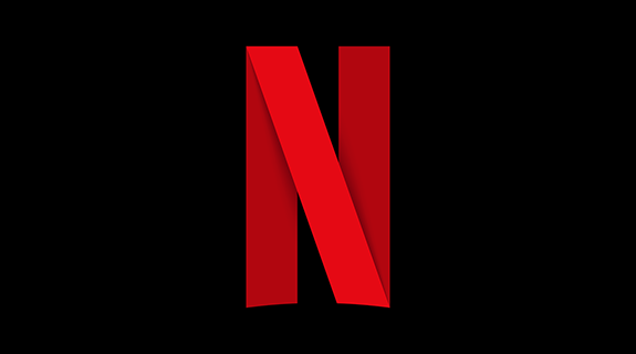
The icon features the red capital letter designed from what looks like a single red ribbon set against a black background. The rounded edges mirror the ‘N’ found in ‘Netflix,’ while a pronounced drop shadow makes the letter pop.
It’s appeared on Netflix’s Facebook, Twitter and Instagram profiles so far and is being incorporated into the mobile app, but Netflix is by no means doing away with its old logo that features the company’s name spelled out.
“We are introducing a new element into our branding with an ‘N’ icon,” the company said in a statement. “The current Netflix logo will still remain, and the icon will start to be incorporated into our mobile apps along with other product integrations in the near future.”
Netflix has not commented further on the new ‘N.’
Graphic analysts have weighed in, with FastCodeDesign’s Mark Wilson calling it “a masterpiece of ambiguity.”
“What really strikes me is the success of this logo’s core visual metaphor,” he said. “What is that ribbon? Is it a red carpet? Is it a celluloid film print? Is it the visualization of Netflix’s own stream, bouncing from them to servers to your own home? It could be all these things at once—not a bad metaphor for a company with astronomical ambition.”
Wired applauded the simple, slightly abstract design.
“It looks to us like they’re betting that a bolder, simpler icon on your home screen will do a better job of catching (and keeping) your attention,” Wired said.
Wired also lumped Netflix in with tech companies like Instagram, Uber, Twitter and Airbnb, who have recently updated their visual brand for the mobile age. Mobile interface design has been leaning toward minimalist as of late, and this is no exception.
“As the devices people use change, and the capabilities of the screens improve, brand experts want the logo to continue to look good and keep up with the changing context,” Wired said. “It’s no coincidence that many successful, contemporary logos look more like icons.”
RELATED:
CNN Customizes New Company-Wide Font
How Seb Lester Type-Faced His Way to Fame
READ MORE: Wired, FastCodeDesign
Tags: