


__twocolumncontent.jpg)


In the crowded landscape of news networks jostling for position, Al Jazeera America, which launched August 20 in more than 40 million homes, stands apart with a brand identity that draws from the American landscape its covering.
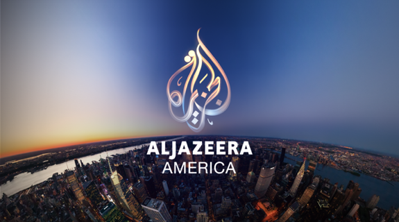
“We really wanted to connect with the heartland as well as to the coasts,” said Elliott Chaffer, creative director for Trollbäck + Company, who created the branding package for the fledgling network including animated logotypes; main and interstitial IDs; news, business, sports and weather opens; and screen architecture for its flagship news show. From the brand perspective, Al Jazeera sees all sides of the story; they’re in the center of the story. [So our] initial concept was, hey, what if we put ourselves in the center of the picture wherever we are?”
To that effect, Trollbäck’s branding package bloomed from Al Jazeera’s logotype, a swooping conglomeration of written Arabic that spells out the network’s name. Across other Al Jazeera properties, such as its Middle East and European channels, the symbol is generally a “flat, metallic golden object,” Chaffer said. “We wanted to be a lot more delicate with it, so it’s not synthetic, but organic.”
Trollbäck art director Peter Alfano and his computer graphics team used Maya’s 3D animation software to create a fuller version of the logo that could take on dimension and volume when rotated. “Now that we had this really beautiful model, we could take it for a walk,” Chaffer said. “We could break it out into these heroic logo reveals, encompassing the whole country, and use paths of light to take on different motion properties relating to the [network’s] different subjects.”
Evoking a network that strives to bring enlightenment via journalistic integrity and compelling, impartial news, Trollbäck’s IDs find the Al Jazeera logo unfolding into beams of illumination that swoop and soar over city skylines, idyllic train tracks, and other iconic American landscapes. The resulting effect is calming yet epic, a quietly beautiful visual meditation on Al Jazeera’s promise to deliver comprehensive news without “over-the-top expressions of brashness,” said Chaffer.
In an almost literal manifestation of its original idea to visually arrive at the center of the story, Trollbäck evoked some of the landscapes by importing plates of incredible panoramic images shot from a helicopter. Alfano’s team then proceeded to build a virtual lens that “lets the CG designer control the viewer’s point of view within the panoramic,” Chaffer said. “It’s literally like you’re inside the whole globe” looking outward.
When time grew short, the company turned to creating the landscapes entirely from CG, including a particularly impressive wheat field at sunset, where the stalks rustle so realistically from a gentle breeze it’s impossible to tell they are 3D.
Though Chaffer said his company didn’t learn of Al Jazeera America’s tagline, “There’s More to It,” until the package was more than halfway to completion, the resulting graphics still effectively suggest the openness and limitless possibility those words convey.
“You can read them any way you like,” said Chaffer. “The path of light, illumination, stories or connectivity. There’s lots of language that you could use to express all that. [America is] just such a vast nation with so many contrasts and as far as I’m concerned, what we’ve done is only the beginning of what we could really do if given the time. So yeah, there really is more to it.”
Tags: