


__twocolumncontent.jpg)


A while back, London-based designer Darren Agnew, whose company DADA has worked with an array of broadcasters and creative agencies, received a call out of the blue from a former colleague with whom he had worked previously on a news channel called 24 Live. Now that colleague, John Partridge, was in a new role – head of programming of a channel run by the former Bloomberg Television executive Lindsey Oliver.
Patridge wanted Agnew to lead design on the new project, which was in as nascent a form as a channel can be. The only detail Partridge could provide, in fact, was the channel’s target audience: Britain’s televisually underserved African population.
“They hadn’t even developed the name yet,” Agnew told Daily Brief from his office in the London neighborhood of Chiswick Park, “but that was the biggest blessing on this project.”
Designers “all talk about getting involved early on,” Agnew continued, but rarely do they get “to be right there at the very start. In our initial meeting, I sat across the table from Lindsey Oliver, John, and Annie Rodgers, our branding and strategy consultant. It was really just the four of us, and then, what do you know, two weeks later I’m in focus groups to discuss potential names for the channel and what kind of programming we should have.”
Those focus groups uncovered a community of potential viewers who attested to feeling “misunderstood, misrepresented and marginalized by mainstream TV brands,” said Annie Rodgers. “There was a clear and vocal hunger for a brand which could super-serve this audience with a variety of content designed for the African diaspora – a general entertainment channel where self-pride and celebration of a culture was right and center of the brand journey.”
In the end, that uplifting notion would become baked into the channel name itself. In the African hybrid language known as Pidgin, Agnew explained, the word “Yanga” stands for “self-pride and showing off – but not in an offensive manner. It’s pride in oneself, which is perfect because the new channel is all about positive African stories and trying to deflect from the usual reports of death, famine, and destruction that come out of Africa. We’re trying to tell the better, brighter stories and how Africa is turning a corner as a continent and becoming a real force in communication terms.”
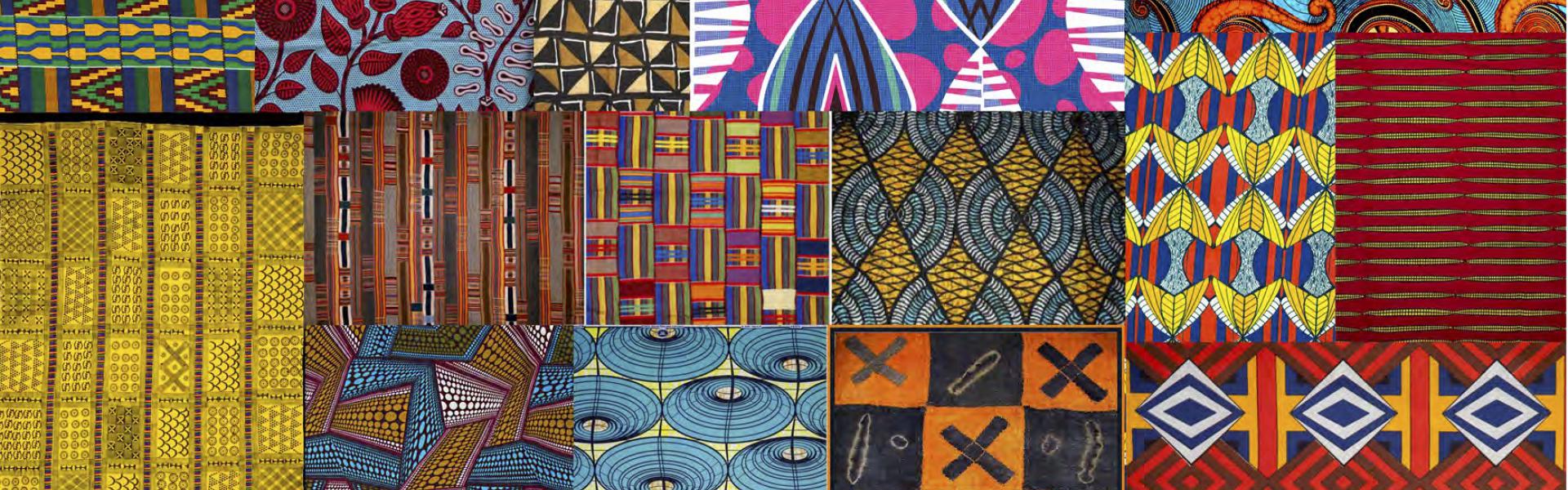
To begin designing the new channel, Agnew set his sights on West Africa, an area “rich in terms of patterns and colors, traditions of dress and fabric,” he said. “What I love about design from that region is that there is no fear of putting bold colors side by side that [evoke a visual shouting effect]. That really helped me because the brand is meant to shout ‘Yanga!’ and to be able to put the reds, the yellows, the greens all next to each other with black text was a really good way of encapsulating that.”
Digging into the history of West Africa, Agnew stumbled across an ancient symbolic language known as Adinkra, which pops up primarily on jewelry, dishware, and other artifacts from Gahnna and Sierra Leone. Dominated by clean, spare imagery, its expressive figures communicate life-affirming notions such as harmony, togetherness, and progress.
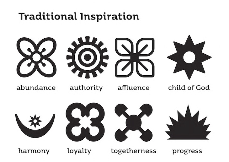
Agnew was drawn immediately to Adinkra’s array of “profound concepts locked up in these quite simple shapes,” he said, but after working with the symbols for a while, he noticed something else as well. Something that would become intrinsic to the entire Yanga design ethos.
“I could only see it after a couple of days, because it’s really, really abstract,” Agnew said, “but all of the Adinkra symbols with positive connotations radiate from a central point outwards – every single one, whether it’s joy, abundance, pride, etc. I thought that our brand could have that same feeling. That’s why I put the text at the center and had it stacked so that it made a shape that I could then radiate from in all directions.”
When it came time to bring the brand to life on-air, Agnew worked with animation company Tomorrow is Closed to deconstruct the Yanga logo, taking pieces from it and making them drop out or float up into the sky over daytime and nighttime programming environments.
In an evening cityscape spot, the pieces ripple with the dreamy luminescence “of a good night out.” Meanwhile, the daytime ident “needed to be more subtle” with a “warm, sunny feeling” in order to appeal to an audience dominated by “mums and kids.” In both spots, the logo elements become interchangeable with the buildings of a thriving metropolis.
When Yanga TV emerged earlier this spring, its slate included four new shows with subject matter ranging from comedy to music to children’s fare. Noni is a magazine chat show for women across the African diaspora. Number 6 is a free-spirited evening of comedy (“‘Number 6’ in Pidgin means ‘use your head,’ “Agnew said, which doesn’t explain too much, but is charming all the same), and Turn Up is a music show driven by Afro-beats. Lastly, Fizzi brings much-needed children’s programming to British-African families, its charming opening fueled by an appropriately effervescent rocket ship that takes kids on a journey to the homeland.
Agnew worked on the branding for all the new shows, which led him into creative places ranging from Turn Up’s logo based on a literal sound wave (“my EP didn’t believe that I could build a working logo from a sound wave,” laughed Agnew. “I’m proud to have proven him otherwise) to a live-action shoot for Number 6 that follows its host, Mansour Bellow, past a parade of cleverly orchestrated neon signs.
It all adds up to a delightful and vibrant new addition to British television landscape, but for its creators, Yanga TV had deeper meaning as well.
“For all of us, this felt like a vehicle for social change in a community poorly understood,” Rodgers said, “so the responsibility to create a bold and groundbreaking brand to meet their demands was a great privilege and responsibility.”
Tags: