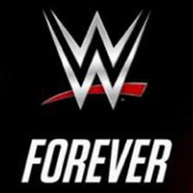
On Monday, WWE officially unveiled its new logo, only the fourth new logo since the company launched in 1982, reports Variety. WWE Chairman and CEO Vince McMahon tweeted the new look on Friday, raising a new flag over the company’s Stamford, Conn, headquarters.
Raising the new official @WWE logo. #ThenNowForever #WWENetwork #9.99 pic.twitter.com/Y3qvHXkiNO
— Vince McMahon (@VinceMcMahon) August 15, 2014
This is not the first time fans have seen the logo: the company used it when it unveiled its new digital streaming service, WWE Network, at the Consumer Electronics Show in Las Vegas. That network launched Feb. 24, and is now available in more than 170 countries for $9.99 per month.
Besides the online streaming service, the new logo will appear on WWE’s Raw and Smackdown on USA and SyFy, respectively, as well as across its line of consumer products and other marketing assets. This Sunday, it will be splashed across everything at its pay-per-view event, SummerSlam, in Los Angeles.
WWE’s last logo had been in place since 2002, and was used when the company rebranded to WWE, Worldwide Wrestling Entertainment, from WWF, Worldwide Wrestling Federation. The 2002 logo redesign was more of an evolution than a brand redesign because it just involved dropping the F, but otherwise keeping the logo the same.
This time around, WWE decided to stick with the red and black colors, because they have become so closely associated with the brand. When WWF launched in 1982, the logo was much blockier, with the two Ws embedded within each other. For a short time, 1994 - 97, the logo was navy and gold.

Read more at Variety.
Brief Take: As WWE evolves, so must its branding.
Tags:












__twocolumncontent.jpg)


