


__twocolumncontent.jpg)


Like the sunrise, ABC’s Good Morning America is there to greet viewers at the start of every day.
Creative agency Vivid Zero drew on that concept to deliver ABC an updated, modern design with energetic graphics, giving the morning-news staple a fresh, elevated feel that’s as functional as it is radiant.
The Vivid Zero team dove into the viewer navigation and structure of the show to present a new open, an innovative “up next” menu, and strategic tease components for its system of lower thirds, while tying it all together with bold colors and clever lighting elements.
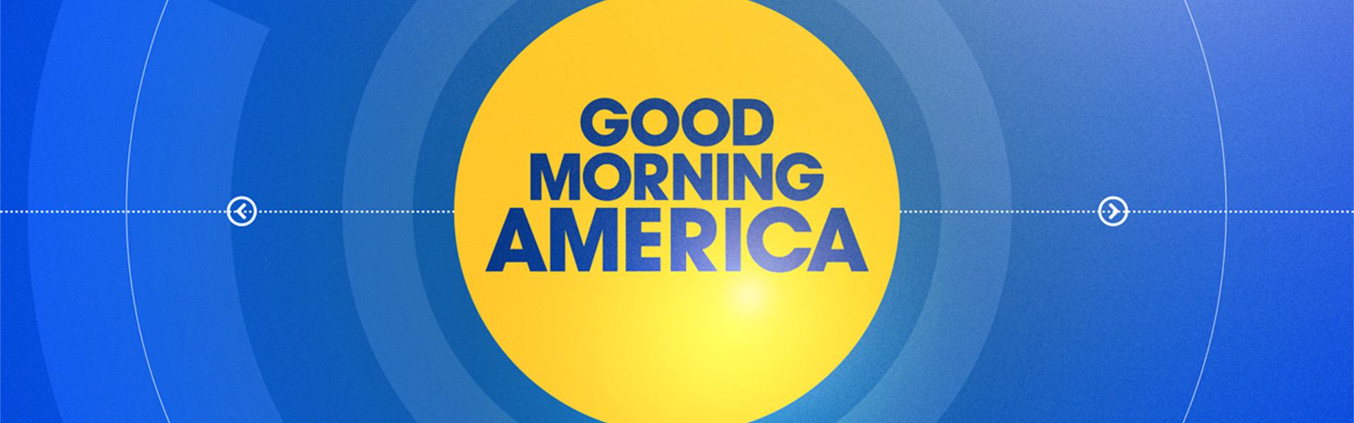
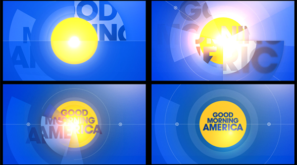
The first thing viewers see is the logo open which mimics a sunrise, and serves as a reminder of the beauty and hope that a new day brings.
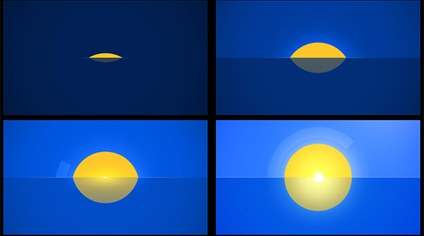
“The very first frame of the sun popping up speaks to everything you want from the rest of the show,” said Alan Ives, SVP marketing and creative, Disney General Entertainment, ABC News.
It not only establishes an emotional tone for the program, but serves a greater navigational purpose as well.
“The Good Morning America open is really a content open. It’s about what’s coming up this morning,” said Michael Vamosy, co-founder and chief creative officer at Vivid Zero.
As the sun emerges over the horizon, radial lines with small arrows spin out from the center and lock into the text of the lower third, helping viewers orient themselves with the content and introducing them to the upcoming news of the day in a clean and concise way.
“This is a really informative, heavy lifting piece that they have to do at every hour, so the graphics need to work hard,” Vamosy continued. “They need to keep it interesting and exciting and urgent, so that viewers feel they want to stick around to find out more. And if they don’t, they’re getting everything right there at face value. If that’s the only thing you see — this two to three minute open — you really get the headlines.”
Research shows that clearly presenting headlines and teasing upcoming stories is a key strategy for Good Morning America, according to Ives.
“We know the audience wants to know what’s coming up next,” Vamosy said. “The largest chunk of the audience that we’re fighting for are the ‘morning samplers.’ They sample between two or three different news shows.”
These viewers hop around to various morning shows as they sip their coffee and get ready for work, and then stick around when they see something that catches their attention, so using teasers to grab viewers’ attention is essential. With that in mind, Vivid Zero spent a significant amount of time and energy into perfecting the lower third, ensuring it did just that in an ongoing and sustainable way.
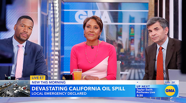
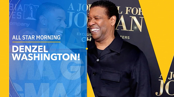
“The language is all about the lower third because that’s what’s on the screen for 75 to 80 percent of the entire show,” Ives said. “So that’s the challenge, coming up with something that’s engaging.”
To meet that challenge, Vivid Zero created an “up next” module inside the lower third to tease upcoming news in an appealing way. The team also looked closely at the presentation of fixed elements such as the time and temperature, the rotation between brand names including GMA, ABC News and ABC News Live, and the display of local affiliates.
Vivid Zero first tackled these graphics elements from a more logical, engineering perspective based on what the lower third needed to do, then played around with the colors and graphics to make it pop. The result is form and function working together with style and creativity.
Lower thirds may not look as exciting in sizzle reels compared to other creative such as IDs and transitions, Vamosy admits, “but if they’re really well done, and if they do their job within the workflow they need to adhere to, that’s when you realize the system really starts to work,” he said.
“I learned a long time ago that lower thirds might not be sexy to some people, but they’re pretty sexy to us,” Vamosy added. “It’s a workhorse, so let’s give it some love.”
Another major design achievement was teasing GMA’s 8 o’clock hour. Vivid Zero used accordion-style sliders to showcase upcoming stories, elevating the show’s existing editorial approach for enticing viewers.
“These guys really know how to tell stories in the morning,” Vamosy said. “They’ve had that structure … It was really about understanding what they were doing, and then giving them some innovative graphic ways to tell the same story with a different kind of visual structure.”
The navigation has an interactive quality to it, where the sliders display three stories, then moves in a way that feels like the viewer is clicking on it, going on to the next story and then resetting to cycle through again.
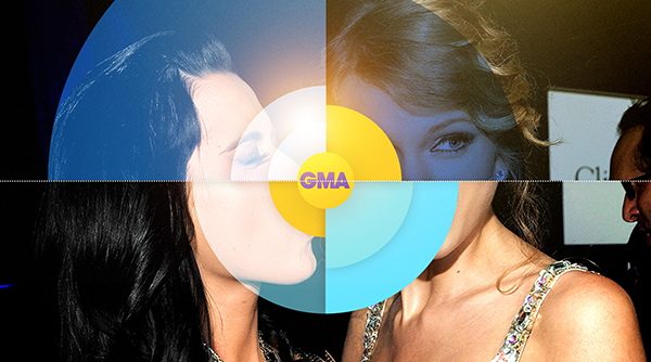
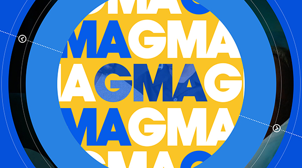
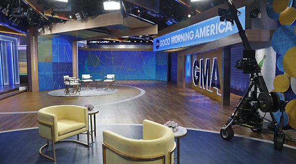
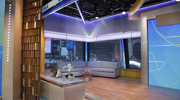
Color also plays an important role in the brand refresh. Vivid Zero moved away from heavy blacks and the previous monochromatic look of yellow and orange, and brought in more of a strong electric blue. Contrasted with bright yellow, it lends vibrant, vivid quality to the color palette.
“It really brings a positivity to the graphics package that helps viewers wake up,” Vamosy said. “It also gives us a lot of flexibility when it comes to how we show content. There’s a neutral quality to it as well, so it can accommodate a lot of heavy movement, and the yellow and blue working together creates a nice range of color.”
For lighter fare content such as entertainment news, Vivid Zero added a lens flare where there was a natural light source, recalling the open’s sunrise motif.
“The idea was ‘how do you make it more than just a pretty graphics package?’” said Vamosy. “How do you give bigger meaning and thinking to the graphics package so that it can support the overall narrative of the brand?”
Ives calls the transitions “truly engaging, electric, and fun. They really knocked it out of the park,” he said.
Throughout the process Vivid Zero brought together key GMA stakeholders — from executive producers, showrunners and talent, to the production team, editing team, marketing team and set designers — and incorporated their insight and feedback before presenting a final plan for the refresh.
“Everyone was just enthused at every level and came with no pushback at all,” Ives said.
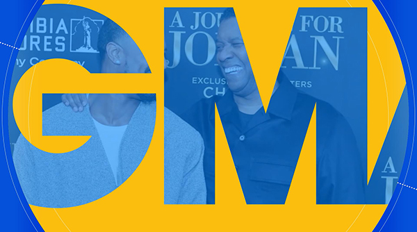
The design appears across every aspect of the show, but is perhaps most visible on the set, where letter cutouts of “GMA” combined with the blue and gold colors create a fun, welcoming and stylish environment that feels like a cool place to hang out.
“That’s really what you want the entire package to do,” Ives said. “Just set the table for the talent and the editorial of the show to connect with viewers in a human way.”
CREDITS
Co-Founder, Chief Creative Officer, Vivid Zero: Michael Vamosy
Executive Creative Director, Vivid Zero: Gilbert Avila
Art Director, Vivid Zero: Thomas Papesca
Producer, Vivid Zero: Derek Tacconelli
Project Coordinator, Vivid Zero: Andre Maercklein
Designer, Vivid Zero: Joseph Keily
Designer, Vivid Zero: Maziar Majd
Animator, Vivid Zero: Joe Lilli
Animator, Vivid Zero: Brian Castle Forte
Tags: abc vivid zero