


__twocolumncontent.jpg)


With the arrival of two new acquired programs – “Modern Family” and “NCIS: Los Angeles”—USA Network is moving into a new era.
As of the week ending Sept. 22, 2013, USA was primetime’s top-rated entertainment cable network among total viewers. Among primetime’s key adult 18-49 demographic, USA rates only behind TBS, which is largely powered by repeats of “The Big Bang Theory.”
While USA certainly isn’t struggling, that sort of ratings success is largely what USA hopes to accomplish with these two off-network acquisitions. USA initially is airing “Modern Family” 18 times across five nights a week in primetime, which is similar to the way TBS schedules “Big Bang.” USA also is planning to use the show as a launch platform for its original comedies, “Sirens” and “Playing House,” starting next year.
USA’s relationship with “NCIS” goes back several years now, with USA’s heavy rotation of “NCIS” largely credited for turning that show into primetime’s most-watched scripted series on CBS. USA bought “NCIS: LA” from CBS Television Distribution after it had aired only seven times on the network, making it one of the quickest syndication buys ever. Four years later, the show made its official debut on USA on Monday, Sept. 23. On Saturday, Sept. 28, USA will air a marathon of the show from 9 a.m. to 1 a.m.
As USA was preparing to launch both programs, the network’s marketing team started thinking about how best to present them as well as the overall network.
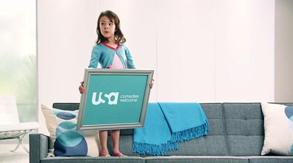
“We haven’t done any overhaul to the look of our air since 2005, when we launched [our tagline]: ‘Characters Welcome,’” says Jason Holzman, USA’s senior vice president, brand creative. “If you look at other networks, there are a lot of brands who rebrand or refresh every year or two. In the entertainment world, not having done anything since 2005 is a really long time. But we’re not of the mindset that you need to do something just to do it.”
USA also started looking closely at its branding because of its growing digital presence.
“We started taking a look at the way we represent ourselves on other screens – desktop, mobile, tablet – and realized there were things we could do to sync that experience for the viewer. We call that ‘screen unification,’” Holzman said.
In June, USA Network launched its redesigned Web site, using a “responsive design” platform, which scales to whatever device a viewer may be using. To be most device-friendly, USA put all of the site’s categories – “shows,” “schedule,” “full episodes,” etc. – on the bottom lower-left side of the screen. As a result, USA Network moved its own on-air bug to the left side of the screen as well.
After carefully studying the network’s entire brand, USA’s marketing team decided that what was needed was more of a refresh than an overhaul.
“We’ve been calling it a haircut,” says Holzman. “When you get a haircut and you come into work, your co-workers say, ‘there’s something different about you. I don’t know what it is, but I like it.’ That’s the haircut. I hope that’s the experience our viewers have. No one is going to turn into USA tonight and say ‘what channel am I watching? This doesn’t look like the channel I’m used to.’ At the end of the day, it’s not about design for design’s sake, it’s about communicating information to the viewer.”
To accomplish this brand refresh, USA made several tweaks, such as changing its brand font to Avant Garde from Gotham, adding angles and perspectives to its photography for brand and show idents and bumpers, and changing up its in and out animations, much of which can be seen in the video above. USA worked with New York-based branding agency Leroy + Clarkson to create the looks.
“USA has been a network that has been really focused on building the USA brand and I think that’s been really successful,” says Holzman. “When someone hears that there’s a new show coming on USA, more often than not they say, ‘I like USA so I’m going to check out that show. They trust our brand.”
Tags: