


__twocolumncontent.jpg)


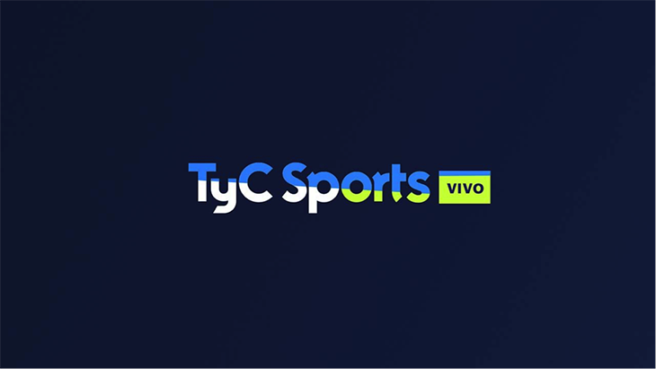
TyC Sports’ passion for soccer resonates loud and clear in its most recent rebrand —a project that grew out of a partnership with Argentine creative studio Lumbre.
Javier Gori, supervisor of CAE (Electronic Art Center) at TyC Sports, says the channel was looking to update its motion graphics know-how.
“Like any other team, we had some short-comings and I was interested in improving them,” he said. I think bringing on a prestigious studio such as Lumbre was a great opportunity. We learned a lot of things along the way and now it is the time to put them into practice.”
The two partners—which had known each other for around 20 years—framed the project around a rebrand that emerged over the course of a month and a half.
“We were on the same page regarding theory, so we approached the consultancy as a field experience,”says Pablo Encabo, executive producer, Lumbre. “Also, we understood that the difference between them and us is that we are not an in-house team, where there are other demands which make it hard to focus on a single project.”
In turn, Sergio Saleh, Lumbre’s creative director, recognized the challenge of defining specific skills to teach TyC Sports’ CAE team, since they were already on the same page.
“It is a television team working for television, with a clear understanding of their role in all aspects. So we decided to position ourselves from their perspective, then we analyzed how they were addressing these projects and shared with them how we would approach them,” he says.
An Epic Brief
Lumbre designed the workshop around a detailed schedule that included weekly tasks, so the rebrand was approached with plenty of time and many elements already set, something that was unusual for both entities.
The brief also was created together as a team, incorporating a range of needs across the network, including technical, artistic, operational and aesthetic requests.
“For us, it had to be broader than just transferring the concept into the look, feel and tagline,” says Saleh.
On one hand, TyC Sports needed a package that worked on multiple platforms.
“The latest branding had been developed more for television than for social media and new technology, so the idea was that it had to be suitable for a variety of platforms,” says Gonzalo Gómez, head of CAE and promotions at TyC Sports.
On the other hand, the promo editors and marketing team asked for more adaptable graphics and projects that were easier to edit.
“There was this need to adapt to the times; to move the language of the package away from TV and more toward a multimedia tone, where the graphics had less weight and a different place within the content. The package had to be simple and plain with a light footprint, but it also had to communicate the message. In addition, the graphics had to be unified and easy to work with,” says Encabo.
‘Overflowing Passion’
Besides aiming to satisfy all the requirements, the two teams worked conceptually to rethink what TyC Sports stood for as a channel.
“[TyC Sports] differs from other channels in that all its hosts and journalists are very passionate,” says Saleh. “Many are known for their emotional outbursts, marking them as true Argentines who are crazy about soccer.”
During their research, the team focused on the worldwide television market, exploring channels that were not necessarily sports-specific and that addressed other types of content such as comedy, film and action.
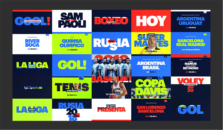
Several phrases emerged that resonated with the spirit of TyC Sports, such as a channel that is “bold,” “loud,” “frank,” and “has no filter.”
From there, they reached the idea of “overflowing passion.” Although it was not used as a tagline, it served as the title of the package and the conceptual thread of the entire project.
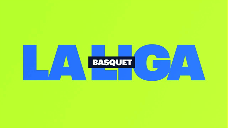

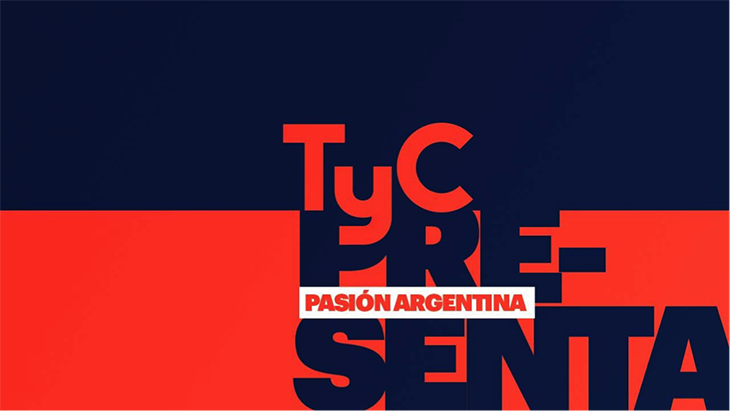
‘Bold’ Typography
Another request was that the typography be large enough to be clearly read on any device.
“We needed to transfer the impact of television to cell phones and make sure the pieces could be created in a fast, simple way, while keeping the spirit of the channel,” says Gómez.
“This request was useful for the conceptual aspect; this is a channel that speaks loudly, says things frankly and has little filter,” added Saleh.
With that in mind, the graphics burst on to the screen with bold, letters and shaking, unstable text.
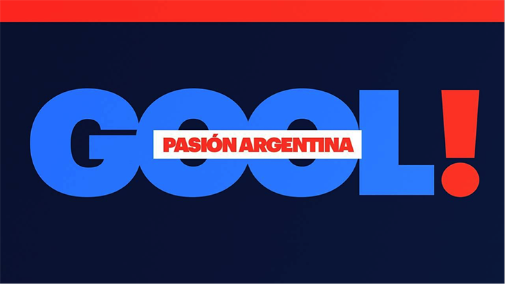
Settling on a Saturated, But Simple, Graphics Palette
When it came to color, the team tested several different animations to come up with a suitable palette.
“We analyzed what’s behind this flood of passion, and how a color can represent that emotional overflow that spills from a subtle element or a single strong passion,” says Adriana Campos, art director at Lumbre.
The final result is that the colors also seem to be shouting. They are saturated, simple, and vivid.
“They are temperamental colors. We found the right balance; it all coexists and everything is tied to everything else,” says Campos.
The palette was developed to align with the channel’s scheduled events, and programs along with the institutional branding that consolidated the proposal—pulling the colors orange and blue from the previous look.
“Each program of TyC Sports is a universe of its own, which is why the look does not relate much to the channel’s branding. What we proposed was to create a package in which the institutional colors fused with those of the programs, so that they coexist,” says Saleh.
Teamwork
One of the benefits of the joint project was how well the teams fit together.
“I believe human relationships are always the most difficult part and, in this case, they worked very well,” says Gómez. He considers the new look to be a good representation of the soccer fanaticism that TyC Sports projects.
It also showcases the channel as a whole, with a “soccer-crazy vision that goes beyond sports,” says Saleh.
“We wanted the workshop to go beyond this new branding and offer the channel certain mechanisms with which to approach other projects in the future,” says Encabo.
He describes the rebrand as an identity with argento flavor: “It is not the same as Argentine; argento is how Argentines see Argentina.”
“This rebrand is like a tango dancer that uses slang,” says Campos, referring to jargon typical of Buenos Aires that combines Italian and Spanish words to create a sort of new dialect.
“Now it has a code of its own, and that allows it to stand out from other sports channels on a visual level.”
Version español: El Rebrand de TyC Sports desborda pasión
Tags: lumbre tyc sports