It may feel a bit strange at this moment, to cover a television network –or anything, really – in Poland without mentioning the heartbreaking conflict raging nearby. But in the spirit of TVN7’s effervescent new rebrand, we’re going to try.
This is a project, after all, with a stated goal of helping you “free your mind,” said Ezequiel Rormoser, executive creative director for Superestudio, the Argentinian design company that led the rebrand, “…to let go and forget about your problems.”
So in the spirit of the new TVN7, let’s set aside the global turmoil weighing heavy on our hearts for a few minutes, and dive into something a little lighter.
The younger sibling of Poland’s free-to-air TVN network, TVN7 is a general entertainment channel with a youthful vibe. Its previous look, designed by the German agency Luxlotusliner, came about when Discovery acquired its parent, TVN Group, in 2015.
At the time, the plan was for TVN7 to “focus mainly on movies,” said Piotr Rucki, head of on-air promotion, thematic channels, TVN Group. That inspired a “purple and anthracite color scheme that was glamorous but also a bit abstract.” Soon after launching under Discovery, the network’s focus switched to more original, youth-oriented fare – and the new programming, Rucki continued, began to “really clash” with the old look.
Enter Superestudio, who Rucki first encountered at an event with which many readers are likely very familiar.
“Obviously, the best place to look for branding inspiration is Promax,” he chuckled. “We met the Superestudio guys for the first time in Rome at a Promax conference. They presented their work to me and I liked it a lot. I told them right at the beginning that TVN 7 was a thing I would like for them to take part in.”
TVN7 had already entered the world of premium cinematic content. Now, it was time to lighten up, create more originals and endear itself to a younger Polish audience.
“Polish viewers love TVN7 for being so easy-going and carefree and showing all sorts of emotions,” Rucki said, “but mainly focusing on the positive sides of life. Inclusion is quite important to TVN7, and we focus on producing content for everyone so that everyone feels welcome here.”
As such, the network “wanted to be really uplifting and colorful, easy-going,” Rucki continued. “Superestudio comes from the country of the sun – Argentina. They’ve got tango, we’ve got polonaise. It’s a different kind of spirit, so I thought it would be perfect.”
Before their collaboration could happen, however, the world began to change.
“With the pandemic and worldwide crisis lurking behind it, it was very difficult to get funds” for a rebrand, Rucki said. By the time a budget materialized in April 2021, Rucki’s team had “basically just a few months” to deliver the goods and get the new brand on the air. Fortunately, in Superestudio Rucki had found an unusually responsive partner at a very unusual time.
“This project was very smooth,” Rucki said. “There seemed to be good chemistry between us right from the start. They felt what we wanted and we felt that they wanted to deliver it. They sensed that we really like simplicity and we don’t like to overdo.”
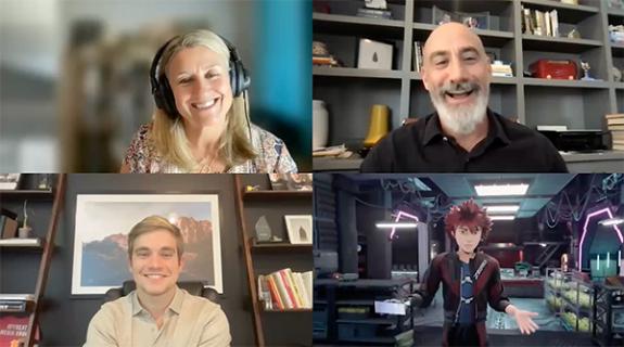
Pandemic-related travel restrictions made it impossible for TVN7 and Superestudio to meet in person, and yet something about collaborating entirely over Zoom, from residential spaces thousands of miles apart, fostered a deeper sense of creative intimacy.
“It was funny,” Rucki said. “I still have in mind the backgrounds that showed their homes where they were working – and they are very familiar with my cabin. We felt that we were at home with them and that they were at home with us. It was a very personal experience.”
The closeness Rucki describes seems to have manifested in a rebrand of striking warmth and levity. “We used the concept of lightness to create our concept,” Rormoser said. “It’s all about being elevated and relaxed, having fun.”

Inspired by the shape of the “7” in the TVN7 logo, Rormoser’s team devised a grid system for the rebrand in which everything moves from the bottom left of the screen to the upper right, tracing the northeastern directional flow of the horizontal and diagonal lines comprising the number seven.
The grid system ensures that all on-screen graphics will move in lockstep, resulting in a “very cohesive and unique brand system that is ownable by TNV7,” Rormoser said. “Sometimes the grid we create for a new brand system is kind of generic, and then what you create within the grid is what makes it unique. But in this case the grid itself is the unique thing – because this framework itself is inspired by the brand, the shape and the content.
Perhaps the most fun part about the TVN7 grid system is seeing how it manifests in the brand’s live-action and animated components. The upward-diagonal flow can be detected across an array of bright and beautiful animated bumpers and IDs that combine live-action with animation. Whether they involve dandelion seeds blowing in the breeze, a train racing from one side of the screen to the other, or even steam rising from a coffee mug, “everything goes from the bottom left to the upper right – always,” Rormoser said. “You can go from slow to fast, play with cuts and the speed of the animation to mix things up, but in the end, everything goes in the same direction.”
The emotional takeaway is a subtle sense of rising, a gentle lift from within. Accordingly, Superestudio’s sonic design accentuates the effect with a sprightly, tinkling mnemonic consisting of ascending notes that seem to float in the air.
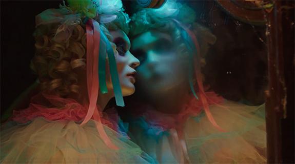
Even the new brand’s color scheme falls into the elevation pattern. A hypnotic blend of pastel greens, yellows, pinks and purples, it morphs and lulls in a sea of drifting gradients that “themselves follow the grid,” Rormoser said. “You can see the gradients move in a diagonal way. It’s almost like a cloud. Their shapes are amorphous. You don’t see the colors the same way each time. We wanted the colors to have smooth animation, an almost organic feel to create this idea of relaxation, elevation.”

At a tense and tumultuous moment in a country at the literal edge of chaos, it may seem frivolous to celebrate the brand packaging of a lighthearted television channel that just wants to have fun. But these are the moments when we look most intently to our entertainment outlets for relief and sustenance. TVN7 and Superestudio have crafted a rebrand designed to make people feel good. For that reason, the timing could not be better.
Tags: rebrand superestudio tvn7




















__twocolumncontent.jpg)
