


__twocolumncontent.jpg)


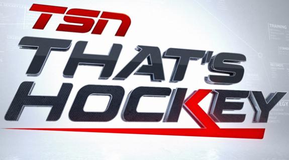
When Canada’s No. 1 sports network, TSN, decided to rebrand “That’s Hockey,” it wasn’t just updating the look and feel of its flagship daily show. It was redefining the dialogue around a national obsession.
“They speak of one sport, and it’s hockey,” said Gil Haslam, creative director for Troika, who partnered with TSN for the recently launched “That’s Hockey” rebrand. “It’s the national conversation.”
Haslam and the Troika team came to see “That’s Hockey” as the catalyst of that hockey-related conversation. A typical “That’s Hockey” viewer can “take on that information,” Haslam explained, “then go to the rink that night and be able to have a more intelligent conversation with someone else, and then that [new] person [at the rink] would be able to go on and have a more intelligent conversation with someone else,” and so on and so forth.
During an early onsite intake at the network’s headquarters in Ontario, a TSN executive told Haslam that the impact of all this data exchanging “makes the viewer hockey-smart,” a statement the creative director now believes to be “one of the greatest quotes I’ve ever heard regarding the positioning of a show… What that meant was that people tune into the show for the conversation, the analysis, the intelligence that’s behind the breakdown of the [topic of the day], whether it be a trade, the standings, the off-season or whatever.”
Haslam’s team went on to distill that vision of hockey enlightenment via the sharing of information to a conceptually-driven “That’s Hockey” identity built on the notion of a conversational “chain reaction.” Using Cinema 4D and After Effects, its resulting graphics aimed to visually ignite nightly conversations around hockey, blasting and spinning through hot topics with the twisting, frenetic energy of the game.
Emulating the kind of in-your-face closeness that only hockey can provide, Troika “wanted to talk about the proximity to the sport itself,” Haslam said. “We have a macro look at [TSN] as a brand, and they have a macro view of what’s really going on inside of hockey. They’re so close to the sport and that’s why we’re so close. Both in the words and in their coverage there is credibility, but it also has this entertainment aspect because in the end, the hockey conversation for them is what is great fun… to be smarter than the next guy. It’s that one-upmanship that we’re really trying to capture in the overall package.”
In the “That’s Hockey” open, frames featuring clips from the day’s news peel off as large-scaled related words, or what Haslam called “conversation points,” slam in with the force of a good cross-check: “Teams,” “Players,” “Injuries,” “Performance,” and so forth. The energetic pattern continues across segment opens, transitions and bumpers. The fun of the graphics design process, Haslam said, was modeling and [abstracting out] iconic hockey imagery, from face masks to skate laces, and “hiding those abstracted elements of hockey inside of all the words or components.”
The final rebrand package lets TSN keep the new identity fresh for each one of the 365 days per year on which “That’s Hockey” airs without compromising high production value throughout. In the end, Haslam said the development process was helped hugely by the cohesive vision of TSN’s in-house team.
“Everyone from top management to the designers who were going to work on the package understood what their brand was,” he said. “Instead of people saying, ‘I like this,’ or ‘I don’t like that,’ they kept measuring [the work] by, ‘does this fit our brand?’ TSN is so tight as far as their focus, their color, their details. You really know what a TSN product is.”
[Images courtesy of Troika]
Tags: