


__twocolumncontent.jpg)


As television companies grow and evolve, so, to, do their visual identities—or at least they should. Rebrands can be as simple as refreshing a look with a shiny new logo, or as complex as a major overhaul that completely transforms public perception.
No matter the scope, rebrands are an essential marketing strategy requiring tons of thought, leadership, design and creativity. Here’s a look at our top picks of 2017.
10. UKTV Originals
New branding from this British broadcast powerhouse is crisp and satisfying with a pair of elegantly designed spots built around a hand-drawn logo to celebrate the process of television production itself.
9. Bounce TV
2D and 3D elements combine seamlessly with live-action in Bounce TV’s new look. Creative agency Elevation established a modern twist while highlighting the network’s existing lineup of eclectic programming for what ended up being “a really beautiful marriage between the two identities.”
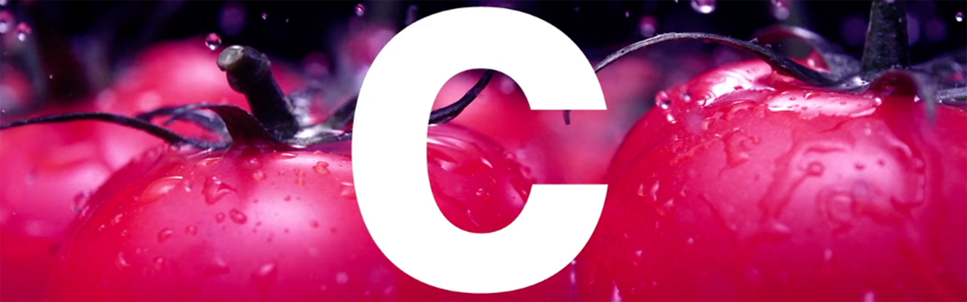
8. A+E Networks’ Global Revamp of Crime + Investigation
London-based DixonBaxi delivered on an ambitious creative brief that was about the look and identity of the channel as much as the content which, the broadcaster has said, is going to take viewers even deeper into the “heart of the criminal mind.”
7. Horror Channel
There’s something not quite right about AMC’s UK genre channel. The rebrand moves away from traditional elements of horror such as jump scares and misdirection, and instead disturbs people in a more chilling and permanent way.
6. Bundesliga
The German soccer league kicked off the 2017 season with a swift, spare 2D refresh as the sports world moves toward a clear identity rooted in functionality and information.
5. Nickelodeon Refreshes Its Brand With Help From Superestudio
The new look by Superestudio that was unveiled at the 2017 Kids’ Choice Awards reflects the “play, surprise and imagination in kids’ lives and delivers on the net’s mission to help make the world a more playful place,” the network said.
4. Cooking Channel
This refresh by BigStar draws power from the combination of ingredients as opposed to one main course. The new package warms things up considerably with vibrant photography and color palettes that are as eye-popping as they are mouth-watering.
3. Fox Premium
Designed by Superestudio, the LATAM pay-TV network unifies apps and television for a new era of “viewsership.” Even if watching on a traditional, linear set-up, the the on-air identity looks and feels as though it’s moving under the influence of human touch, the graphics swiping left and right, or scrolling up and down.
2. Syfy Rebrands as Science Fiction Content Hub
The overhaul by loyalkaspar includes a new logo and typeface across all linear and digital platforms, expanded programming and, perhaps most importantly, a renewed focus on the concept of fandom driven by its revamped news division, Syfy Wire, as the brand aims to become the go-to spot for all things related to the sci-fi genre—regardless of whether or not it airs on the network.
1. TNT
Sibling Rivalry turned the TNT logo into a kind of lens in and of itself, pointing it at powerful images from a wide range of series and essentially inserting the network’s brand right into the content.
Tags: