


__twocolumncontent.jpg)


A television show’s title sequence is about so much more than just presenting the show’s title.
Artistic designers are given anywhere from ten seconds to two minutes to capture the essence of the show to come in a series of images and sounds.
At PromaxBDA: The Conference 2016’s Thursday session called “The Art of Title Design,” five designers gave a captive audience insight into their creative process, revealing the stories behind their favorite title sequences.
Vinyl
When Mick Jagger and Martin Scorsese asked Alan C. Williams, a director at Imaginary Forces, to create a sequence that represented the 1970’s music scene in an evocative manner, he knew he was in for a challenge. “I wasn’t even born in the 1970’s, and here was Mick Jagger asking me to make him feel something?” Williams recalled, laughing with disbelief.
So the director did what anyone else would do: Research. Lots and lots of research. On not just music but fashion and clothing, drugs and culture, the women’s right’s movement and art.
“We didn’t want to show a record player,” said Williams. “We wanted you to feel music in a way you haven’t before. And one of the most important ideas was impact.”
The gritty opening sequence aimed to take what the distortion peddle did for music and reflect that in video form. This was done by replicating ‘70s artist Hans Jenny’s experimentation in animation inspired by sound and vibrations.
Williams also decided that the sequence would benefit from baptizing someone in cocaine - aka 120 pounds of flour. “Our executive producer said, ‘I’ll give you $100, but you’d better clean it up,” Williams said. “At the end of the day we wanted to show people not what rock and roll was, but to feel what rock and roll was.”
Mozart in the Jungle
The title sequence for Amazon’s Mozart in the Jungle was CHIPS co-founder Teddy Blanks’ first foray into television. “I was very excited to work on something people would actually see,” he said.
Blanks was tasked with creating ten different ten second animations that responded to ten different orchestral interpretations of the rock band Phoenix’s Lisztomania — sometimes played by a harp, sometimes horns and strings, other times just timpani and a glockenspiel.
RELATED: The Magically Morphing Main Titles of ‘Mozart in the Jungle’
“So how do we translate that idea visually? The first thing I went to was vintage classical album titles from the 1950’s and 60’s,” said Blanks. “I didn’t really have a fully formed idea at first except that they would be animated along with the music.”
Blanks allocated a different shape for each different instrument. For example, triangles for the harp, circles for horns, squiggles for strings, and “gash-like openings” for woodwinds. He would then listen to the soundtrack and make pencil marks for the number of times each instrument played a note, making the shapes dance with the melody.
Wayward Pines
The instructions M. Night Shyamalan gave to Picturemill for creating the title sequence for his show were just as cryptic as you’d expect them to be.
“He asked, Can you make something about a show we can’t tell you anything about,” said Picturemill head and creative director William Lebeda. “He was forthcoming that it was about a town called wayward pines, and there’s a secret behind the town and what’s going on will be revealed over the season.” But that was about it.
With that information, Picturemill pitched four different concepts. The first showed a seemingly perfect town with ominous undertones, the second showed a perfect town with no people in it except for a man trying to run through the woods, the third had a split screen displaying the town moving both forwards and backwards in time (a blooming flower juxtaposed with a decaying one), and the fourth was a stop motion animation made out of plastic toy models. The final one was the winner.
Cecilia DeJesus, the designer who came up with the selected option, recalled that at one point, “The editor and I took the model, set it on fire, and shot a bunch of footage. It’s always great whenever you have the chance to set something on fire on the job.”
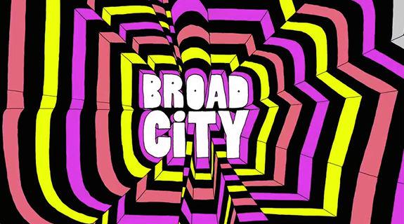
Broad City
Mike Perry, the owner of Mike Perry Studios, has created the short title animation for all thirty episodes that have made up Broad City’s three season.
“It just started with the type and I thought, let’s put a little rainbow wiggle in there and see what happens,” Perry said. “I was hired to do one logo and one design and the meeting went so well they said, why don’t you do all of these.”
The sequences are an explosion of color and design, but if you really focus on it, you can see method in the madness.
One sequence, titled “Makeout,” shows what it would be like if two colors made out. The sequence dubbed “Typographic Vomit” shows, you guessed it, what it would be like if typeface threw up. The sequences mimic the show’s irreverent humor and risqué content.
“I had to get the FCC to approve one of them,” Perry recalled. “The letter ‘A’ fingering the letter ‘D.’ After we got away with that, I was able to do whatever.”
Tags: