


__twocolumncontent.jpg)


Disney-owned global sports goliath ESPN collaborated with Buenos Aires-based design agency Superestudio to rebrand its international channels in key territories such as Latin America, Africa, Oceania and Southeast Asia.
The agency was awarded the rebrand project following a successful pitch in which it presented a design solution targeting a younger audience and unifying the brand across multiple territories and sports.
Working directly with ESPN’s Andre Quadra, head of international marketing, and Tomas Casabal, creative senior manager, Superestudio delivered a full 360 rebrand for ESPN in those markets.
Super-serving the sports fan
With ESPN’s brand commitment, “to serve the sports fan,” the emotive rhythms of both fans and sports were used to define the branding style both in motion and attitude. Loud became the theme that formed the design package’s foundation. That was carried through all the creative.
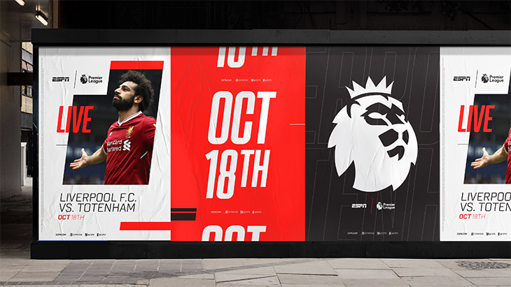
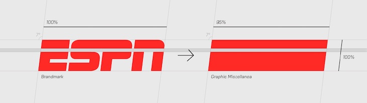
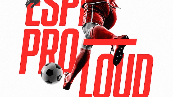
The iconic ESPN logo fueled elements of the design package. A seven-degree grid mirrors the logo’s angles and sets the structure that houses the graphic elements across the channel and all other brand touch points. An abstracted ESPN logo provides additional design objects that add to the multi-layered toolkit.
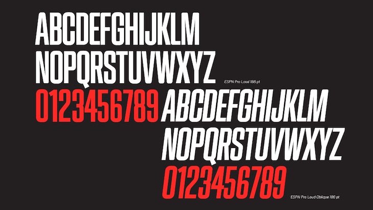
To capture the loudness and boldness of the brand concept, a custom typeface was designed and produced. ESPN Pro Loud was developed in both regular and italic fonts, and is designed to add heroic stature to the branding package.
“This rebrand needed to work across many different international territories and a range of different sports,” said Casabal. “We wanted some freedom within the package that gave flexibility to the regions across our global footprint, but also remained true to our brand essence and heritage.”
Sports-inspired motion theory
“Our motion theory behind this rebrand was inspired by sports and the viewing experience,” said Ezequiel Rormoser, executive creative director at Superestudio. “In sports, it is about being fast and strong, calm but sharp, passionate and loud. Our design reflects and captures all of these emotions and the nuances of sports as a whole.”
To support this motion-theory idea, Superestudio created type and graphics animations that mimic the motion within different sporting activities, like the linear forward motion of racing, the upward motion of basketball and the punch of boxing.


A key part of the brief was creating a brand that would appeal to a younger audience, aged 18 to 30. Superestudio brought a modern and edgy feel to the packaging, especially in the ident execution, in order to capture the attention of this elusive demographic. Fun and vibrant elements not traditionally seen in sports-channel branding were used to give the overall look the kick of youth it required.


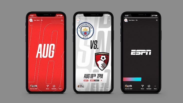
Taking a Multi-Platform Approach
“All branding has to work in many different formats across many different platforms these days,” said Rormoser. “Our design package for ESPN has to work as well in 16:9 as it does in 9:16.”
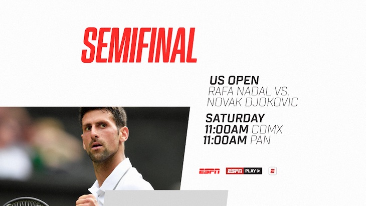
Superestudio provided design layouts for all off-air collateral as part of the rebrand project, including digital, mobile, print and out-of-home. Key to taking the brand from the channel to these platforms was a consistent design principle held together by loud type and striking, emotive imagery.
ESPN’s new channel branding will be rolled out across international territories starting in December. For more information, contact Ezequiel Rormoser at Superestudio.
Tags: espn sponsored post superestudio