Now that the dust has settled from this year’s Emmys, the entertainment marketing community can finally focus on the category that really matters: outstanding main title design.
Produced by Ben Stiller’s Red Hour Productions, Apple TV Plus‘ Severance took home the prize this year (along with outstanding music composition for a series), and it’s not hard to understand why.
Rarely has a main-title sequence captured the interior mind of a show’s protagonist with such squeamish intensity. In Severance, Adam Scott’s Mark works at Lumon Industries, a mysterious corporation whose employees have agreed to undergo a “severance” medical procedure that separates their work memories from their memories of their personal lives. This means their brains are divided into two wholly disconnected parts, creating two sides of the same person—one who only knows life outside of work and another who only knows life… at work. If that sounds like a hellish existence for the at-work version of Mark, it is, and Severance depicts it with terrifyingly stark panache.
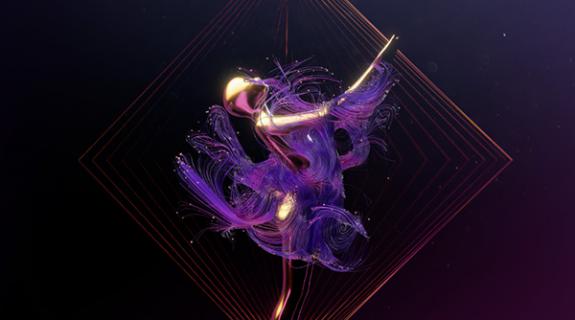
But where the show itself is a master class in cringe comedy and arid, vacuous world-building, its main-title sequence takes the opposite approach. Mark and the objects around him are squishy and floppy. The seemingly firm barriers between rooms and floors turn to gloop at a moment’s notice as Mark stumbles, tumbles and melts between different surreal depictions of his existential dichotomy.
The duodenal fluidity of this realm, the way bodies writhe and multiply, is the work of its creator, the German artist known as Extraweg AKA Oliver Latta. A popular Instagram presence, Latta built his following by bringing textures to life in 3D animation with often discomforting vividness. His work online is rife with crinkling fabrics, squishy liquids, and quivering eyeballs so visceral they seem to jump off the screen.
“I want to provoke and sometimes confuse,” Latta told Brief via email. “I want to pull the viewers out of their comfort zone and what is most important, I want to make them feel something and force them to think.”
Certainly Ben Stiller was provoked. Scrolling through Instagram while still in preproduction for Severance, he came across one of Extraweg’s videos involving babies coming out of a brain and turning into jelly.
“I thought, ‘This is amazing,” Stiller said, recapping the experience in an interview with NBC’s Seth Meyers. Shortly thereafter, Red Hour reached out to Latta to see about working together.
At the time, Latta’s work was going viral (the reason it found its way to Stiller’s feed) and he was overwhelmed by “hundreds of messages and requests every week” across his social media and email accounts. When one of the emails arrived from Red Hour asking about collaborating together, Latta “didn’t believe it at the beginning.” But not even a week later, he was on the phone with Ben Stiller.
To start the creative process, Latta received little more than a script for the first episode from the Stiller camp.
“I actually started from scratch,” he said, “because I didn’t get any visual references from the show.” Still, simply reading Severance‘s pilot script uncovered “a lot of material to work on,” Latta continued. “It was a great starting point.”
After reading the script several times, Latta started breaking down the themes and creating mood boards. A vision emerged in his mind, a notion to “illustrate the struggle” of a main character whose life is split with nightmarish exactitude between professional and personal realms. The images in his title sequence, Latta realized, “should use surrealism and subtle ironic humor” to represent Mark’s “mystical journey of different identities, memories of experiences, grief, loss, and control.”
Eschewing photorealism, Latta hit across the idea of 3D-scanning Adam Scott’s face and then manipulating it digitally to create “a weird world between real and fictional.” Red Hour arranged the scan with Scott in New York and, without ever “actually needing to talk to Adam Scott directly,” Latta got to work. Instead of interfacing with Scott, he used reference pictures in tandem with the Houdini 3D animation software as well as Marvelous Designer, a leader in the fascinatingly specific category of “cloth-making programs for 3D artists.”
At his office in Berlin, Latta used a motion-capture suite to craft Mark’s body language – again, without actually having Scott on the premises. Even more surprising is who the person in the motion capture suit was instead.
“Most of the movement you see is actually myself,” Latta added, an astounding claim considering the tentative floppiness of his animated Mark is pretty much exactly what one thinks of when imagining what Adam Scott might look like while reeling from the mental and physical anguish of a man literally trapped in a workplace hell.
Latta’s soupy, squirming animation serves as a direct counterpoint to the typeface in the title sequence (the literal titles)—a lean, elegant lettering that mirrors the stark, clean vibe of the Lumon Industries interiors. Musician and graphic designer Teddy Blanks designed the typography, and shared the Emmy win with Latta on September 12. He told Brief that he happened to be a fan of Extraweg’s on Instagram before ever coming onto the Severance project.
“I love the surreal, dreamlike imagery [Extraweg] creates, how he takes recognizable human forms and turns them into these bizarre, rubbery globs,” Blanks told Brief over email. “It’s funny and disturbing and you can’t take your eyes away from it. I wanted my work on this show to take a back seat to his. So the challenge was how to create something with typography that was distinctive and iconic but didn’t in any way distract from Oliver’s work.”
To get there, Blanks took inspiration from the mid-century classic, Helvetica, one of the world’s most famous fonts.
“There are dozens of fonts from the last 60 years that are riffs on or evolutions of Helvetica, and this is mine,” he said of the Severance font. “The lowercase is a hair taller than in Helvetica, which makes it more friendly. And there are a handful of divergences, like the fact that the lowercase j is just a line with a dot on it, or that the y has a straight tail instead of a curved one. Little details that add up to a feeling that you’ve seen this lettering before, but it’s just slightly off-kilter.”
Sometimes a thin line materializes above the title treatment at hand, extending out over the given credit like a low-hanging roof. Blanks described this effect as a direct reference to a particular style of corporate branding of the ‘50s, ‘60s, and ‘70s, popularized by graphic designers like the great modernist, Massimo Vignelli. “But,” he added, “it’s also a subtle nod to the line dividing the characters’ lives in the office from their lives at home.”
Blanks previously worked with Stiller designing titles for the director’s Showtime limited series Escape at Dannemora, but Severance offered an even bigger canvas on which to play.
“I usually work alone when designing film and TV titles, and as a result I don’t often get the chance to work on such highly-produced animated sequences,” he said. ”Severance was a great opportunity for me to be a small part of something that felt truly big and spectacular, and to collaborate with another artist I really admire.”
In Latta, he seems to have found a kindred spirit in terms of finding new opportunities to expand horizons and blow minds.
“We live in a world saturated with information in which, unfortunately, few things attract our attention or surprise us,” Latta said. “I have the opportunity to show everyday situations represented with a new visual language to shake people and force them to think for themselves.”
Tags: apple tv plus extraweg main titles severance teddy blanks


















__twocolumncontent.jpg)

