


__twocolumncontent.jpg)


Refurbishing a brand as large and established as Discovery seems like an intimidating task, but Los Angeles-based creative agency Roger’s approach was to keep things clean and simple to achieve maximum impact.
Two things were already clear—and in place—before Roger ever got to work: First, Discovery’s brand is largely based on stunning photography so any rebrand and graphics package needed to be designed to emphasize and supplement the images. And second, Discovery’s brand is already well-known so the goal was to build on that equity.
“As you know, Discovery has been around for a long time. They have a lot of equity in the brand and in the different logo variations they’ve gone through,” said Roger Creative Director Braden Wheeler. “And so in the beginning of the process, they were very specific that they needed to maintain that integrity. The new logo had to maintain the D and the globe, and they knew they wanted a blue color to be involved.”
In some ways, establishing those very clear boundaries made the project easier.
“Personally, I think that having constraints is always very helpful,” said Wheeler. “If someone tells you to draw a picture of anything, you kind of sit there dumbfounded. But if someone says, ‘draw me a picture of a boat,’ you have somewhere to start.
“In this case, obviously, they were quite prescriptive. And I think that that made it an exciting challenge because it was a bit of a puzzle and you have only a very few ways that you can improvise on it. In my opinion, those constraints are kind of exciting.”
Roger also wanted to take the existing Discovery logo (below, left) and flatten it out, taking it from 3D to 2D, which gives it a more modern feel, Wheeler said.
“Ultimately, our goal was to clean things up,” said Wheeler. “One of the things that we were pushing was to go down more of a 2D route. Obviously, when you’ve got a globe, things tend to lean more 3D. We thought that doing something 2D, since they’ve been traditionally 3D, would make more of a bold change to the brand. And in their initial brief—or at least in our discussion about it—they talked about their desire to do so as well.”
“We had all of our designers get together and start sketching things up—trying different things and breaking the rules, and then sticking more closely to what’s been done in the past, but tweaking it.”
While those designers did lots of mock-ups, including a 2D version of a map of the globe, the logo that ultimately prevailed was one of the very first ones sketched out (below). The full logo includes the entire word, but a much more compact version that’s just the globe inside of the D also was created.
Picking fonts, colors
Once the logo was established, design decisions became easier because they emerged from those initial choices. Roger went with a very simple, clean and bold font called Sharp Sans.
“When we were looking for font direction for the brand, we were looking for something that could be big and bold, and speak to the likes of the Diesel Brothers [and other Discovery shows],” Wheeler said. “[We wanted something] high energy that pumped up excitement, but also was elegant, clean and simple and very personable. We were looking for something that could fill both of those challenges and we ended up landing on Sharp Sans, which is created by the Sharp Type Foundry.”
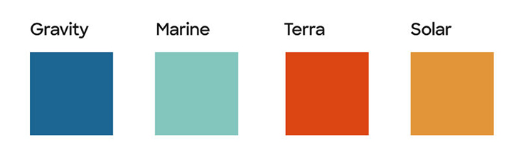
And while the color palette isn’t as important in this brand package due to its reliance on photography, Roger did make some color choices to help guide Discovery’s look. The rebrand’s predominant colors are off-black and off-white, which in the context of Discovery’s culture of exploration and science are named Void and Polar. The main brand color is Gravity, which is a shade of blue just a bit different Discovery’s previous brand blue.
“The previous hero color was pretty much a navy blue. This one is kind of in the middle, it’s a little bit on the darker side of the middle in the range. It was a pretty big departure for them in terms of their blue, but they were not dying to heavily lean on a central brand color.”
Accent colors include Marine, Terra and Solar, which are shades of aquamarine, red-orange and goldenrod, respectively.
“Everybody loves to name colors, so it was a fun part of the process,” said Wheeler. “In our early conversations with them we had pitched some black- and-white designs, which, as designers, we always do but no one ever picks it. But they were interested in it and that was pretty exciting.
“But then you need some color to introduce some accents, and make sure you’re not just totally black and white. So we developed a small palette of colors, including the main blue color. The brand has people in the jungle in Naked and Afraid, and Diesel Brothers driving trucks to the desert—all these different locations and different settings. We wanted to kind of give a handful of colors to accents in the palette that would either compliment or contrast the footage that’s being used.”
Creating the D Frame
Taking a close look at the logo, there’s a spot of white space between the globe and the inside curve of the D that inspired the Roger team to create what they call the “D Frame.” That frame serves as the base of the animated graphics package.
“Being a content-focused brand, we have to show the content, so we were looking for ways to create designs that were focused around frames. We had a lot of initial designs with more simple, traditional rectangular frames. But one of the issues was that [we and Discovery felt they] really needed to own this brand, and, you can’t really own a rectangle. We always look for ways to bring something from elsewhere in the brand. Obviously, the D is something they are very focused on and historically has been a large part of their brand,” said Wheeler.
Initially, Roger considered rounding off both of the frames’ upper and lower right corners to make them look more like the D from which those curves were being drawn. But “ultimately, I wanted it to be a little more abstracted, so we just applied it to the bottom right corner. That gave us an oval shape that we could start to explore,” said Wheeler.
In the end, the beauty of Roger’s rebrand is how it all clicks together, said Wheeler.
“This lock-up of motion of the D—the way it locks up with the globe—that brought us to this sense of activation that ended up ultimately creating the whole motion language of the brand. The globe is the heart of everything that Discovery does. That’s one of the things they really got excited about with the new logo. From some of our first presentations with them, we gave them motion tests of all these things. We had a really energetic, frenetic language to it. That was all born from this early exploration where we locked those first two pieces together. It was kind of magical the way that one little thing sparked the whole process.”
See how the entire rebrand works together in the below brand sizzle:
Hooked on a Feeling
CREDITS
Client: Discovery
Group EVP, Marketing: Lara Richardson
SVP, Marketing Strategy and Ops: Josh Kovolenko
VP Creative, Marketing: Jason Turner
VP Marketing Strategy: Megan DeSouza
VP, Branded Entertainment: Michael Eisenbaum
Senior Director, Production - Marketing: Daniel Oleksiuk
Branding & Design Agency: Roger
Executive Creative Director: Terence Lee
Executive Producer: Josh Libitsky
Head of Production: Liz Catullo
Creative Director: Braden Wheeler
Senior Producer: Anne Pendola
Associate Creative Director: Dave Abel
Art Director: Micah Hahn
Lead Animator: Shawn Lee
Design/Animation: Sam Surtandi, Siwan Seok
Tags: 2d animation discovery logo rebrand roger