


__twocolumncontent.jpg)


With mobile rising to become, if not the dominant space where TV content is consumed, at least a very important one, there’s no reason a network’s promo packaging can’t follow suit. Or at least that was HBO‘s reasoning when it brought in Buenos Aires studio Plenty for its Latin America rebrand. The objective, said Plenty co-owners Mariano Farias and Pablo Alfieri, who emailed with Brief in tandem from Argentina, was “to give the impression that the viewer is controlling the screen like a tablet, and also that the channel’s high-quality footage (due to its original productions and excellent talent) should play a major role on the screen, on top of the graphic system. The idea was the viewer feels that they are browsing through the HBO catalog.”
Below, Farias and Alfieri explain how, with the help of an unusually long eight-month development period, they were able to achieve all that and then some.
“The first step was to design the Navigation system, a see-through graphic interface with a very neat animation style that resembles tablet device touchscreens. This way, the viewer would feel as if he would be touching the screen and choosing what to see. The HBO logo plays the role of the mouse cursor or the finger that selects the content you want to watch, achieving the goal of showing quantity and variety.”
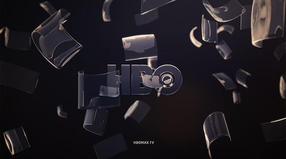
“The IDs, where the channel shows its spirit, would be more abstract to communicate a Premium experience to which one must pay to enter. We went for simple and geometric shapes. Glass was the perfect material for the channel, as it let us see the contents through the forms. We decided it shouldn’t necessarily have realistic behaviors and we could take the freedom to do things like bend it. The [goal] was to animate with a slow pace and a smooth-shifting speed to give elegance to the piece. We found out that slow and quiet can be ‘premium.’”
“It was hard work because the software we use to animate is not the same [that HBO uses] to edit the pieces. We animated in the platform that we usually work with and then we replicated the soft and subtle movements in [HBO’s] platform. Although it sounds simple, to get the moments to have the exact pace HBO needed was not so simple. Everything was done in 2D and 3D. HBO did not want live action since the main promo feature is their original footage. It would had been redundant to use live action as a frame for their high-quality footage. The big challenge was to make sure that the navigation package didn’t look too simple, since the IDs had a lot of CGI and post-production work, and a very high render quality. A full 2D navigation seduced us for its simplicity but worried us at the same time. Luckily we found the perfect balance.”
It was in the music where HBO on-air director Raul Hernandez Mezerhane and HBO senior art director Jesús Martinez wanted the Latin American trait to be present. The references that the client sent were Gustavo Santaolalla and Philip Glass. The first one has a Latin American sound but at the same time, [Santaolalla] uses instruments and sounds that places [his music] near what would be world music. [Glass] is a contemporary classical composer but with simple musical cadences, friendly for almost any ear and elegant in loudness [with] pianos and strings. The music is not the typical electronic loops built with library books. It is a tailored sound created with real wind and string instruments. Six sound houses pitched for the project, the winner being Mil Cables, who did an excellent job up to HBO quality. They created a leitmotif that was stuck in our brains from day one. Hopefully the same thing will happen to the audience and it turns into a trademark in the future.
Branding TV productions are increasingly complex and timing is increasingly risible. Lately we have been doing channel images with hundred of operating pieces in two or three months, working 24/7 and increasing the work structure to cover projects of this magnitude. As of today, Plenty has 17 employees, which is very rare in Latin American studios that work in channel branding, where structures usually don’t go higher than five or six people. So, having eight months to generate this [HBO rebrand] was a key factor. We put deep thought into each piece, no matter how small it was. That is super-valuable.
Tags: