


__twocolumncontent.jpg)


Grab a Summer Ale (even though it’s Thanksgiving), sit back, relax and peruse Loyalkaspar’s brand refresh of Comedy Central.
Yellow-orange not your thing? How about Trevor Blue, Tosh Red or Who Killed Kenny Orange?
All of these colors are part of the new custom color palette the New York City-based creative agency developed for Comedy Central as they went through the process of refreshing their iconic brand. The last time the Viacom-owned network did this was in 2011, when the network made the shocking choice to abandon its prior logo, which featured a globe with a skyscraper sticking out of it.
This time around, Comedy Central decided to stick with the logo it had. The mark had accrued too much recognizability in the past seven years to just walk away from it. According to Adweek, which got the exclusive on Comedy Central’s rebrand, the Comedy Central logo with one “c” inside of another is recognized by 50 percent of those surveyed without prompting, and by 70 percent of those surveyed with prompting.
With the decision to retain the logo made, the network moved on to what they thought did need to be changed. Besides the colors, as discussed above, they took a good hard look at the font.
While they liked their previous font, “Brandon Grotesque,” it had grown far too popular for its own good.
“If you go to the Oculus [at the World Trade Center], all of the shop signs in the mall there are in Brandon Grotesque,” Chris Scarlata, Comedy Central’s vp of design, told Adweek. “It’s like the Volkswagen Beetle—once you see it, you see it everywhere.”
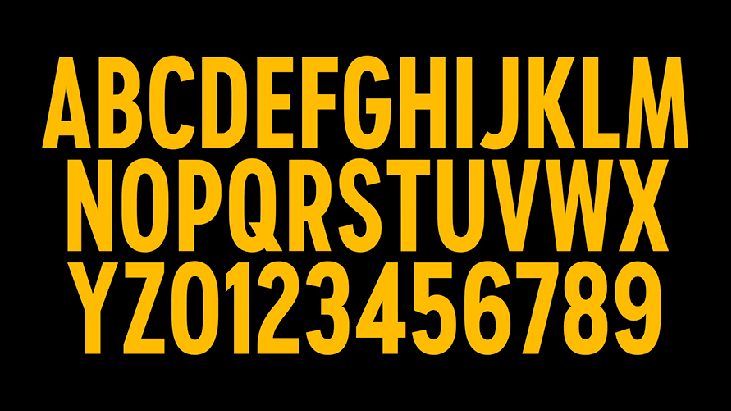
Loyalkaspar went to work and ended up creating a custom font specifically for Comedy Central called “Comedy Sans,” which has little to no relation to the much-maligned “Comic Sans.”
“We have found a custom typeface goes a long way in providing a brand with cross-platform recognition,” Loyalkaspar Creative Director Anna Minkkinen told Adweek. “On social, for example, you aren’t going to put your logo all over that content, but your typeface can speak for your network without doing a hard sell.”
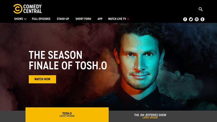
Loyalkaspar put the new colors and fonts into an overall brand architecture that the network could use on-air, online and on social. A visit to cc.com shows the brand refresh already in place.
READ MORE: Adweek