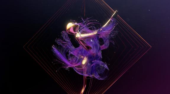
For the main titles of Apple TV Plus’ Platonic, Chicago-based agency Sarofsky went simple and subtle, creating a sequence of blue and pink lines that chase after each other in sometimes straight, sometimes curlicue patterns.
The series stars Rose Byrne as Sylvia, a happily married but somewhat unfulfilled woman, and Seth Rogen as Will, a middle-aged man-child going through a painful divorce. In college, they were great (and always platonic) friends, but have grown apart as they grew up and got married. Now, reunited, they pick up where they left off with their antics. The series investigates how societal norms dictate male-female friendships.
“We explored male/female relationship dynamics visually with simple lines,” wrote the Sarofsky design team on the company’s website. “The blue and pink strands evoke the personalities of Will and Sylvie; the way that they flow, intertwine, separate, influence, and confound each other. At times they become pieces of larger patterns only to break out and play on their own once again, and yes, cause a bit of chaos along the way.”
As the sequence evolved, Sarofsky realized it made sense to create its own hand-drawn typeface with words emerging as extensions of the pink and blue lines.
“The lines could literally flow into and out of the titles allowing us to harmonize them fully while not obscuring the letterforms. It’s rare to have the cast and crew credits to be so integrated into the key visuals within a main title and we are so excited that it all lives as one visual language,” Sarofsky wrote.
The team also created a hand-drawn logotype for the show. Inspired by Helvetica Warped, the logotype merges and transitions the lines into a single character. According to Sarofsky, “the titles are styled after generic stencil type, which extends from the dual-line theme. Loop-de loops were added to the W’s, M’s, and R’s which added whimsy and connected it to the line-work throughout.”
The long main title aired on the series’ first episode, which premiered May 23. It’s set to Dashboard Confessional’s version of “We Used To Be Friends” by The Dandy Warhols.
After the first episode, the main titles evolve into a short custom title card tailored for each of the season’s remaining nine episodes. Each card includes a fun final illustration that relates to that episode.
“Sarofsky has the most amazing capacity to realize an abstract idea and elevate the whole experience of the show by making it so. freaking. cool,” said Francesca Delbanco, show creator, in a statement.
CREDITS
Client: Apple TV Plus
Created by Nicholas Stoller, Francesca Delbanco
Producer: O’Shea Read
Post Production Supervisor: Haley Schaeffer
Agency: Sarofsky
Executive Creative Director: Erin Sarofsky
Executive Producer: Steven Anderson
Creative Director: Stefan Draht
Producer: Andrew Rosenstein
Animators: James Wignall, Eric Larson, Nik Braatz, Lirio Ramirez
Illustrator: Tricia Kleinot
Music (episode 101): Dashboard Confessional’s version of “We Used To Be Friends” by The Dandy Warhols





















__twocolumncontent.jpg)
