


__twocolumncontent.jpg)


When it came time to streamline its brand in an entertainment environment that is bursting with streaming choices, Hulu partnered with London-based creative strategy agency DixonBaxi to unify and simplify its brand.
The result is “This is One Hulu,” which takes the initial brand promise of Hulu—a Chinese word that means “gourd” or “vessel to hold precious things”—and turns it into an entire branding system.
The concept is simple—sticking with Hulu’s trademark green color and even brightening and bolding it a bit, DixonBaxi worked with Hulu’s in-house agency Greenhouse to turn the notion of vessel into a shape that contains the Hulu experience for the viewer. The vessel emerges from the final “u” in Hulu’s name and contains everything Hulu has to offer. The idea is that everything someone seeks in entertainment—original series, movies, live TV, sports—can be found on the service. Disney-owned Hulu currently has almost 40 million subscribers.
The brand premise was fueled by four design principles: put story first, be warm and delightful, do it differently and, simply, be essential, according to DixonBaxi.
DixonBaxi also collaborated with London-based Zelig Sound to create a new four-tone brand mnemonic, a feature that is increasingly essential as streaming apps proliferate.
The sonic network ID runs through all of Hulu’s key brand interactions from platform startups to pre-rolls and campaign end tags, giving viewers an audio cue to associate with the streaming brand.
DixonBaxi also streamlined the brand identity to one typeface—sans-serif Graphik, which the brand can use in all of its weights to bring character, swagger and style. Additionally, the team designed new icons to help viewers easily find their way through the service.
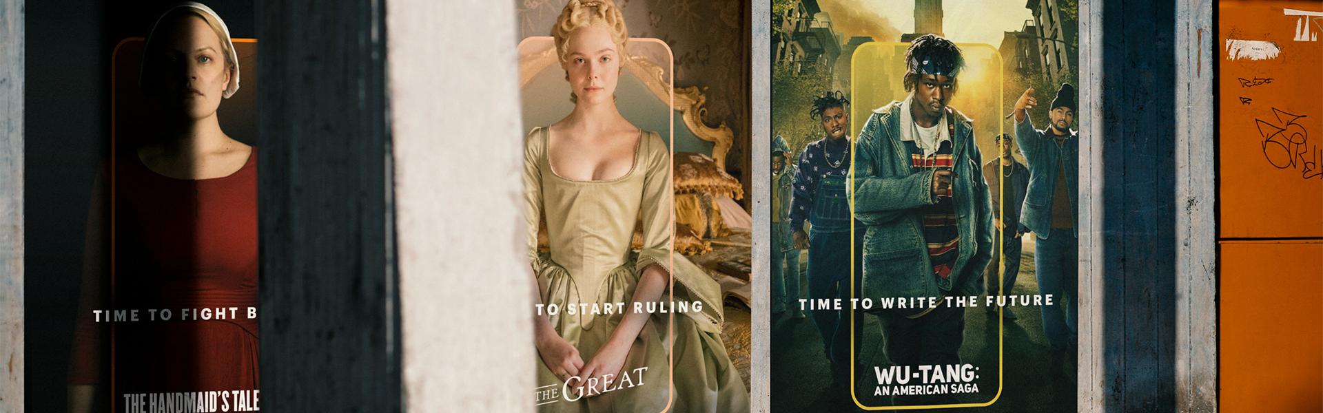
Hulu has launched its new branding as an out-of-home campaign across the U.S., and is rolling it out across every part of the Hulu experience online, on screen and in the app.
Tags: dixonbaxi greenhouse hulu rebrand