


__twocolumncontent.jpg)


Burbank, Calif.-based Midnight Oil partnered with the Television Academy to establish the official aesthetic of this year’s 68th Annual Emmy Awards.
In addition to creating dynamic, high-concept key art—adapted for use across all advertising and promotional mediums— the agency’s collaboration with the Academy generated stunning motion graphics and premium quality invitations for each of the three awards ceremonies.
Evolving the Emmys
Although the iconic aspects of the Emmy brand identity remain consistent from year to year, the Academy values innovation in the form of fresh concepts that raise the bar with each consecutive season. As thought-partners of the Academy, Midnight Oil launched its collaboration by reviewing previous campaign looks and mapping out their continued evolution.
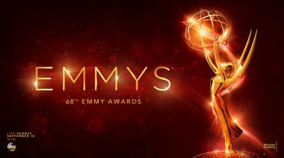
Midnight Oil developed this year’s sleek, modern concept starting with an elegant color scheme of crimson and gold against a stark black background.
Drawing inspiration from the Emmy statuette concept originally designed by television engineer Louis McManus in 1948 — which features an idealized, winged woman holding an atom — Midnight Oil created high-concept key art that would reflect the fusion of arts and sciences integral to the Academy brand.
Blending the glamour of classic Hollywood red-carpet moments with striking gold elements mirroring the Emmy statue, Midnight Oil’s concept was intended to honor the scope and history of the Emmy brand, while simultaneously contributing to its evolution.
Event Horizon
Midnight Oil’s next objective centered on bringing the story of that image to life beyond the static frame with a motion-graphics package of the key art reveal to appear with titles when introduced on-screen during the telecast. Starting with conceptual storyboards that illustrated the reveal for various executions, the agency explored different approaches to telling the story that would uphold its overall efficacy and dynamism.
The “horizon” concept Midnight Oil developed for the motion-graphics package serves to maintain the same art-science metaphor that informs the key art. The story truly comes to life when the viewer rolls off the edge of what looks like a golden planet. Upon pulling back, it becomes clear that the object is actually an atom being hoisted into the abyss by a rotating Emmy statuette.
For the next few seconds, light and energy emanate from the base of the statue in silky converging patterns, giving form and shape to one letter at a time until both the statue and the letters come to rest in place. With one last surge of light and energy, the fiery Emmys logo and animated statuette are fully revealed.
Sky’s the Limit
When the time came to design and manufacture the official Emmys invitations in line with the overall campaign aesthetic, the Midnight Oil teams segued without missing a beat.
Together, the teams devised an invitation architecture and fold pattern that would deliver optimal functionality and brand consistency while upholding the super-premium quality for which Midnight Oil is known.
The agency’s extensive research and development process yielded an elegant origami- fold structure that opened to reveal stunning key art elements showcased against a black background. From sturdy card stock with a soft-touch finish to foil embellishments and type, Midnight Oil left no premium finishing unturned. And since each invitation had to be arduously compiled by white-gloved hands before it could be sent, every element was treated as if it were an individual sample to be heavily scrutinized.
The Takeaway
This project highlights Midnight Oil’s position as problem-solving creative partners that clients can trust. The collaborative nature of that process has allowed the agency to do away with the hand-off altogether, ensuring creative consistency, integrity and security across the board.
Due to the iconic history of the Emmys brand itself, not to mention the confidential nature of the telecast-planning process, these were especially crucial factors in Midnight Oil’s partnership with the Academy.
Tags: