__twocolumncontent.jpg)


Comedy Central is putting content first when it comes to its recently launched brand refresh, which went into effect last month.
The refresh is “grounded in the shows and in the content,” says Josh Line, executive vice president, marketing and creative, Comedy Central, who joined the network in May 2017 from Viacom’s corporate team. And, as the narrator says in the sizzle above, “my simplicity means I can travel across platforms.”
Comedy Central brought in creative and branding agency Loyalkaspar to do the heavy lifting on the refresh, which included buffing up the network’s logo, creating a custom font for it, designing a custom palette and folding it all together into an “integrated branding system.”
“What Loyalkaspar brought to the table is some of the theory and thinking behind how this system could work,” says Line. “They came up with a new system with new rules that made everything work harder. They pulled together a beautiful pitch that gave everyone in the room goosebumps. It was thoughtful and strategic.”
The trick with rebrands in the multi-platform age is that all of the assets have to live across many platforms — on-air, online, on social and on mobile. And not everything is one size fits all.
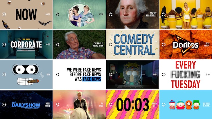
Take Comedy Central’s logo, for example. It includes the “c” within a “c” with the words “Comedy Central” accompanying it. That’s fine for on-air branding when you have a full screen to work with, but it’s difficult to maneuver on a mobile phone or on social media when there’s only room for a small logo. And while Comedy Central research found that its logo, launched in 2011, is relatively recognizable, it’s subtle enough that it didn’t stand out in logo lockups and other busy environments. So Loyalkaspar went to work to make it pop a little bit more.
“We felt like there was equity in that mark. Getting rid of it felt like a strange choice,” says Anna Minkkinen, executive creative director at Loyalkaspar. “And as we were designing, we found we liked working with it, we just needed to figure out how to make it work better.”
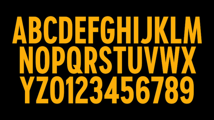
Logo determined, Loyalkaspar moved on to the font, creating a custom font that it named Comedy Sans. Previously, Comedy Central was using a font called Brandon Grotesque that had gotten a little too popular, and as a result viewers didn’t necessarily associate it with Comedy Central.
“We looked at the way they use type and they use a lot of it — on social, on subtitles on all of their videos. That system that we developed puts the logo on the left and the copy on the right. It’s based on having typographic elements, and those work best if the font is condensed but bold,” says Mikkinen. “Coming up with a custom font is not an easy process but it’s a little addictive — it’s cool when you can own this thing.”
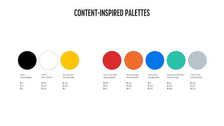
Next up was the palette. Up to this point, Comedy Central had been using no specific palette and following no specific rules. The new palette — while fun, bold and sophisticated — also moves Comedy Central into a more structured branding system that will give the network and its related platforms a unified and universally recognizable look.
Loyalkaspar started by doing some research to see what colors had not yet been claimed by competitive brands. Considering the number of networks that now exist, it’s not surprising that many colors — think Netflix red, Nickelodeon orange or Nat Geo yellow — are spoken for. Loyalkaspar eventually landed on a marigold shade of yellow that it calls “Summer Ale.”
“We wanted to land a signature color and then come up with a complementary palette,” says Line. “Loyalkaspar cleverly came up with the theory that the colors in the secondary palette can be derived from our shows, so we ended up with Trevor Blue, Who Killed Kenny Orange and so forth. The thing that we were aiming for with Summer Ale was that it is a color that communicates a net positive feeling. We wanted to make sure that our palette feels distinctive from those of our director competitors. And the warm jewel tones feel modern, warm and premium.”
Finally, Line and the team at Comedy Central also felt like its sonic branding needed to be brought up to date as well, so it employed branding agency Shout Out Loud, who provided the network with a fizzy new brand anthem that can be heard in the brand sizzle above. Shout Out Loud also updated the network’s simple audio logo so it sounds crisper and cleaner than what was previously being used.
With all of those pieces completed, the integrated branding system could now be put into place. Comedy Central started to assemble the parts into actual promos so that both the network and Loyalkaspar could get a feel for how it would actually work.
“They were excited to experiment with how they would create promos with this system,” says Mikkinen. “They would send us stuff and we would test it. We spent a lot of time with them figuring out what worked and what didn’t.”
In the end, the new system is designed to stand the tests both of time and growth, as Comedy Central continues to roll out across the globe, with France just recently launching.
As the brand sizzle says: “Now you can look at everything as content—a never-ending stream of Comedy Central.”