A New Yorker moves through the city’s subway, confidently navigating signs to quickly get to the desired destination.
The transportation system represents “one of the most iconic, recognizable, simple and effective means of communication in terms of design,” and helped inspire Freeform’s new logo and tagline, said Tricia Melton, the Disney-owned network’s senior vice president, marketing, creative and brand.
Like a young person on the go, the tagline, “A Little Forward,” is both an attitude and a direction that establishes a connection to the network’s audience.
“It captures the progressive nature of the brand and our programming,” Melton said. “It also speaks to the attitude, the moxy, the little bit of sass that we bring as well.”
Greg DiNoto, CEO of creative agency DiNoto Inc., developed the tagline in concert with Freeform.
“What Freeform protagonists have in common with their audience is this idea of the power of possibility, leaning into the world, leaning into opportunity, and grabbing the future by the balls,” he said.
The refresh marks Freeform’s two-year anniversary after a radical shift from ABC Family, into a network that targets “becomers”—the 18-34-year-old demographic of viewers, “primarily at the magical point between their first kiss and first kid,” as PromaxBDA has reported.
RELATED: How ABC Family Transformed Into Freeform
‘A Little Forward’ Sets the Tone at Freeform
The new logo and tagline is Freeform’s way of officially putting a stake in the ground as a network for young adults.
“There needed to be some additional focus, definition and clarity that we needed to bring to life for the brand,” Melton said.
From the strategic platform of “A Little Forward,” the tagline nudges viewers toward Freeform’s content, while being radical enough to spark conversations around important social issues—such as the kind of future we want to build for the next generation—and cheeky enough to post wise-guy gifs, memes and quizzes.
“It’s got that range,” DiNoto said. “It speaks to a higher place, and simultaneously takes the piss out of itself.”
The tagline works hand-in-hand with Freeform’s new logo: the lowercase letters “ff” inside a blue circle on a black background—that’s subtly reminiscent of a transit sign.
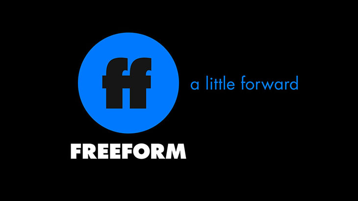
Branding and design agency Ferro Concrete developed the logo and accompanying graphics package around the concepts of simplicity and recognition, designed to quickly point viewers to important information so they can go on to enjoy their content.
“There was this whole idea of stripping a lot of the decoration out of the identity,” said Creative Director Owen Gee. “We felt this target demographic just wants to get their content as fast as possible, and anything that gets in the way is a distraction.”
The logo operates as a kind of shorthand that satisfies limited attention spans, and fits as an icon in small spaces across social platforms. The overall design elements also draw from a primary color scheme that aligns with what Freeform’s young viewers are familiar with in their digital-centric lives.
For instance, the logo’s blue background is not far off from the shade of Facebook and Twitter icons. The bright red on Freeform’s website has a distinct YouTube feel; the yellow conjures Snapchat. On-air, the lower thirds are similar to the message bubbles of a text.
“It’s absolutely a simplifying of the look and feel, and at the same time we’re creating a language that’s in keeping with how our audience digests information and how they respond visually to the iconography,” Melton said.
At its core, Freeform is in cahoots with its audience; it’s engaged in an authentic, honest conspiracy with fans.
“We’re right there with you,” Melton said. “We’re not marketing at you, but we’re it in with you.”
And part of that means leaning into a conversational approach in terms of how Freeform talks about its show and its brand.
For instance, Black-ish spinoff Grown-ish features an Instagram campaign where Zoey (Yara Shahidi), now off at college, is texting back and forth with her parents, siblings and grandmother. It’s a scenario based on how young adults communicate in real life.
“We’re creating these conversations that are not based on scripts, or anything happening in the episodes. They’re independent conversations, and the audience loves them,” Melton said. “I think that’s a really concrete example of finding our voice in a way that’s completely authentic.”
It’s with that sass and swagger that Freeform plans to move “A Little Forward” into the future.
DeNoto said the tagline is designed to grow with the brand.
“You want the line to keep functioning years out,” DeNoto said. “If we can articulate the values correctly, our tagline can live as long as the brand itself remains intact. If they stick to who they are but just continue to expand, this should work well.”
And Jen Fong, executive director at Ferro Concrete, said the logo, too is designed for maximum flexibility and growth.
“It’s deceptively simple,” she said, but has incredible potential to evolve as their program evolves.”
Tags:


















__twocolumncontent.jpg)
