


__twocolumncontent.jpg)


UK-based brand and design consultancy DixonBaxi put fans in the forefront when it came to rebranding the UK and Ireland’s BT Sport to TNT Sports.
The new sports channel is a joint venture of BT and Warner Bros. Discovery. DixonBaxi already had a lot of background with BT Sport, Warner Bros. Discovery and Eurosport, which is owned by Warner Bros. In 2016, DixonBaxi rebranded BT Sport; this year, it helped HBO Max rebrand to Max; and the agency has a long-standing relationship with Eurosport.
For TNT Sports, DixonBaxi wanted to build a brand that put fans’ passion first, as opposed to focusing on the big moments, which has become the standard in sports branding.
“Sport is often reduced to the big epic moment. The goal of the season. The trophy lift. The opinion of a pundit. We wanted to create a brand that has space for a collective view of sports, putting fans in the experience. Something that breaks the traditional ‘big moment’ and feels street-level, rich, tactical and spontaneous,” said Harry Ead, creative director, Dixon Baxi, on the company’s website.
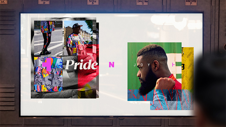
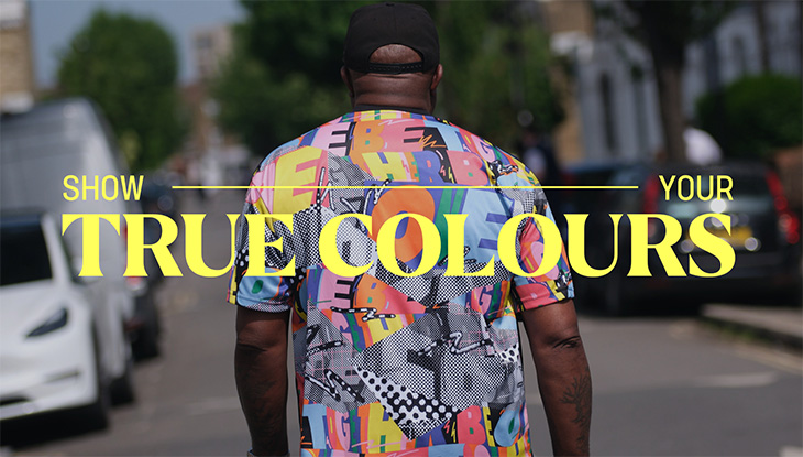
TNT Sports’ new idents, known as “fandents,” feature fans enjoying their sports of choice. DixonBaxi’s team spent two weeks shooting ten events to obtain a range of reactions from all different people to all different sports, including soccer (football) and rugby. The team then assembled the candids into social-media inspired collages, layering images over each other for an organic look.
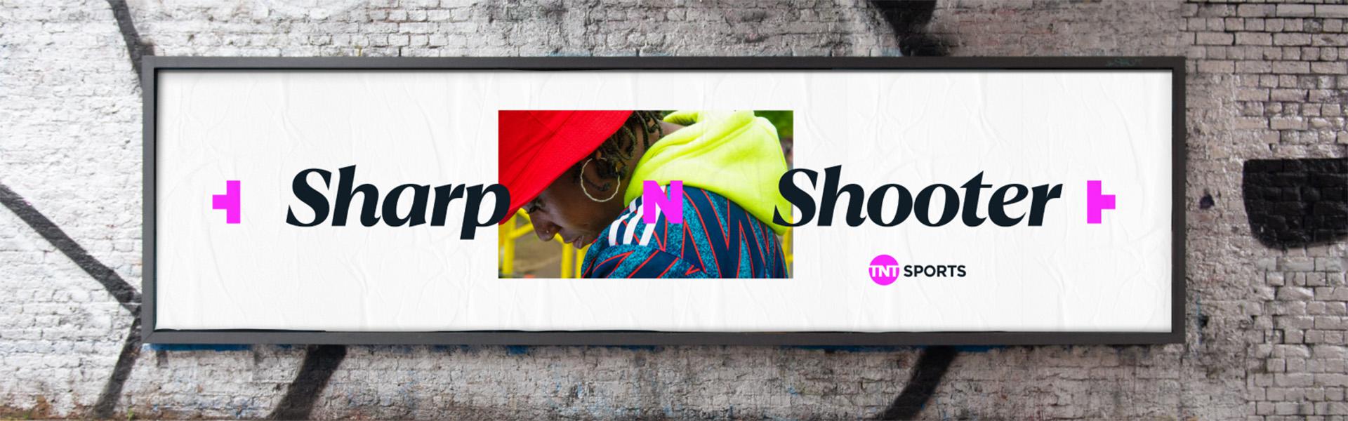
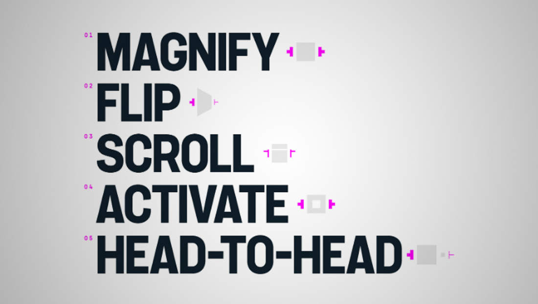
To tie the package together, Dixon Baxi turned the “T” in TNT on its side and placed one on either side of the screen to form a viewfinder that guides the sports channel’s new motion-graphics look. The viewfinder lightly frames words or images and ties back to the channel’s new logo.
The Viewfinder Powers Our Brand
Both the viewfinder and the TNT Sports logo are in a bold shade of magenta, although the viewfinder changes color as needed to frame up teams, rivals, data and other key pieces of information.
The team also spent some time mapping out how the motion-graphics system would work.
Just as DixonBaxi played with the “T” in “TNT,” it also had some fun with the “N,” turning it into a language device, like “Peace N Joy,” for example, or “Clubs N Hearts.”
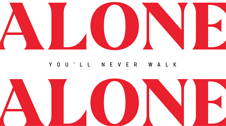
The package’s main font is a unique serif typeface designed by Manchester, England-based foundry F37. That’s accompanied by a sleek sans serif font that gives the package a unique style that differentiates it from other sports networks.
The rebrand dropped across TNT Sports’ channels and platforms on July 18.
READ MORE: Design Week, NewscastStudio
Tags: bt sport dixonbaxi f37 tnt sports warner bros. discovery