


__twocolumncontent.jpg)


The flame of a candle; a woman in a dark parking garage. A discarded purse and shoes on the forest floor; scrubbing bloody hands in a sink.
These powerful images come in quick cuts followed by abrupt halts in movement, appearing through and behind Escape’s logo as contrasting light and shadows evoke a suspenseful, tense atmosphere in creative agency Elevation’s rebrand for the network, which went live January 14.
“As much of Escape’s content involves sinister crime and murder, we explored the idea of introducing images that felt a little out of place, whether due to being in an odd environment or flipped upside down,” said Escape Senior Motion Designer Kelly Turner. “We wanted the graphics to reflect this pacing, illuminating little bits of information until a big reveal at the end.”
The updated look and feel by Elevation builds on the agency’s work for the network’s original branding.
“When Escape launched in 2014, our lineup focused primarily on theatrical movies, docu-drama series and true-crime shows,” said Turner. “The programming evolved to showcase hit off-network series such as Law & Order, Without a Trace and Boston Legal and we needed to update the packaging to better reflect our content.”
The Story of Escape
Much of Escape’s programming revolves around crimes of passion from love affairs and relationships, as well as the aftermath and investigations into those crimes.
“Most of the network’s content is about every day, interpersonal relationships that, in one way or another, went wrong,” said Turner. “We wanted the graphic package to reflect these types of relationships.
For instance, a wine glass, the interior of someone’s home and everyday items being used as weapons are objects that are not normally threatening, but Escape presents them in a context where they evoke a more sinister tone.
“One of our main goals was to allow the viewer to invest a little personal interpretation into what they were seeing,” Turner said of the imagery in the rebrand. We all have our own individual experiences that we inject into our everyday life. A parked car in an empty garage may not feel scary or threatening to some, but to others it will. We spent quite a bit of time reviewing our shows and movies and developed a list of keywords that we felt described a culmination of Escape’s programming.”
From there, Elevation Art Director David Hendrix and his team developed six themes that together tell the story of Escape, inspired by the steps that constitute a crime from start to finish.
- Scandal represents “the itch,” as someone slips off the bonds of conformity and morality, shown through images such as city streets at night, wine glass with lipstick, money, whisky and hands on skin.
- Pursuit represents “the scratch;” the stalking of prey and the quest for something different, shown through images such as a dark alley, hairs rising, footsteps and eyes in a rearview mirror.
- Lost represents “the consequence,” and conjures a literal or metaphorical place where someone feels alone, desolate or missing, and is shown through images such as woods in the mist, a compass needle, and aerial footage of a freeway.
- Found represents “the mess” that stems from the results of the crime, and is shown through images such as blood stained clothing, a dead body in the woods, and police cars with flashing lights.
- Investigation represents “the analysis” as detectives analyze the crime, and is shown through images such as lifting fingerprints, face scans on a computer and evidence boards.
- Psyop represents “the uncertainty” that comes with mind games, self questioning and the abstract nature of control. More generic and mood based, it’s shown through images such as a handwritten note, money being counted and nervous eye movements.
“For pursuit, the theme is intended to make the viewer feel uneasy,” Turner said. “I think we all have had the feeling that someone is watching us, and we inevitably quicken our pace and look over our shoulder.
“Escape’s target audience is women, and women especially can relate to this feeling of unease, resulting in developing a sixth sense to preserve their safety when in unfamiliar places or alone. Women enjoy watching this type of programming, escapism at its best, and I think it is important that our viewers can relate to the content they are viewing, even if it is unpleasant. They can place themselves in these situations and ask, ‘What would I do?’”
Once Elevation solidified the themes, they served as the foundation of the rebrand. Over the course of four days the agency shot carefully selected footage that embodied the imagery, and provided a flexible library of content for Escape to use moving forward.
“Knowing that we did not want the graphics to be overly specific in content, David developed these themes with the idea that they were broad enough to be used in many different contexts, but still guided the viewer into how they should feel,” said Turner.
The themes also shaped Elevation’s development of a desaturated color palette that ties it all together.
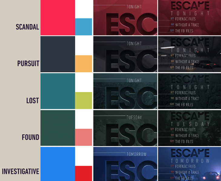
For instance, scandal is a red, lusty color; pursuit a dark grey accented with an uneasy yellow.
“Lost and found were both similar themes in terms of landscapes and trees and we wanted that to feel more organic,” said Hendrix.
And the red and blue of investigation conjures police lights and sirens.
“The pacing and muted color tones felt right, and the imagery made the viewer second guess what they were seeing,” said Turner. “We loved the figure of the woman laying across the landscape as the car drove towards it. It is unexpected, and the viewer doesn’t register it right away. The more you view that ID—and this goes for all the IDs—the more you uncover something new. The imagery in this rebrand is very layered and I think that reflects the minds and thought processes of a lot of the bad guys in our shows and movies.”
Leveraging Escape’s Logo
Escape’s logo, and the brand recognition that comes with it, also played a significant role in the update.
“[It] was a big focal point of the previous package, and they wanted to freshen up the look,” said Hendrix.
Elevation took what was a stylized 2D graphic and gave it more of a 3D “almost tangible feel … where you reach out and touch it,” he said.
To create more of an organic look with edgy tension, Hendrix overlaid it with a milky, skin-like texture—“I know that sounds creepy,” he said—and used a single light source from above, “catching some really nice edge highlights to give it a sharp feel, where you could almost be cut by it.”
Much of the footage also appears either through the logo, or behind it, positioning the word front and center.
The logo is also showcased with diagonal slashes that speak to a fragmented state of being, and play into the tension of the overall brand.
The rebrand was developed over the course of a year, with continuous collaboration between Escape and Elevation that built on the previous projects they’ve done together.
“Elevation has proven to be able to tackle multiple genres no matter what the content,” said Turner. “[The] creative team takes the time to understand our creative needs, explore our ideas, present a variety of solutions and are very flexible.”
Indeed, Hendrix said he enjoyed every stage of the rebrand, and was able to see it all the way through.
“My favorite part of any process is the initial development, and early exploration,” he said. “It’s so fun to get a project where there’s so many possibilities to help explore and shape it, and get the best of what you envision it to be, and what the client needs.”
CREDITS
Network: Escape, Katz Networks/E.W. Scripps
Network, SVP of Creative Services: Bryan Slonaker
Network, Senior Motion Designer: Kelly Turner
Design Agency: Elevation
Creative Director(s): David Hendrix, Stephen Cocks
Producer: Stephanie Carson
Art Direction: David Hendrix
Lead Artist: Kito Kondowe