


__twocolumncontent.jpg)


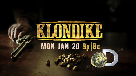
With its six-hour January miniseries “Klondike,” Discovery entered the scripted game for the first time in its 27-year history. The gamble paid off, earning the network its highest Monday primetime ratings to date, which continued strong throughout its three-night run.
With Tim Roth, Abby Cornish and “Game of Thrones” heartthrob Richard Madden leading the cast, Discovery’s “Klondike” key art let the actors’ distinctive faces lead the marketing charge. Working on location in Calgary, veteran photographer Kevin Lynch and mOcean creative director Gregg Higgins utilized unique lighting effects and the set’s own powerful authenticity to produce starkly dramatic images that feel torn directly from the era of the Gold Rush
Brief spoke with Lynch and Higgins, along with Discovery Channel SVP of marketing Lara Richardson, about the creation of these powerful images and the importance of authenticity to both this campaign and the Discovery Channel in general.
Lara, “Klondike” was Discovery’s first foray into the scripted game. What needed to happen with this key art to help the production stand out from what has come before?
LARA RICHARDSON: We wanted this to have a very theatrical feel, so we pulled the top 25 movie posters of all time and took a look at those. That’s where we knew we wanted to do something very simple but that popped out. I think the inclination for television networks is to try to put way too much in key art: “We need to see everyone’s face and we need to name everyone…etc.” When I was looking at [posters] like “American Beauty” and “Pulp Fiction,” “Jaws,” “Alien”… they’re all just very simple and a lot more conceptual than we’re used to seeing from TV key art. We wanted to really tap into that.
The resulting images, featuring straight-on portraits of each main character, are eye-poppingly stark and dramatic. Kevin, talk about the process of capturing those photos and prepping for a successful shoot on location.
KEVIN LYNCH: We had sometimes 15-20 minutes to get the shots with people like Sam Shepard and Tim Roth. I wanted to get the actors to 1) be in character, and 2) to comprehend what we were trying to convey. They have to look like they’re in character without overacting. A lot of actors don’t like doing still shoots during their takes because it throws them off of their whole day, their focus. You have to have your shit together… Ironing out the kinks the day before and having an incredible crew that you can rely on that really understands your goals and what you’re trying to accomplish in a shortened period of time. Then when the shoot day happens, you don’t worry about the technical stuff, you just focus on the creative process and gaining the actors’ trust in the few minutes you have time with them.
On location, you were able to shoot the actors in costume and in character, and even used real gold for the images. From a marketing perspective, Lara, how important was it to get that on-set authenticity?
RICHARDSON: Oh it made the campaign. We were very lucky to get the time that we did there. The actors were literally in the middle of shooting when we are able to [come in] and the [“Klondike”] set was incredible. It was not shot on a studio stage – it was shot up in Canada on a real working Western set that had both interiors and exteriors. For Discovery, it’s so important in everything we do to keep the authenticity even when we’re in something that’s scripted.
You chose to under-light the portraits, which is unusual in key art. Gregg and Kevin, what about this effect appealed to you?
HIGGINS: While working on the creative, one of the ideas for the under-glow was that in “Pulp Fiction” there’s the briefcase, but you never see what’s in the briefcase. You don’t know what it is, but you know it’s the thing that’s driving people, and so in [“Klondike”] gold is driving people, but you don’t necessarily have to see the gold. When you under-light somebody, it really opens up who these characters are.
LYNCH: The hardness and the obsession… all that really reflects itself in this lighting. It was daring because usually it’s not the most flattering light, so you have to really make sure you have it in perfect position so it doesn’t make [the actors] look too “vampirish.”
Kevin, you used what’s called a “tilt-shift” lens for these portraits. What effect did that technique have on these pictures?
LYNCH: A tilt-and-shift lens lets you cheat the parallax of the lens. You can throw half the image or even more out of focus. It was used in the old days for architectural stuff. I like using it on portraits of people. It looks like an old portrait that was done with a view camera. It allows it to have more of a feeling of the period, the authenticity of the time of the gold rush, when people had their portraits taken
Lara and Gregg, in terms of marketing efforts for future Discovery scripted projects, what were your takeaways from doing this key art?
HIGGINS: I wish we could shoot on a practical set every time. It was wonderful from a photo shooting perspective, but also from the experience of being around while they were shooting and that influencing us in terms of how we worked with [the actors] and in bringing out their characters. It was just a great experience.
RICHARDSON: When I originally had this project in mind, I thought we would be going snow, ice, cold, harsh conditions in the key art because that’s kind of what [those characters] were facing. But the richness we were able to capture by warming things up and using gold and finding that burgundy color, I think made a huge difference. You don’t see that color a lot and the gold stuff worked really well on top of it. Had I gone my original way, I think it would have portrayed a very different story.
Tags: