


__twocolumncontent.jpg)


When it comes to competitive culinary entertainment, no matter how famous the judges, how notorious the contestants or how outrageous the challenges, the show’s real stars are always the mouth-watering dishes.
Bravo took this to heart in the summer of 2011, when it made a “big” deal out of its season premiere for the sweet-toothed Top Chef spinoff series, Top Chef: Just Desserts (TCJD). While the season’s chef contestants taunted the camera with over-the-top culinary machismo, the commercial’s real stars hovered alongside them, strong and silent: an array of giant-sized layer cakes, tarts and other sweet treats that were nearly as big as the humans.
The campaign set the tone for the series as a new course in the network’s successful portfolio of reality programming, but for the Season 2 premiere, the challenge was to “come up with something new that would build upon last year,” said Amy Troiano, VP of on-air promotions at Bravo. “We wanted to go beyond giant, amazing desserts and do something that really catches the viewer’s eye.”
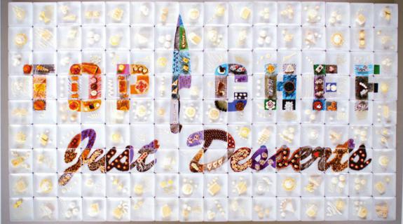
The solution? Leave the confections normal-sized this time around, but go big on the quantity of sweets – so many, in fact, they could be pieced together to form the TCJD logo itself, completely out of, what else, Top Chef desserts.
Concept: Incorporating TCJD’s competitive vibe, Troiano’s team decided to present the logo as a “creation” of the Season 2 chefs, who would jostle for position to build it as the spot progressed. They called upon production company danAppelcreative to bring their unique vision to life. Company founder Dan Appel, who also directed the spot, was excited by the challenges presented by the giant logo.
Appel’s team used 144 dessert plates that were each 7.75 square inches. When placed together they created a TCJD logo approximately five feet, 10 inches wide by 10 feet and four inches high set on a six-and-a-half by 11-foot custom stainless steel table.
Production: To address the challenge of working under hot lights with delicate and easily destructible dishes, Appel called in Food Fanatics, a company of food stylists, to create nearly 150 unique desserts that would fit into the color scheme. Using a combination of real food ingredients and, by Appel’s account, a “bunch of materials from Home Depot,” Food Fanatics whipped up dishes ranging from coconut layer cake to tiramisu, Rice Krispies treats and a plethora of fruit tarts.
After three long days of prepping, Food Fanatics’ dessert logo materialized beautifully during the shoot on the floor of a soundstage with Appel’s crew successfully capturing it from high above. However, there was one last piece of the puzzle to incorporate, or “pieces,” as it were. The spot needed to show the competing chefs bringing their desserts to the table and actually building the logo from scratch.
Since there was not nearly enough time in their shooting day to dismantle the intricately designed logo and actually choreograph a rebuilding of it on camera, Appel’s team created an illusion of logo construction using an old-fashioned camera trick. They had each chef walk into the shot from off camera, remove a dessert plate and then walk backwards out of the frame. Played in reverse and sped up, the chefs appear to be moving up to the table to add their contributions to the logo.
In the end, the production was a successful combination of old and new-school techniques, ranging from reverse playback and elaborate prop-making to the ultra-modern iPhone app, Artemis, which allowed Appel to figure out what lens could best capture the giant logo from above. The resulting spot feels both classic and contemporary, and the dessert logo, as promised, is richly textured and beautiful to look upon. “When you put it all together in post, and that last plate is going in and that finished logo is revealed, it’s a huge accomplishment,” Appel said. “And believe me, it takes a village.”
Tags: