


__twocolumncontent.jpg)


The French premium cable channel Canal+ turned 30 years old this year, and celebrated with a massive campaign extending across on-air, digital, mobile, merchandise and beyond. But the nexus of it all is undoubtedly a beguiling, ultra-ambitious set of more than 30 original idents starring French celebrities.
Led by Olivier Degrave, head of on-air design, Canal+ last December began developing the campaign that would drive the idents.
The first step was to create a typography that merged two lettering systems from Canal+’s history: a custom font created exclusively for the famous Canal+ program Nulle Part Ailleurs, and the more widely known Bodoni type, which was used in very early Canal+ idents during the network’s first year of existence. Referencing both historic typographies brought the 30-year celebration full circle, mixing “the present and the past to make something new,” said Degrave. And indeed, the font that emerged from this development process somehow looks both futuristic and classic at the same time, while also exuding a properly celebratory feel.
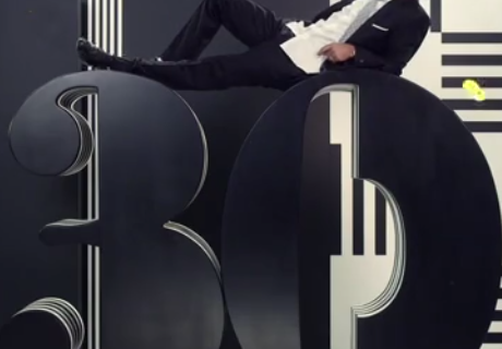
One could imagine this typography converted into the numeric candles seen atop birthday cakes, an action that Degrave’s team actually executed in a way, if on a much grander scale, via the enormous, waxy-looking No.30 prop on display in many of the idents. The attention-grabbing prop was crafted from 10 interlocking layers of black and white plastic. Its presence was intended to give the talent “something to do, to play with in the geometric system on the set,” said Degrave. The plan worked, as evidenced by this spot featuring Amélie star Jamel Debbouze.
The breaking of the prop that occurs in the above video was unplanned, making it exemplary of the infectious, carefree vibe that resonates across all the spots. It’s a seemingly loose, improvisational approach that was only made possible through nearly a year’s worth of planning and the construction of a rigidly controlled physical environment where spontaneity could occur – a carefully wrought design that Degrave called “the creative playground of Canal+.” That playful zone is clean and geometrically precise, hosting both the new typography and the talent without drawing away from either.
Once the set design was in place, Degrave proceeded to write 20 scenarios that could occur within the space, each featuring a top French celebrity from throughout Canal+’s illustrious history, ranging from actors to athletes to game show hosts to politicians and beyond. Last May, he proceeded to show what he had come up with to London-based agency Studio Hansa, and asked them “to think about [what I’d written] and write other scenarios.” Studio Hansa co-founder Omar Honigh and art director Gary Roberts proceeded to “call 10 days later and propose 20 more.”
On its end, Studio Hansa creative partner and filmmaker Nick Scott said the agency was inspired to take Degrave’s vision to another level.
“Our take on it was why not do 30 for 30 rather than one really bombastic, super-expensive piece of communication?” he said. Degrave and Canal+ agreed with this assessment and Studio Hansa proceeded to storyboard more than 40 scenarios for the network. Then it sent its production team to Paris to shoot those spots.
The “most important rule” during production, said Degrave, was “real shooting. Build something in real life.”
Canal+ is like HBO, he explained. “People pay for us, so we have to build something unique, something remarkable… It’s the reason why we are much more open to the optical arts than pop arts – to build something you cannot duplicate.”
The idents achieve the goal of feeling like nothing else that has come before, but do so by grounding in classical forms. The typography is a blend of two decades-old fonts. When the color scheme isn’t black and white it is monochrome, the lines of the set design sharp and clean. Though Scott said that Studio Hansa saw “spectacular things happening” with CGI early on, including using it to make a piano drop in one ident, computer graphics were ultimately set aside for a mostly in-camera look and feel. When synthetic visual effects were employed, it was with great economy, the form perfectly complimenting the function, as in this spot inspired by the classic video game Pong.
Within such a spare, elegant landscape, small actions outlined by the storyboards become electric, the celebrities popping off the screen as though they are sharing the room with you. With no more than 15 to 20 minutes for each celebrity during the four-day shoot, the purpose of the months of planning became abundantly clear.
“They needed to know exactly what they were doing and we needed to keep it pretty simple for them,” said Scott.
Because the production was so well prepared, the beautiful people on display seem both elegant and relaxed, like they are having fun. The feeling exuded is glamorous without being garish.
“It feels kind of like fashion, like Vanity Fair” said Scott, “which is odd for TV but that rigid style to it made it totally graphic and helps the timelessness.”
In the end, he continued, “they’re pretty simple spots really, that allowed the talent to come on board and take it their own way. [The celebrities] all did things that added to the spots and brought their personality out… I guess that’s the reason they’re stars.”
Tags: