


__twocolumncontent.jpg)


Moira Abramzon began her career in Buenos Aires as a graphic designer for TV stations. Her path led to Los Angeles and then Rome, where she founded Mu Design before moving back to her home country where her company is based.
The studio’s name brings her back to her roots, inspired by the onomatopoeia reminiscent of the many cows grazing the Argentine countryside.
“It’s a joke, but also very sentimental and heartwarming, and really a question of belonging that I’d never expressed to anyone,” she says.
A 2007 project assigned to her by Sky Sport Italy motivated her to take the leap.
“I was intrigued by the way Moira faced each new project,” said Gabriel Galluccio, one of the creative directors at Sky who is now creative director at Fox International Channels for Europe and Africa. “We’d already worked on a couple of projects for some show titles and I liked her dedication to strategizing creativity.”
The work spurred Mu Design to take on more sports projects, including creating an identity for the 2012 Olympic Games.
Abramzon’s goal was to create an improved image across 13 pay-TV channels, designed to stand out from other national channels while sticking to Olympic branding regulations.
“The solution lay in the many sports and categories that ran across the different channels. And there were limited resources for a certain number of graphic elements,” says Abramzon.
She based the final creative on modular elements, using assets that could be refreshed with actual images of events as the Games progressed.
“Moira gave us a platform where we could combine Sky’s typical, transparent identity with the language of sports and the Olympic Games,” says Galluccio.
One of the studio’s strengths lies in its strategic use of creative resources.
“It is essential to be able to generate an identity that the channels themselves, either in-house or through an external team, can later continue developing and expanding, without it costing millions,” says Abramzon.
Another project for Singapore station Hits follows the same modular format.
A Typographic World
Mastering fonts is another of Mu’s specialties, as demonstrated by the studio’s own logo design. It features letters that are not completely closed for a look that fluctuates between classic and modern.
“We started with the sum of the parts, and wanted to present a proposal where [the name] was recognizable, but required an effort to identify it. Also, we wanted to construct something more modern while using the traditional bodoni font as a basis,” says Abramzon.
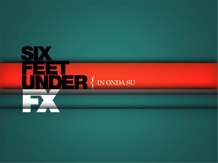
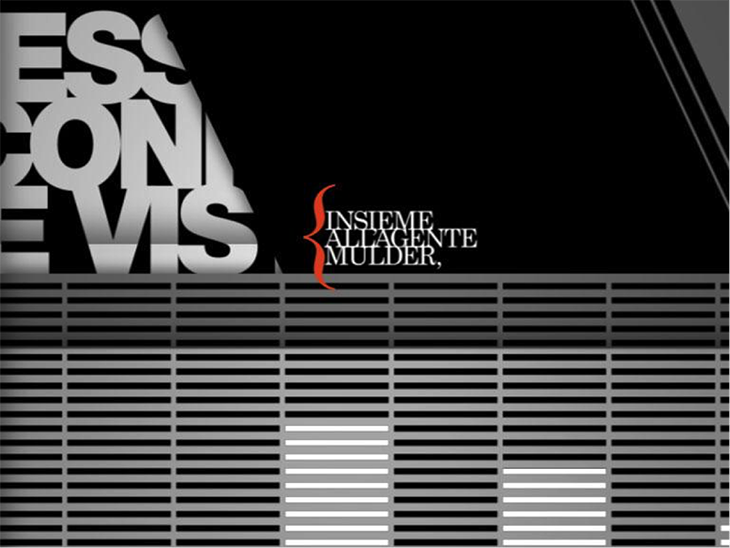
The studio’s portfolio includes typography-based projects, such as those created for Italy’s FX channel in 2010, at a time when the network targeted male audiences with very heterogeneous programming.
“The main problem was that the content differed greatly, spanning the gamut from American cult series to vintage Italian films,” said Juan Pablo Kessler, former art director at Fox Channels Italy at the time, who now serves as head of design and art director at creative agency Bundesliga. “The channel’s visual identity was clean, vectorial, editorial, noticeably typographic and with a reduced color palette. We needed to communicate diverse programming contents in a way that was consistent with the brand.”
Mu Design wove together the diverse programming with a number of idents that used memorable dialogue from FX’s most iconic shows to create a soundtrack for the brand.
The following year, the team was rewarded with the launch of renowned series such as Six Feet Under, Dexter, The X-Files and Mad Men, and produced pieces that incorporated well-known phrases from each show.
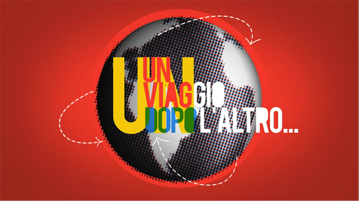
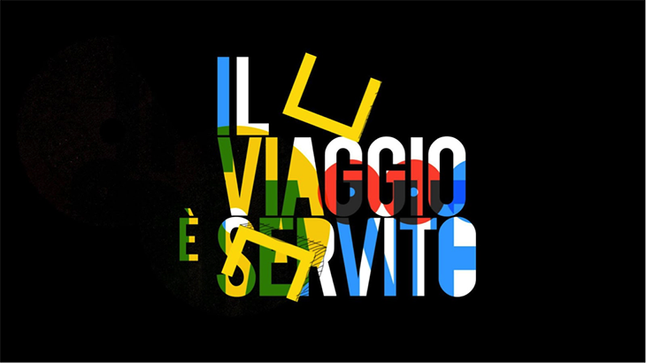
Meanwhile, Mu also worked on developing other projects, such as idents for Nat Geo Adventure, also in Italy where the creative proposal asked for adventure vignettes, “as if they were recipes or small ways to recount a journey,” says Abramzon.
Mu broke down possible visuals for the project, with specifically composed audio tracks for each.
An Auditory Universe
Careful attention to audio is another valuable part of the studio. A good example is the project created for the station run by Italian food and wine publishing group Gambero Rosso.
“All the audio was made with bytes recorded from actual kitchens, as someone chopped, mixed and fried,” Abramzon says.
The idents for kid’s channel ZooMoo in Latin America and Asia also featured realistic audio using the character’s own voices and bodies.
“We began developing the branding, the naming, the logo, and the ZooMoo personas—a mix of animals and characters with which we personified the logo,” says Abramzon.
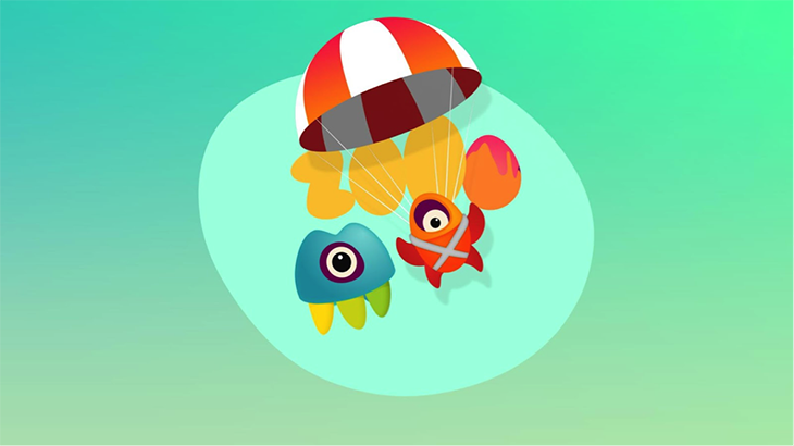
Later, Mu created a series of thematic idents and bumpers based on the channel’s content areas.
“They were a bit abstract, as is nature, with different points of observation for the narrative, showing that we are not always looking at the world from our own perspective, but that we can also see it from the side or from above,” she says.
The majority of the studio’s work in audio is based on representing reality, since most of the sources Mu uses to shape its ideas come from real life, and from machines. “Many decisions around animation are based on forms of specific mechanisms such as gears, balls and fluids that are then turned into something digital,” says Abramzon.
This ability to observe reality is another talent Abramzon acquired after having worked and lived in several markets and locations, from Rome to Buenos Aires, where the studio is based today.
A Digital Dimension
Mu Design is now evolving towards the digital media world within television. For example, Mu created the packaging—minus the logo—for Raze TV, a high-quality content platform for young Latino audiences.
RELATED: Raze TV Paints Young Latinos as Leaders in Global Culture
Raze TV retrata a los jóvenes latinos como líderes de la cultura global
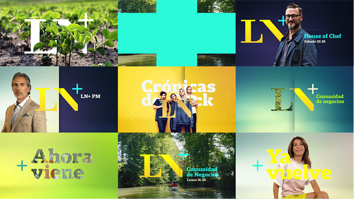
Mu also worked on a project that began as a digital proposal for Argentine newspaper La Nación and evolved into a TV channel.
“It is a very simple and conceptual proposal, mostly informational,” says Abramzon.
To create the logo, Abramzon kept the letters LN from the name.
“The legacy that came with the brand was slightly refined and the “+” symbol was added, not only at a conceptual level but also to appeal to the digital element, implying that from here we expand; we generate content and interesting information,” she says.
The evolution to digital comes with other challenges, such as the necessity of immediacy.
“We need to achieve a strong identity but the aesthetic and graphic presence is limited,” she says. “Sometimes we have to work with materials that lack quality. But our goal is to create the best we can with what we have and continue to develop quality branding.”
Version español: Creative Review: La evolución de Mu Design
Tags: